
The One Power Word to Persuade Them All

“Because you’re worth it.”

This famous slogan by the cosmetic company L’Oréal’s uses one of the most powerful words in persuasive copywriting — “because.”

Humans crave reasons and resolutions. Ever since you are a small child, you want to know “why?” The master of persuasion, Robert Cialdini, explains why that basic desire drives action:

A well-known principle of human behavior says that when we ask someone to do us a favor we will be more successful if we provide a reason. People simply like to have reasons for what they do.

When you lose motivation with a task or job, you may find yourself asking “why am I even doing this?” in the first place. Reasons equal motivation, including motivation to click through, reply, comply with your request, or even do you a favor.

So are you making the most out of the power of “because” in your emails?

The Surprising Power of “Because”

People aren’t even choosy about their rationales for behavior, as Harvard psychologist Ellen Langer found in a famous 1978 study.

Langer and her colleagues wanted to see whether people would let someone skip ahead of them in line at a busy library copy machine. They asked people three request variations. Take a look at the success — or conversion — rate for each question:

  • Excuse me. I have 5 pages. May I use the Xerox machine? — 60%
  • Excuse me. I have 5 pages. May I use the Xerox machine because I have to make some copies?93%
  • Excuse me. I have 5 pages. May I use the Xerox machine because I’m in a rush?94%

It makes sense that not providing a reason performed the worst — simply asking without a justification makes you look presumptuous. But surprisingly, giving the meaningless, redundant rationale of “I need to make copies” did nearly as well as a legitimate explanation. In this scenario, the mere existence of a rationale increased the likelihood of success by 55%.

Still — the power of “because” by itself has its limits. When the line interrupter announced that they needed to jump ahead to make 20 copies rather than 5, people became much more critical about the reason’s substance.

Compare:

  • Excuse me. I have 20 pages. May I use the Xerox machine?24%
  • Excuse me. I have 20 pages. May I use the Xerox machine because I have to make some copies? —  24%
  • Excuse me. I have 20 pages. May I use the Xerox machine because I’m in a rush? 42%

As Langer explains:

Once compliance with the request required a modicum of effort on the subject’s part, thoughtful responding seemed to take the place of mindlessness, and the reason now seemed to matter.

Almost any explanation motivates — but the bigger the ask, the more the quality of your reason matters.

Because Persuasion Requires a Bridge

So now you know that we, humans, will use almost any reason to justify our behavior — but that a quality reason is most compelling.

“Because” is the conjunction that connects your goal to the reader’s motivation, putting everyone on the same side. The takeaway here is not necessarily to go heavy on the word “because” in your copy as a quick-fix formula — but to carry out that connective reasoning that bridges the gap between intentions. Emails and calls to action fail to convert when they fail to take the reader’s perspective into consideration.

Your reader is the protagonist, the VIP, the star. L’Oréal’s enduring pitch isn’t that their cosmetics are worth it — it’s that their customers are awesome. Give reasons that resonate with readers so that they’ll follow your request and become loyal customers:

  • because that’s the awesome type of person they want to be (appealing to self-expression needs)
  • because it will help them accomplish their goals (appealing to functional needs)
  • because it will be fun or enjoyable (appealing to aesthetic needs and the senses)

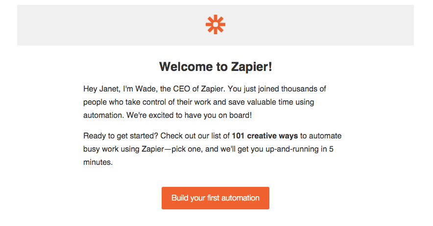
Despite being the participant of many-a-power-word list, “because” doesn’t seem very common in digital copywriting. Try testing using the word “because” in your emails and copy to motivate people to comply with your call to action.

Copyhackers
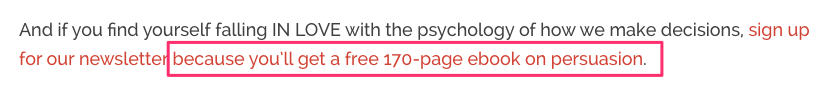
example of a CTA from Copyhackers using “because”

Now let’s dig into some examples of how you can use the power of “because” in your emails:

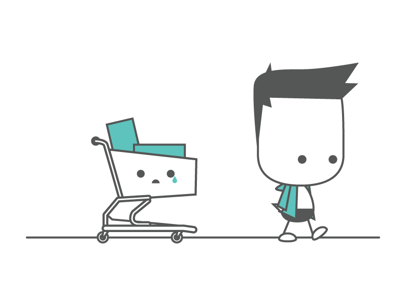
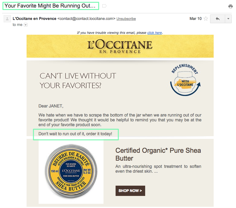
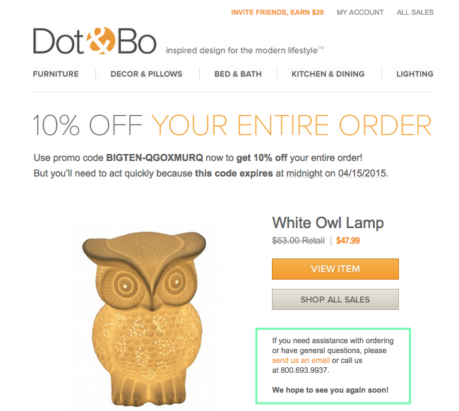
Dot & Bo (limited time + incentive)

This cart abandonment email from Dot & Bo provides the good ol’ Cinderella rationale to act quickly — “because this code expires at midnight” within 2 weeks.

Dot & Bo "because" marketing email

The limited time discount is not the only “because” factor in this email. The cute owl lamp is not a random product but something I left in my shopping cart before leaving the site. This customization based on my behavior makes the message feel relevant and that this call to action is for me rather than any ol’ Joe Schmoe.

ePantry (VIP treatment + incentive)

ePantry provides a subscription service for sustainable household products. Their brand revolves around their mission to prioritize customer happiness and, as a B corp, social and environmental good. This strong company identity and purpose provides many reasons for customers to bite.

This email with the subject line “We do things differently” is no exception.

ePantry

This is a good example of the “because I have to make more copies” rationale. While I don’t doubt that ePantry believes its community members are the best, that reason is also not specific or compelling on its own. It works, given the company’s consistent mission and messaging, the sweetener incentive of free shipping, and the feeling of special treatment — a mix that has worked so successfully for companies like Zappos.

Stitchfix (testimonials, social proof)

Stitchfix offers affordable personal styling services for women. As part of the sign up process, you have to fill out a personal style profile to share your sense of taste, budget, size, and lifestyle. Instead of bugging me right away with a generic “please complete your profile” nudge, Stitchfix sent me 4 reasons to get moving from happy customers.

Stitchfix

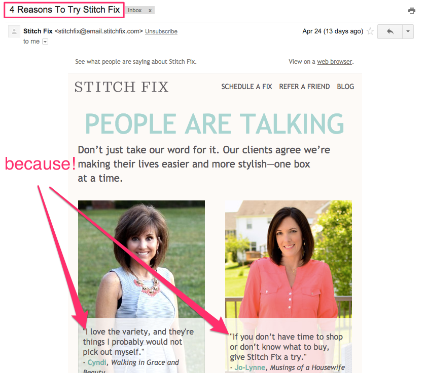
Your happiest customers have already found reasons that resonate — and they’ll probably say it best.

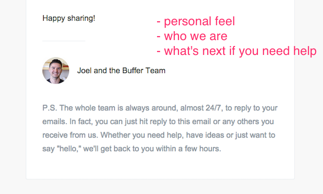
Unbounce (accomplish your goal + incentive)

In its newsletter, Unbounce sends updates on their newest, best content. In a smart move, the company also connects its content audience to its product by including a call to action in every postscript.

Unbounce

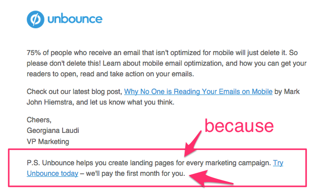
While there’s no explicit “because” statement — there’s a reason (Unbounce will help you solve the problem of creating marketing landing pages) that leads right up to the pitch to “try Unbounce today.” Notice how they follow through with what sounds like an incentive. “We’ll pay the first month for you” sounds like a more compelling reason to act than the usual “free trial” angle.


Don’t make an unjustified request that sounds like a presumptuous command or comes off as worthless noise. People like having reasons for what they do, and as one wise giant robot dinosaur says:

EVERYONE CARE ABOUT SELF FIRST. TAKE HINT. CARE ABOUT THEM FIRST TOO.

WHOLE POINT OF COMMUNICATE? THEM. WITHOUT A THEM THERE NO COMMUNICATE. IT JUST OTHER WORD END IN “ATE”.

For marketing emails — and any emails really — where you’re asking people to do something, give reasons. Because you’re worth it. Because awesome.

What’s your experience with conversion when using the word “because”? Share with us in the comments!

Photo: Olivier Jeannin/Flickr

Optimize Your Welcome Emails With These 5 Templates

Sure, welcome emails are vital.

They help acquire that critical feeling of trust that anchors a stronger customer relationship. Research by ReturnPath even shows that welcome messages not only boost engagement but predict long-term subscriber behavior and revenue potential.

But the blank page is always nerve-racking, especially when you’re trying so hard to create a really great first impression. So we’ve gathered examples of 5 different types of welcome emails that many businesses use — with copy templates you can use and adapt to get started.

5 Types of Welcome Emails

Welcomes arise in many situations. People meet businesses in many different ways — which calls for more than one type of email greeting.

Here’s a rundown of the 5 types of welcome emails:

  1. General product / service: The basic welcome message from a business, app, or website once you sign up for an account.
  2. Newsletter Subscription: A welcome to your marketing world, whether the goal is to nurture leads, build an audience, engage existing customers, or promote sales.
  3. Personal outreach: New signups automatically receive a personal welcome email from someone in the company. This has become a standard email practice for many startups.The following 2 types are less common but still important to categorize as welcome emails and treat with the same care.
  4. Free Sample Welcome: Companies often offer free content in exchange for an email address — it’s just as crucial to make a memorable first impression here.
  5. Invitation: When a teammate or group member invites others to a product or service.

welcome Ami!Want your own editable version of these 5 copy templates?Download now (and get a bonus swipe file)!

First, review our tactics for how to create a trustworthy first impression plus the 3-part Princess Bride formula you need in all welcome emails.

Also consider the context, timing, and flow of your welcome emails — in relationship with each other and other messages. For example, if you have a verification step to confirm an email address, will that be in a separate email or combined with the welcome message? What’s the action that triggers the welcome — a signup, purchase, promotion, or contest — and how will that inform your approach?

Now let’s look at examples and copy templates that you can start using today. The templates refer to an imaginary productivity app called Prioritizer.

5 Welcome Email Templates

1. General Product / Service Welcome Email

Example Email – Evernote
Subject: Get Started with Evernote

Evernote Welcome Email

Evernote’s welcome email is short but gets all the right points across, telling you why it exists, how it will help you, and a clear CTA. What’s the most important action for the reader to take next? In your quest to be helpful and informative, don’t bury the next step.

Some quick subject line idea from my inbox:

  • Welcome to Blue Apron (the basic bread and butter of welcome email subject lines)
  • Welcome to Mention Janet! (the personalization variation)
  • Thanks for joining! Let’s get started. [CNET Insider]
  • Welcome to Bigstock Free Trial (specifying context of signup)
  • We’re pleased to meet you [Headspace]
  • Wistia Powers, Activate!

General Welcome Email

[greeting]
Hi Bob!

Welcome to Prioritizer! Thanks so much for joining us. You’re on your way to super-productivity and beyond!

[who we are; our mission/ what we help you do; how it works]
Prioritizer is a task management app that helps you focus on the important things in life by only allowing you to add 3 items a day. Set and track daily, weekly, and monthly priorities — and get the stuff that matters done.

[what to do next that will set you up for success]
Our number one tip to get the most out of Prioritizer is to download our browser extension and give it a whirl. [how it helps] It’ll make sticking to your priorities super simple and just a click away.

[CTA](Download the extension)

[open communication channel for questions, conversations, and help]
Have any questions? Just shoot us an email! We’re always here to help.
Cheerfully yours,

The Prioritizer Team

Grab your editable template here.

2. Newsletter Welcome

Example Email: Zapier Blog
Subject line: Thanks for Subscribing to the Zapier blog!

Zapier welcome email part 1

Zapier’s email welcoming new subscribers to its blog is great. The most important information is at the top — setting expectations about type of content and frequency of emails. Presumably people sign up for recurring newsletters for a reason — and this is your chance to make sure those reasons are mutual and they won’t mark you as spam down the line.

Zapier welcome email part 2

Many newsletter welcome emails offer a collection of proven material to give new subscribers a sense of the quality content they’ve just signed up for. Others may offer a freebie or bonus content as a thank you for signing up that reflects the content to come.

Finally what makes Zapier stand out here — that many businesses don’t do well — is taking the time to introduce the company behind the blog is and what it does.

Quick things to consider:

  • What’s going to be in the newsletter? What type of content will it link to?
  • How often and when will subscribers get newsletter emails?
  • If your blog publishes multiple times a week, will you send an email with every new post or offer to set email frequency preferences?
  • Are you going to share a best-of collection of reads or a freebie?

Subject line ideas from my inbox:

  • Welcome to the Sunday Dispatches [Paul Jarvis newsletter]
  • Thanks for subscribing! Let’s get started with some free resources [Campaign Monitor]
  • [Groove’s Startup Journey] You’re subscribed to the Groove blog 🙂
  • Subscription confirmed! Welcome to the Buffer email club!
  • Thanks for subscribing! Here’s some free stuff [Invision]

Newsletter Welcome Template

[greeting]
Hi Linda!

Thanks so much for signing up for the Prioritizer newsletter! [set up expectations/make personal connection] You’re joining an amazing community of folks who love nerding out about productivity.

[set up expectations re: frequency + type of content]
You’re joining an amazing community of folks who love nerding out about productivity. Here’s what to expect: every Tuesday you’ll get an email with a collection of our best content with actionable advice and food for thought to help you get more done.

[who we are / why company exists]
Oh, by the way, let’s introduce ourselves before we get going. Prioritizer is a task management app that helps you focus on the important things in life by only allowing you to add 3 items a day. Our goal with the newsletter and our content is to create and share content that will help you be more effective with your time!

[best content / freebies to build trust + affinity]
As you wait for the next issue, check out some of our most popular posts. They’re a great place to get started.
(links)

[openness to conversation]
We’d love to chat. Just hit reply to this email or any of our newsletters to get in touch with feedback, questions, or ideas for us!

Have an awesome day!
Louise, Prioritizer Marketing Manager

[secondary call to action can go here, or a trust-winning reminder how easy it it is to unsubscribe]

p.s. Want to check out our Prioritizer app? Head here to sign up for a free trial.

Grab your editable template here.

3. Personal Outreach Welcome

The personal outreach email isn’t just for introductions. It fits in at any point in a customer lifecycle — whether it’s to ask for feedback, “check in to see how things are going,” or offer help after periods of inactivity. Here we’ll focus on the personal outreach email for the specific purpose of welcoming people aboard.

Quick things to think about:

  • Be personal, as if you were sending an email to a friend. Use simple formatting and plain design.
  • Consider flow. If this is the only welcome email you’re sending, incorporate all the elements in the general product/service welcome. If this message is part of a welcome or onboarding series, consider timing and goals.

Example Email: Farmigo
Subject line: Hope you love it!

Farmigo personal welcome email

I got this personal outreach email from Benzi Ronen, the founder of Farmigo. What does it do well? It arrived in my inbox 10 days after the general welcome and, more pertinently, a day after my first order. So the interaction felt personal and responsive to my individual behavior, even though it was most likely triggered automatically.

The message also reiterates Farmigo’s missions while soliciting customer feedback. The coupon incentive in the postscript didn’t hurt either — I used it to make my next purchase.

At this point, you’re not going to stand out for sending a general personal outreach email. While it’s important to offer your customers a chance to provide feedback and kickstart a conversation, this message is an opportunity to both cement your business identity and give new users a nudge in the right direction.

Personal Outreach Welcome Template

[greeting]
Hi Gene!

I’m Louise Belcher, CEO of Prioritizer. I’d like to personally thank you for signing up. Welcome aboard our journey towards smarter task management and happier productivity!

[explain mission / common goal; personally connect with the reader]
We started Prioritizer because we’ve always had trouble keeping a realistic to-do list that made sure important priorities got done. So much of your day escapes you because you end up doing reactive work that feels more urgent.

[lead into what you’d like the reader to do next]
Our mission is to help people keep on track with valuable goals. So I wanted to make sure you get the most out of your trial. [CTA] Check out our 5 top tips for success with Prioritizer.

[open door to support and feedback]
I’d love to hear whether you think Prioritizer helps fulfill your big goals or what we can do to improve. If you have any questions about getting started, I’m happy to help. Just reply to this email!

Let’s do great things together!
Louise Belcher

[postscript call to action – great spot to get a little more salesy, offer an incentive, ask a specific question to elicit a response, or express extra personality]
p.s. I love reading about productivity but hate wasting time finding quality stuff. What’s your favorite source of good reads?

Grab your editable template here.

4. Free Sample Welcome

Companies, especially many SaaS businesses, offer free content, such as e-books, guides, reports, and other goodies to increase their visibility and collect email addresses.

One common mistake I see over and over is that this email includes a download link or quick thanks and not much else. Yet this is often your first point of contact with people who’ve just expressed interest in a field in which you’re probably selling.

It’s worth your time to make a great first impression here and take advantage of the opportunity to make a meaningful connection, set expectations if they get put on a marketing email list, or include a more specific call to action with enough context to persuade.

Example Email: Litmus
Subject line: You read the 2015 State of Email Report. Now what?

Litmus download email

Litmus offers its 2015 State of Email Report as an instant download. While the email I got doesn’t specifically say “welcome”, the message acknowledges the fact that I may be new to the Litmus universe. Litmus already knows that I’m interested in email because I downloaded their report — so I’m likely more receptive to their nudge to start a free trial.

What I especially like about this email is the explicit “Now what?”. If you’re sending freebies and resource downloads to grow your lists, come right out and answer the “Now what?” question. Will you send more emails? Do you want them to start a trial? Would you like them to share the resource?

One quick tip: be specific in your subject line. Instead of “Here’s your ebook,” include details. People are more motivated to open and read an email from a relative stranger if the subject line is clear. Here’s a nice example from Copyhackers: Yay! You’ve got your free persuasion ebook + this (you’ll love it).

Free Sample Welcome Email Template

[greeting & gratitude]

Hi Bob,

Thanks so much for your interest in our 50 Most Successful Productivity Lifehacks book! [access to resource] Here’s your download link.

[what’s next?]
You’ll also start receiving weekly emails with thoughtfully human-curated content and our best blog posts full of actionable advice and food for thought to help you get more done. If that’s not your jam, no worries – just click the unsubscribe link.

[explain who you are, make a short pitch to give context for your call to action]
At Prioritizer, we’re only interested in lifehacks that make it easier to focus on accomplishing great goals — so much so that we made an app for it! We help you keep a realistic to-do list of priorities.

[CTA] Check out our 30-day free trial!
(Start being more productive)

Always here if you have any questions,
The Prioritizer Team

[postscript – a nice spot to ask for a visibility boost for your content]
p.s. Think this guide is helpful? Just click here to share with friends and colleagues.

Grab your editable template here.

5. Invitation Welcome Emails

Invitation (and referral) emails can be the first time someone meets your business. In order to make a trustworthy impression and appealing introduction, make sure your invitation email includes this information:

  • Who invited the reader or created the account?
  • Who are you and why should the reader also sign up?
  • What’s next?

Example Email: HelpScout
Subject line: Welcome to HelpScout

HelpScout invitation email

HelpScout’s invitation email is short and covers all the bases. It’s clear about who extended the invitation and explains why the tool is helpful. The call to action should be rather straightforward here — to set a password or create/activate a new account. The overall goal, as with all welcome emails, is to create trust and motivate those key first actions.

Invitation Welcome Email Template

[greeting]
Hi Bob!

Tina Belcher invited you to join The Burger Team on Prioritizer! Welcome to the crew!

[who you are; what you do; why should reader care?]
Prioritizer is an app that helps teams collaborate to accomplish big goals. Your teammates need you!

[what to do next]
All you have to do is finish setting up your account to join your team.
[CTA](Set password)

[help getting started]
Find out more about Prioritizer with our 5-minute walkthrough or just reply to this email with any questions! We’re always here to help.

Cheers,
Your friends at Prioritizer

[secondary CTA]
p.s. Once you’re all set up, we recommend downloading our browser extension. It makes Prioritizer a lot more useful!

Grab your editable template here.


welcome Ami!Want your own editable version of these 5 copy templates?Download now (and get a bonus swipe file)!

User Onboarding

The Princess Bride Formula for Memorable Welcome Emails

“Hello. My name is Inigo Montoya. You killed my father. Prepare to die.”

You might not realize it, but this famous quote from the Spanish swordsman in The Princess Bride has all the ingredients you need to make great welcome emails.

  • Hello — the Greeting
  • My name is Inigo Montoya. You killed my father. — Who you are: a name and identifying information that provides the context (what you do, your interests, cares, and concerns) required to make a connection
  • Prepare to die. — What comes next.

Princess Bride welcome email formula

Let’s examine the 3 elements of the welcome email, go through some ideas for what to say, and see how to tie it all together (without threats of revenge).

1. The Greeting (and gratitude)

The greeting is quick moment simply to say “hi” and “thanks.”

This is the one spot governed by convention, so don’t think too hard about the basic social act of acknowledging other human beings — “hello” or “welcome” will do just fine. Follow through with an indication of happiness or gratitude that someone expressed enough interest to grant you entrance into their inbox.

  • Hi, nice/great/lovely to meet you, welcome, hey
  • We’re happy, glad, excited, thrilled, delighted that you joined our app!
  • Thanks for subscribing/signing up for our list!

Gain your advantage by breaking away from the generic. Add some specificity. Personalize using first names and other relevant details — and make the reader feel special or part of something larger than themselves.

  • Thanks for joining our newsletter community of thousands of people who love email!
  • It’s exciting that you’re one step closer to mastering how to play the ukulele!

2. Who are you (and why is that important)?

Now this is your big chance to stand out. Anyone can say “welcome” and “thank you.” It’s who you are and why you exist that makes you distinctive. Strangely, this is the one element that’s most often missing in welcome emails, making them feel as if they could have come from anybody. Organizations overlook this step or just assume you’ll remember who they are.

What makes you worthy for people to trust and connect? What do you do, why are you here, and why should the reader care?

Here are a few snippets I pulled from real welcome emails:

  • what you do

GetFeedback makes it easy to create mobile-ready surveys.

  • share your origin story

We started Karma with one simple idea: everyone should be able to get online, everywhere they go.

  • specify your mission

We’re on a mission to make your working life simpler, more pleasant and more productive. [Slack]

  • show people better versions of themselves

You just joined thousands of people who take control of their work and save valuable time using automation. [Zapier]

  • how it works

Watch a video to quickly learn how to make the most of your Inbox.” [Google Inbox]

Timeful’s email verification message hits many of these points elegantly:
Timeful welcome email

3. What’s next?

The final component of the welcome email is to build trust by setting up expectations and move readers towards your goals with clarity around what to do next.

What’s going to happen after this welcome conversation?

  • Newsletter welcomes often describe what type of content and frequency to expect.
  • Grubhub’s welcome email explains that subscribers will get discounts, prizes, and restaurant recommendations.
  • Blue Apron explains: “each week, we promise to bring you the best, fresh ingredients along with new and imaginative recipes to enjoy.
  • Asana notifies you of 2 more emails to follow in its welcome series: “Welcome to Asana! This is the first of three emails we’ll send over in the next week to help you transition from email to Asana.

Then, be clear about what you want readers to do next. Often this is framed as how to get started, the best suggestion for success, or ensuring you get the most out of the service or product. Some common goals for your call to action:

  • download or install something like an app, browser extension, or code snippet
  • watch a walkthrough video
  • perform a task, like create your first project, fill out a profile, or set preferences
  • reply to the email or set up a phone call
  • make your first purchase (using this incentivizing discount coupon!)

Are there multiple tasks that will help someone get started or activated? Split up your welcome emails into a drip series. Getting the most out of an app or site doesn’t mean you have to stuff all that most-ness into one email

Finally, inform your new signups that they’re in good hands if they need help with any questions or concerns that come up. Be clear about how to get in touch, whether that’s a support site, email, or phone number.

  • If you require assistance, have a question, or would like to suggest new features, please visit Todoist Support at https://todoist.com/Support. We’re happy to help you anytime!
  • We’re here to help. If you have any questions about getting started, setting up your first automation, or saving time with Zapier, just reply to this email. Our friendly support staff will point you in the right direction, free of charge.
  • We would love to get your feedback and learn about how we can help you to best manage the web apps you work with every day. Just reply to this email anytime. [Meldium]

4. Tying it all together

Editing is especially important for your welcome emails. You don’t have much of a window to make a great first impression. Your message should be clear, concise, and distinctive.

Do a final check to make sure every sentence and image serves a purpose by asking whether it meets any of these goals:

  • earning trust
  • building towards a particular action
  • showing personal context

Now let’s see how some companies combine all the elements of the Princess Bride welcome formula:

Gilt

Gilt‘s welcome email is straightforward, quickly setting expectations of how its emails and sales work and getting you to browse and shop right away.

Gilt welcome email

  • Greeting: Welcome to Gilt! We’re thrilled to have you as a member.
  • Who you are: Learn how to shop like a pro…Then get ready to score some amazing deals from hundreds of top designers and brands. We don’t want you to miss a thing…
  • What comes next: be on the lookout for our daily emails — most sales start at noon ET every day. SHOP NOW.

Buffer

Buffer is a tool that helps you share social media content. Here’s the welcome email sent by CEO Joel and the team.

Buffer welcome email part 1

first part of Buffer’s welcome email

A huge part of Buffer’s company identity is its emphasis on amazing customer service and personal touch — and you can tell by the way that priority is woven throughout this entire welcome email: Every single one of us is here for youdrop us a line anytime. The whole postscript is devoted to explaining that the whole team participates in support around the clock and sets up the high and valuable expectation that you’ll hear back within hours if you reach out.

Buffer welcome email part 2

second part of Buffer’s welcome email

Farmigo

Farmigo is an online farmers’ market that delivers locally grown and produced food directly to your community. It’s all about the farm-to-neighborhood connection.

Greeting: Dear Janet, Thanks for joining Farmigo! Clearly you’re someone who loves delicious, fresh-from-the-farm food, and we’re happy to offer you a new way to get it.

The greeting here does a great job of making me feel part of the local food movement, enriching my sense of self-identity — which starts creating emotional affinity for a company I’ve just met.

Farmigo welcome email part 1

Here the what comes next is brought to the forefront. The service involves a fair amount of logistics so the email makes clear what I have to do to get my first (incentivized!) order delivered and where to pick it up.

Who you are:
Farmigo welcome email part 2

Finally, the last part of the email explains Farmigo’s origin story, mission, and values all while connecting to a certain community of people and tapping into powerful emotions like excitement, inspiration, and pride.

Shoeboxed

Shoeboxed is a tool for scanning, organizing, and keeping track of receipts and expenses for reports and taxes. Unlike Farmigo, Shoeboxed’s welcome email is extremely succinct but it includes all the necessary elements.

Shoeboxed welcome email

  • Personalized Greeting: Welcome to Shoeboxed, Violet!
  • Who you are: This part might have used some beefing up, but you get an idea of what Shoeboxed does because they encourage you to submit receipts.
  • What comes next: The best way to get started is to download the mobile app or launch the web app.

Don’t make your welcome email sound like an impersonal, automatic form letter. Otherwise, you’re wasting an opportunity to continue making your pitch to a willing audience and saying something to be remembered by.

Submit your welcome email(s) to janet[at]customer[dot]io for a free, friendly critique!

Liked this post? Check out 5 Keys to Welcome Emails that Make Rewarding First Impressions or 5 Valuable Templates to Optimize Your Welcome Emails.

Email Marketing Basics: Newsletters and Drip Campaigns

This week, I chatted with Carl Sednaoui, an email marketing consultant and co-founder of MailCharts, a tool e-commerce marketers use to uncover their next email move.

We decided to go back to the basic building blocks of email marketing: newsletters and drip campaigns. This is a great introduction for beginners, and for more advanced types, a quick refresher with helpful pro-tips and food for thought.

Here’s what you’ll learn in the next 12 minutes:

  • When you use newsletters versus drip emails — and what to expect.
  • What to do if you don’t have anything new to share in a newsletter.
  • One great tactic that both builds relationships and improves deliverability.

AMA: We cover the basics here, but newsletters and drip emails aren’t always simple. Ask your questions in the comment section below. Carl and I will answer them!

Watch our chat:

Full transcript

Janet Choi: Hi, I’m Janet from Customer.io. I’m here today with Carl from MailCharts.

Carl Sednaoui: Hi, everybody.

Janet: And we are going to talk about our favorite thing in the whole wide world, email.

Carl: Go, email. So what are we talking about today? All the email?

Janet: Today, we could talk about all the emails but I think that would be pretty boring for everyone. So let’s just talk about two types of emails.

Carl: There’s many different types of emails that you can send out, and the most popular are drip and newsletters. One of the things as we were talking about before this, and you mentioned, is that when you speak to somebody that’s new to email marketing, it’s often hard for them to wrap their head around what is what, and when to use which one.

Janet: Sure.

Carl: So I think we can talk about that today. Does that sound like a good idea?

Janet: That sounds great, let’s start there.

Carl: All right cool, so let me share my screen with you, And I’ll share with you examples of emails. So here’s an example of a newsletter. This newsletter was sent by Any.do, which is a to-do app, and they’re announcing their Web version, and they’re saying it’s here. So they most likely send this email to their entire list at the same time, one the same date, announcing that this new product of theirs was ready.

Janet: Okay.

Carl: So this is one example of a newsletter. Another example of a newsletter will be this email here from Uniqlo that they sent to, again, most likely to their entire list during the holidays or during winter. And here, we have this great content or this beautiful image about this orange jacket followed by some pricing information and some holiday discounts, along with a few other items that they were promoting.

This is very typical to newsletters. So whenever you check your inbox and you look at the emails you received from different companies, most of the times, those are the emails you’re looking at. They’re just newsletter emails that either went to the entire list or the majority of the list. This is content that is relevant either today, or for the season, or for this week and that also includes special promotions as we saw here earlier, new announcements, things that just got out the door.

Janet: Sure.

Carl: This is what newsletters look like and when they are used. On the flip-side, there are drip campaigns. Drip campaigns are basically a series of emails that you will receive over x period of time. As an example, here’s an email from our friends at MailChimp. You see here it says, “Number 1. Getting Started with MailChimp.” This email is all about using a template or how to create your own, inside their tools. So this drip goes out to any new MailChimp subscriber. So this is the first part of it, then a few days later, you’ll go ahead and receive the second part, which is about collecting subscribers and building your list.

Here they talk about Facebook integrations and other features they have. Then if you wait a few more days, you’ll get yet another email. So here’s number three, and this one talks about how to avoid the spam folder to reach the inbox. Then you’ll get four, five, six, and so on. This is exactly what drip emails are. They’re a way to send messages or information over time in small chunks. You can think of them as bite-sized messages.

Janet: Yeah, and I think one interesting difference between them, as you were saying that with the drip emails, everyone gets the same one depending on where they are in their customer life cycle, versus the newsletter, you sort of enter the stream, where you enter the stream. If you signed up for a newsletter last week, you’ll just start getting that stream of information that they’re sending out.

Carl: Right. And then the other big pros and cons to the two is that, imagine you’re the marketer at MailChimp. You and your team go ahead and create this beautiful email drip. Once you’ve created this drip series, you can basically send it and forget it — in the sense that subscribers that join your list or become customers in a month from now, three months from now, or maybe even a year from now will still get this very viable email drip.

On the flip-side if you look at Uniqlo, the marketing team behind this has to create these newsletters on a daily basis, on a weekly basis. So it’s a lot more on-going effort that must go into generating these newsletters. Whenever you create a new email, you need to test the email, make sure all the links work properly, make sure that you have all the tracking codes, all the UTM parameters, that the template doesn’t break in different email clients. It’s a lot of on-going work to be sending newsletters on a frequent basis.

Janet: Yeah, it’s a little bit like the difference between writing a book about something where you’re done and everyone can read the same book and be helped by it or whatever. And then versus a blog post every week, where you have to keep churning out new material.

Carl: Yeah, That’s a really good comparison, actually. I hadn’t thought about it that way. Both of them have the value they provide.

Janet: Right.

Carl: And both of them have their place in your email marketing strategy. One of the things I wanted to mention when it comes to newsletters is that often times, you don’t have new things happening every week. Often times, you don’t have new products, new items to talk about every week. And the default to that, whenever the C-suite is pushing you to be sending more emails, or you yourself want to send more emails, it’s the default to promotions.

That is something that as a recipient or the newsletters, as a subscriber, it comes less and less appealing over time. If this is the seventh promotion that you’ve sent me in a row in one month, I’m less just likely to go ahead and purchase from you, then if it was the first promotion.

Janet: Right.

Carl: One of the things that I have seen done really, really nicely is what I like to call product narratives, which is one email where you highlight this one product, and you talk about this one product in-depth, and why it’s a great product. So in the example of Uniqlo, they are known or at least, from what I’ve seen in the subway ads, for creating very high-tech fabrics.

So they can have an email where they talk about one piece of clothing, article of clothing, how it was made, the process and give it a lot more life than just like, “Here is a bunch of images of products you can buy today at a discount.”

Janet: I think that is a good strategy for people, especially businesses who don’t have regularly restocked inventory, or new things to show every week. They can really go in-depth and tell a story either about a customer, or a feature, or like a product. That can be way more compelling than just giving you, “Ten percent discount”, “Limited time only”. I think that’s a good way to do newsletters without being overly promotional every single time.

Carl: Yeah, absolutely. And then on the drip side, often times, when you create a drip, you want to, before you even map what the drip is going to look like, have a goal in mind. So what is your goal? In the example we shared with MailChimp, their goal was to get new customers onboarded and to get them to know about the different features that they offer.

Janet: Right.

Carl: Right, and so they’re giving you this information one step at a time to make sure you as a customer have time to process it and digest it. That’s much more user-friendly than just sending you like, “Here’s our startup guide”, in this like 30-page PDF. Right? So that’s the goal behind this email series that they have. Sometimes you’ll have companies who’s goal is to sell.

Janet: Right.

Carl: One of the things I’d like to make sure that everybody thinks about is don’t approach your drip campaign as just a series of sales emails that are spaced with x days in between them.

Janet: Right.

Carl: Try to have some form of story that goes through all those emails that you are sending. If your goal is to drive sales, how can you drive value at first before you try to ask for the sale? Or how can you approach the drip with content that makes people keep listening and keep opening up your emails?

Janet: Yeah, I think that’s a really great point. Just the idea of dripping information out in a certain period of time doesn’t necessarily mean that the content is sales or promotional, you know. It’s sort of agnostic about the content.

But the most successful ones that I see are mostly educational, entertaining and provide value to the customer other than an offer or a sale that they want to make. That sort of builds up enough trust for them to make the sales sort of later on down the road, maybe closer to the end of the drip, or in another drip.

Carl: Exactly, and of the things I love to do in a drip for example is to try and choose your response from the subscriber. So ask them why they’re interested in, or what is their favorite article of clothing, or what are you going to do this week, whatever the case might be. And a company like Uniqlo, if they would set up a drip or maybe somebody with a volume such as MailChimp, doesn’t have the resources to handle that kind of responses or maybe don’t want to.

But if you’re a smaller company and you can do that, I really encourage you to do so because it helps you create a bond with your subscribers, and kind of build that relationship over time. It also helps with your deliverability, right? Because Gmail will see that you responded to this email address, the emails that come from this email address are much more likely to end up in your inbox than your spam folder or elsewhere.

So there’s a twofold game behind this that I think makes that really appealing. So if you can trade responses, go for it because you’ll learn a lot.

Janet: Yeah.

Carl: You’ll be surprised by how much people are willing to share.

Janet: That’s a really great point. And I think it goes to going beyond just a few of your open rates and click rates. Are these subscribers and customers actually engaged, whether you’re sending a drip email or a newsletter.

Carl: Exactly.

Janet: That’s a really great point.

Carl: Yeah, and then one last, quick thing before we wrap up.

Janet: Sure.

Carl: Whenever you create a drip, often times, you’ll see your open rate and your click rate decrease over time. And that’s because subscribers have been on your list for longer. So keep that in mind. People are never more likely to open your emails that when they’ve just signed up. Okay, I think that’s the right words. First time.

Janet: They’re most likely to open…

Carl: Exactly.

Janet: … when they’re new.

Carl: They’re most likely to open a new emails when they just sign up, versus a month from now, versus a year from now. You’ll see this tail basically, your email rate tailing off in terms of open rates and click rates, and that is expected. So as a marketer, if you see that, don’t freak out. It doesn’t mean that your second or third email are really bad. It’s just a normal user behavior that you’ll see throughout your campaigns.

Janet: Yeah, and I think that’s the same advice for doing newsletters. You’ll probably see a bigger spike with new subscribers. And then you’ll see a continual ebb and flow of unsubscribes.

Carl: Exactly.

Janet: Awesome.

Carl: All right, well this was great.

Janet: Thanks for teaching us about drip emails and newsletters.

Carl: Of course. I’ll see you next time.

Janet: All right, bye.

Carl: Bye.

5 Keys to Welcome Emails that Make Rewarding First Impressions

What’s the most important characteristic to convey to new and prospective customers?

Let’s start by examining the two main traits that form first impressions — confidence and trustworthiness. Social psychologist Amy Cuddy explains what goes on in your head upon meeting someone new:

We’re judging how warm and trustworthy the person is, and that’s trying to answer the question, “What are this person’s intentions toward me?” And we’re also asking ourselves, “How strong and competent is this person?”

The common mistake is to play up the wrong quality. You see, while you seek trustworthiness and warmth in others — you, yourself, yearn to be admired and perceived as competent and strong. As Cuddy points out, “[T]rying to be the more dominant one in the interaction is probably … going to shut them down.”

Being trustworthy is the trump card — and first impressions stick. That’s why the welcome email is such a turning point in your digital customer relationship.

Typically, welcome emails are touted as having pretty amazing engagement rates — with Experian reporting 4x the open rate and 5x the click rate of other types of emails. But this comparison to other emails like promotions or newsletters isn’t very useful because it ignores the fact that welcome emails perform a particular and vital purpose — they help secure that crucial feeling of trust at the beginning of a customer relationship.

Read on to learn 5 ways to create awesome welcome emails that make a great, trustworthy first impression:

1. Set clear expectations.

Uncertainty is especially counterproductive at this early stage. Clarity about your identity and intentions will remove extra mental work to determine whether you’re trustworthy. This includes everything from reiterating your mission in the message copy to what email address and from name you choose.

New users and subscribers won’t really know your name. A special personal welcome email from the CEO, for example, is ineffective if I mark it as spam because I don’t recognize the name of the sender. Give as much context as you can at this first point of contact and use your company name along with a welcoming email address, like so:

  • Colin from Customer.io (colin@customer.io)
  • The Customer.io team (pleasereply@customer.io)
  • Customer.io (win@customer.io)

As for your copywriting, be direct and helpful — or as the saying goes: “Write to express, not to impress.” Trying too hard to be clever or being overly promotional in your welcome email will confuse or turn off your reader. Nothing lowers the all-important trust factor than the feeling that the only reason someone’s talking to you is to make a buck.

Set the stage for what’s going to come next. For a welcome to a recurring newsletter, you might describe the kinds of articles and frequency to expect. For product or service welcomes, guide new users towards next steps and explain why that will bring them closer to their goals.

Here’s a welcome email from Viki that does a nice job of securing their identity and intentions for new users:

Viki welcome email

2. Connect on a personal level.

Build trust by creating a strong emotional connection and appealing to people’s sense of self.

First, make your email readers the star. Remember, they long to be confident and awesome while wanting you to be warm and trustworthy. Personalize messages using people’s names, and use the second-person “you” more than the distantly royal “We” and the off-putting selfish “I” in your copy.

Then cast the vision of how you’ll improve their life or help them become better versions of themselves. Refer back to the reasons why they might have signed up for your list or registered for your product in the first place. What problem do you help solve? What’s in it for them? That helps people decipher whether to categorize your business in the “worth it” pile over the trash.

Consider research led by neuroscientist Daniela Schiller showing how similar the brain’s process of making social snap decisions is to the mental mechanism of assigning value. First impressions activate the amygdala and posterior cingulate cortex (PCC) — parts of the brain that deal with emotional learning and valuation, including “economic decision making, the assignment of subjective value to rewards under risk and uncertainty, and credit assignments in a social exchange.”

Trust is something you have to earn.

Spell out the benefits of your emails. Set expectations that you’ll provide education, help get something done, motivate towards a goal, or offer financial value through coupons or a surprise freebie. Check out the first email I got from Grubhub:

Grubhub welcome email

This does a great job of conveying personality while connecting with readers using the second-person and explaining the benefits to come in future emails. Not only does that incentivize me to stay subscribed for discounts and recommendations, not including them in the first email keeps this welcome message clear.

3. Don’t Babble.

Edit ruthlessly. While the welcome message’s point is to make a trustworthy first impression, it’s also most prone to that common email mistake of a “more is more” approach.

Too much choice and too much text makes information difficult to digest — which means you’ve neither eased uncertainty nor increased affinity. Just think of the in-person parallel: when you meet someone who drones on and on without regard to your reactions or needs, you zone out, shut down, or leave.

So don’t babble or try to do everything at once by cramming tips, pricing information, installation directions, upsells, and anything else you can think of all in one email.

Take a look at how Wufoo’s welcome emails have evolved. The old welcome email, while friendly in tone, presents the reader with 6 options for what to do next. That’s confusing and demotivating. Also, the first interaction probably isn’t the best time to ask for product feedback or send people over to the blog.

Wufoo old welcome email

The new welcome email feels a little less personal, with the team member names removed and no greeting, but the message is much clearer on what to do next: create my first form!

Wufoo new welcome email

If you have a lot to say — spread it out over multiple emails in a welcome series. That way you can progressively nurture customer relationships using education and inspiration without turning people off at first encounter.

4. Listen Up.

Nothing feels more frustrating and dodgy than an uncommunicative company that refuses to engage with customers and their problems in a human way. Every email is a customer happiness opportunity — to get feedback, start conversations, and stand out simply for treating people like people. Don’t overlook the quiet act of listening in favor of flashy, one-sided promotion.

As Amy Cuddy told Wired, one of the quickest ways to build trust is “to let the other person speak first or have the floor first. You can do this by simply asking them a question.” This tactic is especially valuable for entrepreneurs, scrappy startups, and smaller companies to turn size into a business advantage.

Groove’s CEO Alex Turnbull found that simply asking a question in their welcome message — “why did you sign up for Groove?” — is incredibly effective. This email sees a 41% response rate, and not only establishes lasting, valuable relationships with customers but collects valuable qualitative marketing data.

For Groove, the listen-first approach performed better than a product-focused message or product-specific call-to-action. “This may be because our in-app walkthrough, which we spent a lot of time improving, is good enough to keep the user engaged in their first session,” Alex explains.

Ask subscribers questions such as Why did you sign up? like Groove, What do you need help with?, or What problem are you trying to solve? Or simply ask people to share a little bit about who they are.

Here’s the welcome email that we send after people subscribe to the Customer.io newsletter, asking why they’ve signed up:


Customer.io newsletter welcome email

While there’s definitely room for improvement here, I love hearing from people who take the time to share their email goals and questions.

5. Get the timing right.

Note that real-time welcome emails outperform batched welcome emails by 10x (in terms of transaction rates and revenue), according to Experian. Triggering a welcome email in real-time makes it more relevant and timely.

Make it even more relevant and timely by considering the particular context of a user’s experience like signup source or product onboarding. Remember: timing, especially for behaviorial emails or a series, is something to test and optimize.

Here are some situations to think about:

  • account verification: Does the user have to activate an account by verifying an email address? Is the account verification its own email or part of the welcome email itself? If it’s separate, which should come first? For instance, when you sign up for Tumblr, you’ll get a quick email to verify you account:

Tumblr email verification

In this case, a friendly welcome email followed 3 days afterwards:

Tumblr welcome email

  • onboarding: Do people generally take time to explore your app or site after signup or go through a product tour? Then your welcome email might be more effective if it’s set to send hours or even days, like Tumblr, after first signup. Are you finding time spent on your site low and bounce rates higher than you’d like? Set your welcome emails to send automatically or minutes after signup.
  • user behavior: Knowing whether or not someone has taken an action like downloading something or completing a tour can change the optimal welcome time and message. What if users finally signed up for their accounts for the specific purpose of buying something? Then it doesn’t make sense to send them 2 welcome emails or encourage them to make their first purchase. That makes you seem unreliable or annoying rather than responsive and trustworthy.

Like all first impressions, welcome emails are pivotal because they both drive and predict future engagement. When done well, you acquire happier customers who understand, like, and value what you provide and valuable mental real estate for new users in the process of solving problems and making purchasing decisions.

The first impression, proactively and thoughtfully crafted, goes a long way.

Come across a great welcome email lately? Forward it to us or share with us in the comments!

Liked this post? Check out The Princess Bride Formula for Memorable Welcome Emails or 5 Valuable Templates to Optimize Your Welcome Emails.

Welcome mat photo: chrisinplymouth/Flickr

What SaaS Businesses Can Learn from Abandoned Cart Emails to Boost Sales

Sales don’t happen in an instant.

Yet there’s a common misconception that sales works like a chain reaction or an impulse buy. That candy bar you pick up while waiting in line at the grocery store? See – want – add to basket – pay – done!

Selling, especially in this modern age, isn’t so simplistic or immediate. As Daniel Pink, bestselling author of To Sell is Human argues, selling is about persuasion, influence, and moving people enough to convince them “to part with resources— whether something tangible like cash or intangible like effort or attention— so that we both get what we want.”

Persuasion takes time — and it’s actually online retailers who’ve taken this lesson to heart. They realize that they’re up against competing forces of life, distraction, and busyness. People browsing in a store online are also thinking about what to have for dinner, worrying about that unfinished project at work, skimming Facebook, checking email, swiping on devices and opening more browser tabs than humanly readable.

Enter the abandoned cart email. If you’ve ever left a site without buying an item in your cart, you’ll often get this kind of message a few hours to a day later — ideally when you’re less busy with fewer tabs and thoughts — reminding you of the lonely item still waiting to fulfill its purchase destiny.

abandoned cart illustration

The abandoned cart email is one of the most powerful tools in a retailer’s arsenal to increase sales — and if your SaaS business isn’t using similar tactics, you’re leaving money on the table.

Why Abandoned Cart Emails Work

At first glance, an abandoned cart looks like a lost sale. With up to 99% of first-time visitors to online stores not making a purchase and an average 68.07% of online shopping carts abandoned, retailers seem to be utterly failing their customers.

SaaS companies aren’t much different, with conversion rates that can feel distressingly low. “The typical software company has less than a 2% conversion rate on their free trials,” reports Patrick McKenzie. He also estimates that “40-60% of users who sign up for a free trial of your software or SaaS application will use it once and never come back.”

Yet according to shopping cart research from SeeWhy, 75% of online shoppers do actually intend to buy. Most people don’t make a purchasing decision immediately — but that doesn’t mean they won’t be ready to do so later. The abandoned cart email is a reminder to customers that revives their original intent to buy.

Similarly, your month-long free trial, as Patrick suggests, might be over in a matter of five browsing minutes — but your window of opportunity hasn’t yet closed. A failure to convert from a signup or trial doesn’t always mean your product wasn’t a good fit. Your would-be customer might have simply abandoned your offering in the cart.

So are you sending any abandoned app emails?

4 Tips for Crafting Abandoned App Emails that Boost Revenue

Abandoned cart emails tend to be very effective. According to Salescycle, open rates for such emails are “well above 50% and more importantly, conversion rates around 30% across the board (that’s over 3x the rate of traditional marketing emails!).” And if the typical conversion rate on free trials for SaaS is around 2%, as Patrick says, “altering the behavior of any two trialers out of a thousand would increase sales by 10%.”

Numbers aside, abandoned cart emails work because they adhere closely to the two most important rules for email success: be relevant and timely. These are personalized emails, based on your behavior, nudging you to do something you had some interest and intention to do in the first place.

If that sounds very similar to lifecycle emails, that’s essentially what these abandonment emails are in the SaaS context — persuasive messaging on onboarding, activation, and retention, usually triggered by the fact that a user hasn’t completed an important action.

Here are a few takeaways from retailers’ abandoned cart emails that you can apply to those lifecycle messages to rescue your product or service from getting ditched too soon.

1. Consider Timing

Dot & Bo is a modern home decor and furniture site, whose cart abandonment campaigns resulted in a whopping 400% increase in revenue. They send one email 2 hours afterward abandonment, and then if you still haven’t completed the purchase, a second email, a day later, with a discount. The subject line and messaging is personalized and prompts a return to the site.

Dot & Bo abandoned cart email

Optimal timing depends on context and the purchase itself. That’s something Dot & Bo is testing, according to Allyson Campa, VP of Marketing. As she explained to MarketingSherpa:

you might imagine if it’s a bigger purchase … a two-hour reminder may be too soon because, essentially, they’re considering this and running it by a family member or housemate and thinking about their budgets.

For SaaS products, the purchase timeframe probably stretches out beyond a matter of hours or a day or two. Take a look at your data and see how long it takes, on average, for customers who convert and use that as a benchmark to start testing your email timing.

2. Invoke Scarcity and Urgency

Scarcity is an effective psychological principle for motivation and persuasion. That’s why retailers often put an expiration date on their deals and offers or infer when you’re running low to suggest a follow-up purchase.

L'Occitane scarcity email

If you have a time limit on your free trial, for example, you should be sending multiple reminders that time is running out.

Thinkful, which offers online courses to learn coding, has a series of 3 emails employing this tactic. These are basically abandoned cart emails, set to send out to people who have created an account and never finished their purchase of a course (after 1, 2, and then 4 days).

This subject line, “We’re holding your spot,” for example, makes the purchase seem more urgent:
Thinkful scarcity email

They follow up with another message, “We kicked off classes last week,” playing with your sense of FOMO (fear of missing out):
Thinkful FOMO email

3. Appeal to the Original Intention

Abandoned cart emails remind people about their intended goal — but that’s often much easier to pinpoint in a retail situation. You just refer back to whatever’s in the cart.

For SaaS, however, intentions aren’t as easy to identify, nor the memory of your product as strong, since people might not even remember signing up in the first place. Still — your ability to persuade, move, and ultimately sell will depend on supplying a compelling reason to return. Consider why someone might have signed up for a trial, and appeal to this goal in your emails.

Take a look at Zapier’s welcome email. It describes the value of Zapier in accordance with a new user’s intentions rather than the tool’s technical features, which don’t resonate as powerfully.
Zapier welcome email
Who doesn’t want to take control of their work and save valuable time? That’s a more powerful “abandoned cart” reminder than “come back, and you can connect a bunch of apps!”

4. Add a Personal Touch

You don’t often think of online retailers as caring and human, but those businesses understand that their abandoned cart emails are perfect opportunities to offer help. Many of these messages encourage getting in touch with their customer service team.

Dot & Bo abandoned cart email with support contact info

Similarly, SaaS companies can send a personal outreach email that focuses on offering support if an app has been abandoned.

Here’s one such “app abandonment” emails from branded.me, a tool that makes a customizable website based on your LinkedIn profile. Tyler from customer support offered personal help and guidance after noticing that I haven’t completed a key action — publishing my site — with a message 3 and 14 days after the “abandonment.”

branded.me personal offer of help emails


Retailers get a bad rap for their email frequency, so much so that the rest of us may overreact by shying away from communicating about our product at all. Marketers and businesses also get caught in the acquisition part of the job — that all you have to do is simply reach people with the intention to buy your wares to make the sale.

But if you’re not sending any type of “abandoned app” emails, you’re very likely abandoning your customers. Leaving people to their own busy, distracted devices after they’ve expressed initial interest by signing up for a trial or take a look around is a missed opportunity to help them follow through.

How long do your customers typically take to make a purchase decision? Share your thoughts and comments with us!

How to Activate New Customers With the IKEA Effect

I lugged around a 3-shelf bookcase from IKEA through multiple years of moves, through three different states. Despite the fact that these bookcases often go for as little as $10 or for free on Craigslist, I could never bring myself to sell mine for that low a price.

I knew this affection for a particle-board, wonky bookcase didn’t make any rational sense. Then I learned about the IKEA effect, where you assign more value to products that you’ve had a hand in creating.

If you’ve ever had the pain and pleasure of putting together IKEA furniture, you also know that almost ridiculous sense of pride when you finish assembling the ümlauted thing. That this creation came into being by the grace of your sweat and a tiny allen wrench can be supremely satisfying, so much so that even though you and a hundred people in your neighborhood have that same exact table, you value yours almost laughably highly.

It turns out this surprising phenomenon can play a pivotal role in your customer onboarding and activation. Here’s why.

IKEA manual happy people

Why You Love Your Own Work

People were actually willing to pay more for products that they’d built themselves.

When Dan Ariely, Michael Norton, and Daniel Mochon studied the IKEA effect, they had people assemble things like plain old IKEA storage boxes and origami creatures. Even when it came to cardboard boxes, people became attached to their work simply because of their own efforts.

The researchers explain:

labor alone can be sufficient to induce greater liking for the fruits of one’s labor: even constructing a standardized bureau, an arduous, solitary task, can lead people to overvalue their (often poorly constructed) creations.

In fact, when participants who had built the IKEA boxes were asked to bid on their creations, they were willing to pay 63% more than non-builders.

The IKEA effect can be so strong that people value their DIY creations on par with that of masters. The researchers asked both study participants and origami experts to construct paper frog and cranes. Apparently these study participants didn’t have a knack for the art of origami, as non-builders this time “saw the amateurish creations as nearly worthless crumpled paper.”

Meanwhile, the builders valued their own creations almost 5 times higher than non-builders, about on par with the price that non-builders were willing to pay for the expertly crafted origami.

What’s driving the IKEA effect? We have a basic human desire to feel effective and competent, able to make something happen. Increasing those feelings boosts the value of our work in our eyes.

A Solution to the Blank Slate Problem

Is the first impression your new users get an unwelcoming blank slate in your app? Consider the very similar problem of a writer facing the blank page. The bare, chiding emptiness induces paralysis (hello writer’s block!) and a hurried escape into procrastinatory reaches of the Internet. It’s no wonder that when people sign up, see a blank slate, get overwhelmed, and never return.

“Ignoring the blank slate stage is one of the biggest mistakes you can make,” as the veritable experts at Basecamp explain. They continue:

Unfortunately, the customer decides if an application is worthy at this blank slate stage — the stage when there’s the least amount of information, design, and content on which to judge the overall usefulness of the application. When you fail to design an adequate blank slate, people don’t know what they are missing because everything is missing.

Without innards to give your product or app shape and meaning for people, there’s little to compel.

Here’s where the IKEA effect comes in. Increase a new user’s commitment by putting them to work. Instead of dumping them onto an empty page and telling them what to do, this is your opportunity to show them, as Patrick McKenzie puts it “a vision of the future they’ll have if they’re using the software, ideally a vision more focused on them than just focused on your software” — by having them participate.

This doesn’t require real data or content. Weave sample and educational content into your product by default to encourage people to spend time and effort to perform small tasks. As Ariely and his colleagues confirmed in a follow-up study, competence plays a “crucial role … in creating consumer interest in self-created products and in making their efforts feel rewarding.”

How to Put New Users to Work

Sometimes companies do this confusing dance when it comes to onboarding, hesitating to ask too much of newcomers for fear of turning them off but also wanting them to return.

The IKEA effect is powerful enough so that it kicks in even for creations that aren’t “unique, customized, or fun to build.” And as any learner knows, the difference between reading about something and actually doing it is the key unlocking a meaningful sense of competence and investment. The context you need to arrive at that point is real-world practice.

Don’t let people’s tendencies towards consumption over creation doom your product. Rather than cramming all your tips in a list of instructions or a guided tour that people speed-click through without truly comprehending, give them material to work with and manipulate to increase their sense of competence, which leads to increased commitment.

First, provide sample data, pre-filled defaults, and editable templates to help make your app feel animated with content and connections, and alive to users. Then use email triggers, prompts, and guidance to get people to interact with that content — even if it’s just to move a card around on a board or reply to an email. This helps to lower the fear and frustration of dealing with a new product while increasing capabilities.

Here’s how 3 companies employ the IKEA effect in their onboarding process inside their app and by using the trigger action of activation and onboarding emails.

Wistia

Wistia helps people be awesome at video marketing, but to take advantage of their marketing and analytic tools, you need a video.

The tool is set up so that you can’t do anything until you confirm you email address. Once you click on your activation email and finish setting up your account by entering a password, you can get started by creating your first project.

The problem is: what if you don’t have any videos ready to upload? You’d be left with a sad, blank page with only a “no projects yet” message. Instead, Wistia kickstarts the IKEA effect by giving you the option to borrow a video.

Wistia start page

Having a cute video with Lenny the dog to customize and share gets you immediately into using the tool, creating your own version of content while giving Wistia the opportunity to guide you along the way.

Customizing borrowed video on Wistia

iDoneThis

iDoneThis is a productivity and management tool that helps individuals and teams make and share progress every day. After you set up your account, you are faced with a blank slate, but like Wistia, iDoneThis offers you a quick “done” to borrow and use right away. Having input prompts in the entry fields also encourages you to type away.

iDoneThis IKEA effect on web

Even if you don’t stick around the website after setting up your account, a team confirmation email also encourages you to make an entry right away:

iDoneThis IKEA effect onboarding email
All you have to do is reply to the email with the response to the question, “What’d you get done today?”. That reply gets entered, the blankness is no more, and the new user gets to see how to use the tool.

Basecamp

True to their word, Basecamp designed a helpful, interactive “blank” slate by providing a sample project into their project management app.

Basecamp sample project listing

Pre-filled content such as comments, files, and due dates here performs double-duty to show you what a project-in-progress actually looks like while providing instructions and tips.

Basecamp sample data

This allows you to explore the product to perform tasks with the sample data at your own pace, without forcing you through a guided tour.


The IKEA effect can help new users break away from their inertia to give your product a real go by increasing their rewarding sense of competence, and as a result, boosting their investment.

Remember, the IKEA effect breaks down if the labor isn’t productive. In order for the link between your work and the positive feelings of liking and investment to happen, the task must be successfully completed. So putting the IKEA effect into practice is also a valuable exercise in itself for product creators. It makes you think about what success means from the customer’s perspective and whether you can deliver that vision of the future, even with borrowed or sample data.

New users’ fleeting interest and attention seem to be a persistent thorn that causes many to exclaim, “but if only I could get people back to actually try the app!” But your job neither ends after pushing out a product nor after you get somebody to sign up. It includes getting someone to care about what they can do with your product.

Your turn! Have you seen the IKEA effect in action? Share your response or any thoughts with us in the comments!

User Onboarding

How to Manage Friction to Hold onto Your Customers

As I looked at my monthly credit card bills, I knew what had to be done.

I had to turn off 1-Click ordering on Amazon.

The conventional rule of creating a great product is to remove all the friction in the user experience. Make it easier to get stuff done at a push of a button. Friction, bad! Fast, good! Let’s take my personal finances out of the equation and look at the buy-now action that Amazon popularized. It’s the very model of a frictionless experience. See, like, want, buy, done.

Generally, people just want to get to their desired result — whether it’s to be entertained, feel more organized, learn something, or buy socks because you don’t want to do laundry. And they’ll be more likely to use your product if you help them reach their result and stay out of their way.

Friction is often your obstructive culprit, especially at that reluctant stage of new user inertia. That’s why so many sites and services use social logins using Facebook, Google, and Twitter to sign people up with one quick click. But is the one-click, quick-push method always the smartest choice?

Sometimes you need some friction to help people stick around rather than slip away.

The Art of Friction Jiujitsu

Lumosity discovered that a little bit of friction is valuable in the long run.

Getting the sign-up flow for an app or website is crucial, which is why so many use that minimal 1-click approach. Enter an email address — or better yet, click to log in with social — and boom, you’re in.

Lumosity decided to put this convention to the test, experimenting with sign-up flows with various levels of complexity. They found that having people answer questions led to fewer sign-ups, but as Sushmita Subramanian, Director of Product Design, explains: “those people who made it through were more valuable — people who were willing to invest in our product, who would pay to subscribe, who would continue to use it for a longer period.”

Lumosity signup survey screen

The current sign-up flow takes you through 5 survey questions before you can even enter your email address. Once you do, there are 2 more screens with even more questions on demographic and personal details, such as education level and how much you sleep. Still not done, you then take a “fit test” to “calibrate your starting point.”

This is friction as intentional design.

Lumosity extra questions signup flow

As Subramanian says, “What we found is that sometimes friction can help you acquire customers that really believe in your product, who want to build a long-term relationship with your company.”

At the end of the day, you want to prioritize having more customers rather than having more sign-ups.

Purpose-driven Friction

Your process affects not just quantity but quality of your users — which in turn impacts your workload and business. Attracting new sign-ups willy-nilly may be counterproductive, not only increasing churn but straining your support resources.

Withdrawing a credit card requirement to remove friction at signup, for example, can require more intervention to activate and onboard new users. As Planscope’s Brennan Dunn points out, when people actually make it through a paywall to sign up, they’ve done their research. He explains:

You must revisit the way you onboard new users if you drop card requirements. It’s not that you get crappier users when you drop the card requirement; you get less informed users.

Remember, it takes a combination of motivation, ability, and a trigger to enable behavior change, according to the Fogg Behavioral Model. A trigger nudges you to act — but whether you actually do take action relies on your level of motivation and ability. Friction can impede both motivation and ability. If you have to trudge up an enormous hill to return a library book, you’ll probably procrastinate.

Lumosity "We are personalizing your training program."

However, friction can boost your motivation if it’s for your benefit. Lumosity emphasizes the personalization angle of its survey questions, which ultimately gets people engaged and invested enough in the app to pay. The friction here is intentionally framed as beneficial for the user. The result —10% higher subscriptions than without friction.

The takeaway is to make any points of friction purposeful. Does it serve the user or provide value to you in the long run?

How to Use Email to Calibrate Friction

Whether you want to introduce deliberate friction or remove counterproductive friction depends on user lifecycle stage and context.

There’s the friction of retention — the slow, cumulative process of other interests, apps, and everyday life crowding your product out of people’s attention until rolling at last to a stop. There’s the welcome friction problem of the happy customer who wants an upsell like annual billing or to help refer customers but doesn’t have an easy way to do so. There’s the counterintuitive Lumosity-style friction filter where adding intentional hoops to jump through is beneficial.

Often these points revolve around email, whether it’s grabbing for the gold ring of your email address as part of sign-up or using it as a trigger. Just remember that deploying emails as your trigger can also turn into counterproductive friction. Ever get a barrage of emails after signing up for a product? However well-meaning they are, they can get annoying and motivate you to hit unsubscribe.

Now, let’s look at how three companies are calibrating friction around their signup and emails:

Pinterest

Like Lumosity, Pinterest deliberately inserts friction into its user signup flow. While their first step starts with entering an email address and name, they then ask you to choose 5 topics of interest to follow. Like Lumosity, they frame this as a personalization step to “build a custom home feed for you.”

Pinterest signup makes you follow 5 interests to create a "custom feed"

The flow then asks you to install the Pinterest browser button — and even if you choose to skip this step, they don’t let you proceed without another insistent nudge.

Pinterest signup insists on downloading button

If you complete these screens, you’ll also find three emails in your inbox — a confirmation email to verify your address plus two others that provide education and tips about how to use Pinterest.

1 of 3 Pinterest welcome emails

Pinterest understands that the up-front friction of receiving multiple emails, filling up a custom feed with existing content, and downloading a tool to pin or save content helps activate new users. All this just to get started reduces counterproductive friction down the road.

Buffer

Anyone who handles social media for a business understands the struggle to feed the never-satisfied monster of your social feeds with content. Buffer understands that pain and offers a solution that not only keeps users active (making the company happier) but also helps them accomplish their goals (making customers happier). It’s a win-win.

When your scheduled posts run out, Buffer not only sends you a quick email nudge to fill up your queue but provides 3 post suggestions to reduce the friction of having to find new content to share. A quick click on “Add to Buffer” lands you directly in your account with the post set up, and all you have to do is press a button to add it to your queue.

Buffer nudge email to refill buffer queue

This double-duty nudge, keeping you actively using the tool and removing a barrier to content creation, is a genius friction-removal tactic to keep up momentum. It’s like knowing when to give somebody another push on the swings to keep them going.

Planscope

Planscope calibrates friction in its signup flow carefully, inserting deliberate extra steps on the one hand and removing barriers on the other.

At first glance, Planscope’s signup process looks like the 1-Click variety. Enter email address to open sesame to the product right away.

Planscope signup flow homepage

Upon entering your email address, though, you have to provide some more information — including details about your business, such as what field you’re in and team size. That helps Brennan and his team know who is a qualified lead (that will stick around and find Planscope’s project management tool useful) and reach out accordingly.

Planscope signup flow survey

This mini-survey also personalizes an onboarding process, where the friction of not knowing where to start is removed. After completing the sign-up flow, you’ll see a demo project — that corresponds to the field of work you’ve chosen in the sign-up flow — already in progress with tasks, time, and budget already filled in.

Planscope reducing fiction demo data

This sample material provides a mental shortcut to understanding the possibilities of the tool and learning how to use it. For example, when I created my first project, I didn’t quite get the distinction between Task Group and Task Name, and referring back to the demo data helped me figure it out in seconds.


Creating a completely frictionless experience might mean that people sign up and then slide right on through to inactivity and cancellation, like a slippery bar of soap.

Instead of simply identifying where friction appears in your user journeys and stamping it out, examine where you want to intervene with a trigger or put the brakes on the speed of the journey and why. It’s a matter of purposeful design as well as continual recalculation and recalibration to get everyone — and your business — where they want to go.

Have you ever seen other successful examples of calibrating friction? We’d love to hear your thoughts and stories in the comments.

Battle the Forces of New User Inertia

The beginning of a new habit or practice is always the toughest stage.

If you’re like me, starting a new habit at the gym can be a stage of personal hell. Wanting to exercise more, I ended up in a new fitness class, with an instructor whose enthusiasm and pep didn’t extend to explaining near-impossible moves. If I hadn’t foolishly positioned myself so far away from the door, I would’ve high-kicked and lunged right out of there after 10 minutes.

An object at rest tends to stay at rest, and that basic Newtonian law of motion applies to most people. Getting started is often the most challenging because it takes extra energy to break away from the inertia of an established groove.

According to author and entrepreneur, Nir Eyal, understanding this fact is crucial to your product’s success. You see, you’re trying to change someone’s groove to become your customer. A new sign up doesn’t mean instant behavior change and product love.

You have to produce new habits. That’s why it’s so important to get in touch with your new customers in their first few days and weeks, and help them along. I would’ve given that cardio barre class more chances if the teacher had offered modifications of her routine for beginners. Like a product customer, I was already battling confusion around how to perform basic functions, feelings of discomfort, fear, and indifference, and a competing, established habit (of staying at home on the couch).

If you want your new customers to keep coming back to you, what are you doing to combat these powerful forces against you?

How to Get People Hooked

Eyal provides a helpful framework to change your new users’ behavior to get them on your side. The Hook Model explains how to create “an experience designed to connect the user’s problem to a solution frequently enough to form a habit.”

Hook model illustration

Trigger → Action → Reward → Investment

While we’re focusing on the trigger and action stages of the Hook Model in this article, let’s take a closer look at each stage:

Trigger + Action:
New habits all start with a trigger, an internal or external nudge that sparks enough motivation to act. While you can’t control someone’s intrinsic drive to use your product, you can provide helpful external triggers with emails to nudge them along.

Getting from trigger to action takes more work. According to the Fogg Behavioral Model, behavior change is a function of a combination of motivation, ability, and a trigger. That is, B = MAT.

Even with a helpful trigger, most people will lack the mental resources — the motivation and ability — to act. Everyone is busy with their own lives, which means there’s a scarcity of attention, time, and cognitive familiarity for anything new, including your exciting product.

Change is more likely to happen when motivation is high, it’s easy to do, and something reminds you. How many times have you decided to start a new habit like learn a new language or cook more — and keep forgetting about it, always feel too busy to get around to it or that it just seems so difficult to start? (Isn’t that 99% of New Year’s resolutions ever?)

Reward: Habit-forming products, according to Eyal, deploy 3 types of variable rewards:

  • social: the reward of connecting with others and receiving validation
  • resources: the reward of money or information
  • self: the personal gratification of competency, mastery, and accomplishment

The reward for completing actions shouldn’t always be the same, because we get desensitized. That’s why products like Pinterest or Facebook can be so addictive and habit-forming. There’s always something new to amuse and reward you.

Investment: After going through a cycle of trigger, action, and reward, you’ll feel a little more invested. That shift in attitude then makes it easier for the new habit to progress and stick around.

Applying the Progress Principle to User Goals

Frequency is crucial when starting a habit for it to take hold and grow roots, but just because repetition is at the heart of habits doesn’t mean you should send people into meaningless, repetitive loops.

The habit-forming potential of a product depends not just on sufficient frequency but also the perception of utility. People won’t actually stay unless you give them a meaningful reason to, by providing enough value.

A powerful way to do that is to foster their sense of progress by breaking things down into smaller steps to create a string of small wins. That’s incredibly motivating. “Once a small win has been accomplished, forces are set in motion that favor another small win,” as Karl Weick, the psychologist who coined the term explains.

Framing these small wins means understanding what progress means from the user’s perspective. As Sam Hulick puts it: “People don’t buy products; they buy better versions of themselves.” Successful behavioral design using the Hook Model, then, requires empathy to fight the curse of knowledge and be able to coach people from starting line to superhero (or that better version of themselves).

When designing your series of hooks, work backwards from the reward. That way, you’re more likely to connect with a motivating sense of personal progress for the users. What is particularly useful and gratifying about your product? How does it help a user become better or happier? What steps are necessary to carry out an action that leads to those rewards? How can you cascade steps to build on each other to provide a sense of progress?

How to Apply the Hook Model to Your Onboarding Emails

It’s your job to be proactive when it comes to making new users active.

Welcome, onboarding, and early lifecycle emails are a perfect external trigger for increasing people’s investment in your product. Use these to nudge, guide, enable, motivate, and ultimately create a sense of meaningful progress. Here are a few ideas for what you can do:

  • nudge to remind them that you exist (and perhaps offer some personal assistance)
  • enable by providing instruction and education with tips, a getting started guide, or videos
  • remind and motivate by providing regular metrics or a digest of achievements
  • encourage progress by celebrating milestones
  • motivate by framing their past behavior and actions as a path of progress

Design these triggers to show rather than tell how people can achieve goals on their terms, towards that better, more productive, happier vision of themselves.

Let’s examine how some companies hook their new users with trigger emails.

CloudApp

CloudApp is a simple, useful tool used to quickly share screenshots and gifs with others. After you sign up for CloudApp, you get a message to verify your email address and activate your account:

CloudApp welcome verification email

When you click the link, you arrive on this page, which starts downloading the app and provides a handy new user guide.

CloudApp activation screen

Then, if you haven’t created your first “drop” — that is, uploaded and shared a file — you’ll get a trigger email in about 15 minutes. It includes a simple gif to show you how to take a screenshot or existing file, upload it to the app, and share it with people.


CloudApp how-to gif

CloudApp does a great job of removing the friction that many new users encounter with a new product. Instead of having to nag people to download the app, they’ve combined the verification trigger to an automatic download action. Having an email trigger if you haven’t performed a fundamental task in the tool — and using a gif format to show you how easy it is — paves the way for the user to get to the reward and feel more invested, more quickly.

Typeform

Typeform is an easy, beautifully designed online survey and form builder. Their welcome email starts the ball rolling with a one-click option to check out and even copy sample templates, which kickstarts your way into playing around with the app right away.

Typeform 1st email

Afterwards, Typeform continues with a drip campaign of 5 more emails, educating new users about helpful tips and tricks.

Typeform 2nd email

Concentrating the timing of these daily tips triggers soon after signup helps Typeform use frequency, utility, and progress to start establishing a new habit.

Freckle

Freckle is an online time tracking software, geared towards consultants and freelancers.

After I signed up, I didn’t return to Freckle for about a week, and I began receiving emails like this:

Freckle triggered email

These trigger emails posed smart questions about my time tracking habits and explaining that the lack of clarity around quality and quantity of hours is detrimental to business. They functioned to increase my motivation to act to become a business superhero: of course I want to better grow and shape my business!

After a week, I also got a digest that reported that I hadn’t logged any time. It reminded me I hadn’t used the product and provided a nudge. If I had logged time, the email would’ve gotten me back into the site to check out its Reports feature.


Freckle weekly digest

Using triggered emails based on activity — or inactivity — of your new users, as CloudApp and Freckle does, is especially effective in motivating your new users, because they’ll experience your hook series in a progression that is relevant and responsive to each individual.


Getting those first few weeks of user experience right is key to capitalizing on initial interest. Disregard and lack of guidance will turn into lack of engagement, making all your efforts to find and attract leads and new signups for naught.

You wouldn’t want to make an investment in something yourself with little to no knowledge. When you show people the value of your product by guiding them through cornerstone actions in your product instead of just talking at them, they’ll become more engaged and invested in what you’re doing.

Get them hooked on some positive feelings!

What are some other examples of products that get you hooked? Let’s discuss our favorites in the comments!

User Onboarding

How to Get Your Customers to Love You

The dating site OkCupid provides a fascinating window into humanity. One of the most surprising facts I discovered about this humanity is that its greatest love is reserved for an object. Routinely listed as one of the “6 things I could never do without”? The iPhone.

Yes, Apple is superior at capturing hearts than my comrades-in-courtship and I are. Indeed, their iPhones have achieved what marketers call “heart share,” a concept uncommonly invoked in the world of hard metrics and market shares.

In 1989, Dr. Ellen Day, a professor at the University of Georgia, defined the term “share of heart” in The Journal of Consumer Marketing, as an indication of the “emotional relationship between a consumer and a particular branded product, retailer, or service provider.”

heartstrings illustration

Emotion often takes a backseat in the everyday details of building a business, either pooh-poohed as impractical or lost in the shuffle when it comes to priorities. Day identifies a familiar tendency of marketers’ to over-intellectualize products, as we zoom in on our awesome features and exciting milestones. The problem, she explains, is that “often the marketer’s focus is on product attributes, while consumers concerns themselves more with intangible benefits.”

Over 20 years later, things haven’t changed much from Day’s observation. As onboarding and marketing expert Samuel Hulick put so well, using Mario and the fire flower power-up in his popular illustration:

People don’t buy products; they buy better versions of themselves. When you’re trying to win customers, are you listing the attributes of the flower or describing how awesome it is to throw fireballs?

don't describe the fireflower but the feeling

Why does emotion work so well and how do companies like Apple use it to create such strong connections?

The Sticking Power of Emotion

First of all, making an emotional connection allows you to capture both heart and mind.

Emotional memories are particularly powerful and sticky. Neuroscientist, Wendy Suzuki, illustrates this point beautifully in a moving story about why she studies memory.

When Suzuki started her career, she was fascinated by the physiology of memory and all its mechanistic details. Her perspective shifted when she came across a quote in a New York Times profile of the world-famous chef, Thomas Keller, who realized with the death of his father, that: “At the end of the day when we think about what we have, it’s memories.”

Suzuki soon experienced the depth and longevity of emotional memories herself. When she learned her father was starting to suffer from dementia, the news moved her to try to shake up her family’s reserved habits. She wanted to be more outwardly emotional and expressive — specifically, to say to each other “I love you” out loud, a sentiment always understood but rarely voiced.

Her parents agreed to try out the new practice on one of her weekly Sunday calls with them. That first time was understandably awkward and uncomfortable. On the phone with her dad the following Sunday, Suzuki realized that he might not remember their agreement when he’d been having trouble navigating to the 7-11 where he’d been buying his morning coffee for the last 30 years.

She was ready to remind him, but — “that week he said ‘I love you’ first,” she recounts. “And he said ‘I love you’ first every single week after that.” As a neuroscientist, she realized what was happening:

“emotional resonance is helpful for memories. It really pushes those memories into our long-term memory, so the beautiful emotion of his daughter asking him whether she can say ‘I love you’ … beat dementia and allowed him to form a new memory.”

In a world bombarding and blasting you with messages competing for your money, time, and attention, real emotion is what cuts through the noise and lasts. It’s what you have at the end of the day.

Create Emotional Attachment With the 3 E’s

Amazingly, marketers can create emotional memories and resonance in a relationship that, let’s face it, usually starts out and often stays pretty indifferent.

Researchers at USC Marshall School of Business examined what it is about brands like Apple and Manchester United that captures people’s hearts and discovered that they reduce the psychological distance between themselves and the consumer.

Basically, brands get up close and personally meaningful. There are 3 factors — the “3 E’s” — that go into building closer emotional attachments by relating to people’s sense of self: enticement, enablement, and enrichment. And it turns out that these factors are an even better predictor of actual purchasing behavior than what people self-report on what they’d do.

Enticement appeals to aesthetic needs and the senses. As the researchers explain, entice with “any combination of sensory experiences — visual, auditory, gustatory, tactile, olfactory, thermal, and/or kinesthetic.”

Starbucks, for example, designs an experience that’s all-around pleasing to the senses. You walk in and smell freshly-ground coffee, sit on comfy chairs, hear soothing music, see tranquil colors, taste pumpkin spice flavored things. That overall experience is part of its brand and why people return to get their fix.

Enablement appeals to functional needs. By creating a sense of efficacy, you tap right into people’s emotions about themselves. To repeat Hulick, “people are buying better versions of themselves.”

Whether it’s a fancy chef’s knife or an app on your phone — if a product helps you get stuff done, you’ll relish that autonomy and sense of control. That’s a pretty great feeling.

Enrichment appeals to spiritual and self-expression needs. This factor is the most abstract but perhaps also the most powerful. Brands that resonate with your values and reflect a sense of yourself and your aspirations feel inherently personal.

Take TOMS, a brand known for giving away a pair of shoes to a child in need for every pair you buy. When people purchase and wear TOMS, they’re fulfilling a do-gooder identity that they crave.

Whether it’s TOMS or a luxury brand — when you are what you buy, you’ll most likely love what you’re buying.

How to Attain Heart-Share Through Emails

Emails are an ideal medium for creating emotional resonance with customers. After all, email is all about people and relationships.

To bring you closer to your customers, consider how much value they can experience regarding the 3Es of enticement, enablement, and enrichment in your emails.

Here are a few examples of companies delivering on those 3 E’s to create memorable emotional connections and in doing so, create effective marketing.

Warby Parker

Warby Parker enrichment example

Warby Parker’s emails regularly tap into enrichment by featuring hip glasses at hip prices, appealing to people who identify as trendy but down-to-earth. In one of their year-end emails, they play into that self-expression appeal even further by timing the company’s annual report with the chance for their audience to make their own quirky, charming annual report.

Poncho

Poncho email aesthetics enablement example

Poncho delivers personalized weather reports based on your routine and preferences (it’s only available in some areas right now). Poncho’s emails appeal to the senses with cheerful bright colors, clean layout, and adorable poncho-wearing cat mascot. Since Poncho emails are highly functional, reliably preparing me for my day and night, while also offering jokey, often sympathetic copy and the occasional excellent GIF — I’ve become quite attached to these twice-a-day emails.

Kollecto

Kollecto email enablement example

Educational content and email courses are great for connecting with people by delivering enabling value.

Kollecto is a service that delivers personalized art recommendations to start and grow an art collection. Like many other sites, Kollecto offers a free course to get people to sign up for its email list. (Unlike many others, I’ve opened and enjoyed every single email.)

The month-long course on affordable art is fun, informative, and pulls you into what Kollecto is doing as a business. The 3rd lesson, for example, teaches you how to describe your tastes in art. Then, if you submit what you come up with, a Kollecto art advisor will find 3 pieces of art based on what you wrote. By both enabling and getting you to participate in a personal process, Kollecto accumulates some great heart share points.

Food52

food52 email aesthetics example

Food52’s emails feature beautiful, mouthwatering photography. With a minimum of copy and soothing color scheme, the aesthetics here all focus on the food, and their emails tend to make me want to dive into the pictures themselves. I’m sure they’ll settle for the available reality of diving in via clickthrough.

OkCupid

OkCupid email senses example

While the most direct way emails can entice the senses is visual design and images, don’t forget the power of words to create a sensory or emotional experience. Take this email I got from OkCupid telling me to check out a certain stone cold fox named Juno. It was a funny, entertaining little email that got me to click through to the site and like the brand a little more for the experience of the joke.


When marketing emails blast and urge and push and hype, customers feel disconnected, tune out, and unsubscribe. You can’t deliver value by only talking about and appealing to your own self.

Remember, to get people to love iPhones so much, Apple doesn’t talk up its technical specifications, it tugs at the heartstrings by showing you the possibilities of what you can do.

Create emotional affinity by creating value and meaning. When you strengthen emotional attachment with your customers by appealing to the senses, level up their awesomeness, and enrich their identity, you’ll start to win over their hearts.

What brands do you feel strong emotional affinity (or aversion) for? We’d love to know!