
Introducing Ami: Our Mascot Journey From Bot to Bird
Say hello to Ami, our fine feathered mascot!

Mascots may seem like a silly concern for a business but they can be powerful images. They’re eye-catching and convey personality, which helps companies stand out. Take it from Reddit co-founder Alexis Ohanian, who notably designed the Reddit alien and Hipmunk’s aviator chipmunk and says: “People can like mascots in a way that you can’t quite like a website. It’s a way to humanize a brand.”
When I joined Customer.io almost half a year ago, there had already been talk within the team about creating a mascot. As a big fan of character design, and having some mascot designs under my belt, I immediately jumped on the task to create a great Customer.io mascot.
It turns out our mascot creation process wasn’t so straightforward. But in taking our time and getting the whole team involved in the process, we ended up with the adorable little pigeon we know and love today. Here’s how Ami came to be and some takeaways to consider when coming up with your own design.
Part 1: The Bot
From the start, getting the shape right was really important. I believe that the best mascots are iconically simple, making them instantly recognizable and relatively easy to draw from memory. Hello Kitty is a great example of this principle.

My original mascot idea was a cute robot, representing how we processed data and helped people send out more effective emails.

After experimenting with different shapes, I settled on a mailbox-type figure, with a big head. I wrestled with weighty robot design questions such as: How should the legs look? Do this robot even have legs? Should it have a jetpack instead?

Eventually I ended up with a stubby little guy with long arms, which I nicknamed “Ciobot”. My favorite feature was how Ciobot had an LED screen for eyes, which allowed it to show status messages or alerts.

I presented Ciobot, the cheerful, data processing robot to the team, and explained how I wanted him to lend our rather complicated application a more friendly and human feel.
Enter Diana, who chimed in saying something along the lines of,
“It’s not so humanizing if he’s a robot.”
She was right.
A simple shape wasn’t enough. Ciobot could be the coolest, cutest thing ever, but at the end of the day, it was still a robot. That didn’t convey the friendly, human touch we’d wanted. So the mascot had to be something else. Something living.
Part 2: The Bear

My mind immediately raced to mammal — something warm, soft, and cuddly — which soon led to bears. I tinkered around with two bear designs:
- One was more teddy bear-ish with cub-like features
- the other was more “grown-up” in the shape of a triangle

After many iterations, they merged into a singular bear design. To emphasize that the bear keeps busy with email, I gave it a little courier bag and hat and nicknamed him “Courier Bear.”

I had a really good feeling about Courier Bear. He was simple, amazingly adorable, and not a robot. When I shared the rough sketches with the team, the response was even more positive than with Ciobot.

But there was one big problem. Courier Bear looked a lot like Freddie, Mailchimp’s awesome mascot. They were both mammals, brown, and rocked courier gear. Although I came up with Courier Bear totally independent of Freddie, the similarities were undeniable and undesirable for a mascot to call our own.
It was back to the drawing board. However, unlike the first two attempts, now I had a clearer direction, with more concrete design goals and lessons from what didn’t work.
Part 3: The Bird

From the beginning, I’d been reluctant to use a pigeon because I felt it was too predictable. Since traditional cuddly bears didn’t work out, I decided to give birds a shot.
The initial pigeon design was a no-necked, stubby little guy with a hat inherited from Courier Bear. It was just okay, because I felt that the shape wasn’t strong enough and far too detailed.
As I continued experimenting with various head/body shapes, I became enamored with a jellybean-type shape. I tacked on some wings and give it a very simple face. I don’t know what it was — maybe the proportions of the face to the body or how the wings sat — but this pigeon instantly filled me with delight. I nicknamed it “Jellybean”.
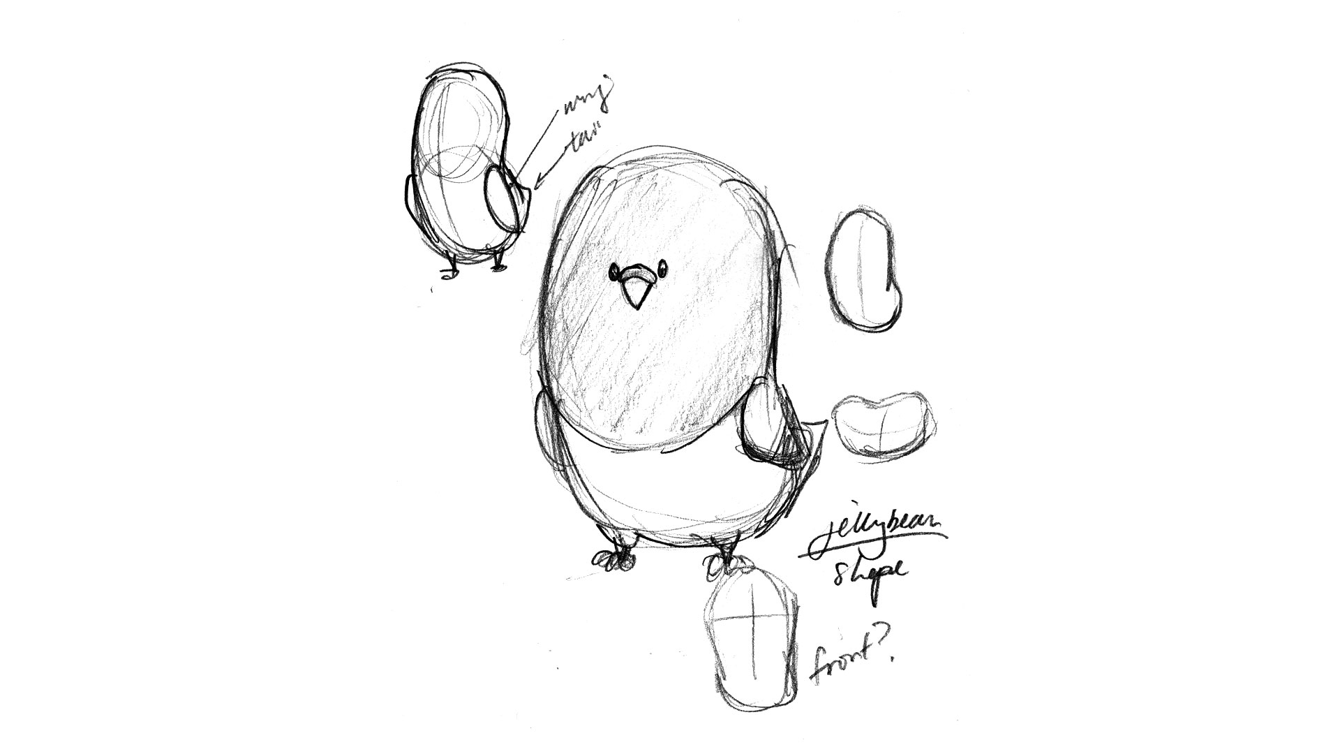
There was one tiny problem. Jellybean was drawn at an angle, which meant the distinctive shape got lost in the head-on view. Still, I felt the charm was there, so I thought Jellybean was ready to be taken to the next level.

The color choices were relatively easy. Thankfully, pigeons are pretty monochromatic by nature. One thing I did want to stand out was the stripe that ran across Jellybean’s neck. I coloured that Customer.io green (naturally).
I was pretty excited with how Jellybean turned out and thought I’d gotten it this time. I loved how Jellybean looked, and the team’s feedback was all-around positive.

Then I received a direct Slack message from Diana, who told me she didn’t really like the pigeon. I was surprised and asked her what I could do to make Jellybean better. I’m glad I was open to listening, because not only did I figure out what I needed to tweak, I also learned that Diana was secretly a Pigeon expert (for real!). Now I knew if I could design something that met her approval, it meant I did something right.

What’s almost painfully obvious to me now is that the digital Illustrated version of Jellybean looked like a bullet, as Diana described it, instead of a bird. After a couple of iterations, we were able to nail it. She was happy, and I was even happier (and very relieved).
Part 4: Ami

The team loved the final design of the pigeon. We then proceeded to think of a name for the little guy. Diana instantly chimed in with “Ami”. She proceeded to explain that “Ami” was short for “Cher Ami“, a female homing pigeon who saved a battalion in World War I and became the most famous pigeon in history.
Admittedly, at first, I wasn’t too sure about the name “Ami”. But the name stuck, and we couldn’t come up with anything that had the same the level of depth as the story of Cher Ami.
How to Design a Kick-ass Mascot
Creating Customer.io’s mascot was one heck of an undertaking. But keeping these six points in mind kept me on track and on message:
- What does the mascot communicate about the brand? Does it meet your goals and communicate the feelings and impression you want?
- Is the shape iconic? Is it simple? Does it make an unintentionally negative visual impression or resemble something you don’t want associated with your brand (like a bullet)?
- Is it distinctive? Your mascot is an identity. So you don’t want something boring, bland, or confusing because it’s similar to a different company.
- Does it have a personality and story? The task of humanizing a brand and helping to tell a company’s story is easier when your mascot has a bit of a personality and biography herself.
- Is the design flexible? Am I able to easily animate, emote, and even accessorize the mascot? Having a flexible design enables you to creatively showcase your mascot in many different applications and scenarios. Like, for example, creating something fun for Halloween.

- Are you considering feedback from the team? Even though I handled the artwork exclusively, I wouldn’t have been able to do it without the support and feedback of my team. Ami was something that we all helped to create and ended up being a stronger mascot.

We adore Ami, and we hope that you all do as well.
I’d love to hear the story of your mascot! Share with us in the comments.
Update (March 23, 2015): Ami has evolved into some pretty special! We recently just launched Amiverse – a little place on the Internet that showcases all the awesomeness that is Ami.