
How to Optimize the Post-Click Experience for Your Email Marketing Campaigns
When it comes to creating a successful email marketing campaign, many marketers often overlook one of the most essential components: the post-click experience. Neglecting this element plays a monumental role in the 70-90% bounce rate for landing pages.
Post-click optimization ensures that the email click-through results in a conversion, by directing prospects to a dedicated landing page.
Five elements can help optimize the post-click experience:
- message matching
- limiting external links
- smart white space usage
- contrasting call-to-action (CTA) button
- thank you page
Let’s discuss each element and highlight examples that demonstrate both the email and landing page in action.
Message matching
Message matching in an email marketing campaign refers to the process of matching the email’s primary message, headlines, and imagery to its respective landing page. This is to ensure that the same offer is presented in both the email and the landing page.
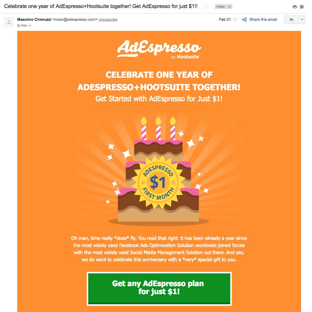
AdEspresso provides a great example, starting with the email:
Then, the corresponding landing page:

Notice that the email and landing page headlines are nearly identical and the 30-day AdEspresso plan for $1 is highlighted in both locations. On top of that, the recipient will see matching colors and similar CTA buttons for a designed experience.
Email marketing strategies with strong message match let email recipients know they’re in the right place post-click so there is no confusion. They allow you to provide prospects with a consistent user experience from start to finish, making them more likely to redeem the offer presented to them.
Limit navigation or external links
It’s a simple rule of thumb: have one goal. Since every landing page should be designed to promote a single offer, the conversion ratio should always be 1:1 — one clickable element for one conversion goal. On your landing page, the CTA button is your clickable element.
Let’s look at Boostability’s email campaign as an example. First the email:

Now the landing page:

No external navigation links exist and the green CTA buttons are the only clickable elements. For visitors to exit, they have to close the browser window.
Landing pages with multiple clickable elements, like navigation or social media links, distract visitors from the conversion goal and allow them to leave the page before converting. Ultimately, this creates friction and re-routes the customer journey away from the path you intended with the email campaign in the first place.
Keep visitors on your landing page, engaged, and focused on the offer by removing all off-page navigation links and maintaining a conversion ratio of 1:1.
White space
White space (a.k.a. negative space) is the empty area between and around landing page elements. This empty space doesn’t have to be white; it can be any color, as long as it separates the elements.
White space is meant to separate landing page elements, draw attention to specific items, such as headlines, images, and CTA buttons, and reduce clutter for optimal visual experience. It also improves readability, focus, and comprehension of the offer.
Stride Tax helps improve the user’s post-click experience with this email:

Here’s the landing page:
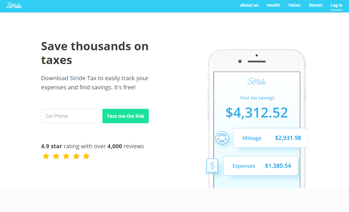
In the email, there is sufficient white space around the body copy, drawing attention to the CTA button. Once clicked, the landing page’s negative space again draws your eyes and attention to the content and messaging.
Negative space allows your reader’s brain to take a visual break while processing your page’s content. This is important because too much information at one time can cause information overload, making it difficult to absorb and retain any information at all. With less clutter and fewer distractions, it’s easier for the brain to take in and process information, and better focus on what matters most.
Ensure your page elements have room to breathe by surrounding them with white space, and persuade visitors to focus on what you want them to focus on — the CTA button.
Contrasting CTA button
The CTA button’s sole purpose is to capture visitors’ attention and persuade them to redeem the offer. To ensure it does that, design it in a color that stands out.
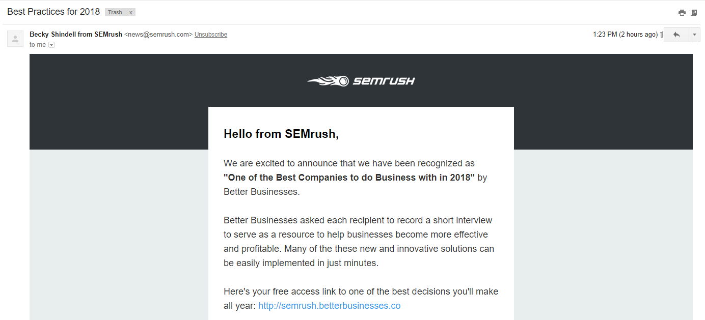
This SEMrush email with a simple text link:
…leads you to a landing page with a yellow CTA button that really pops:

It’s important to use color psychology to select your CTA button color. As a rule of thumb, avoid using whites or grays. The button should jump off the page but also mesh well with the rest of the page. Since blue and yellow are near opposites on the color wheel, the CTA buttons contrast well and effectively draw visitors’ attention.
In addition to choosing a contrasting color, incorporating other visual cues (like arrows or eye gaze) can draw even more attention to it. Adding enticing, personalized copy also helps persuade visitors to click.
By designing your CTA button this way, you make it easy for prospects to get what they want, and you make it easier on yourself to get the conversion.
Thank you page
Everything up to this point has focused on persuading people to convert, but even when they do complete the conversion goal, you’re not finished optimizing their post-click experience. After conversion, another best practice is to send people to an optimized thank you page with a sincere note, an image of the offer, and details on how to access it.
In the example below, the thank you page shows the content asset, explains how prospects will receive it, and encourages them to visit the blog for additional ways to optimize ad spend:

Should the user click through to the blog, that is another touchpoint Instapage can use in its retargeting efforts for related content or product offerings. It also gives the company an opportunity to demonstrate their expertise on post-click optimization.
A thank you page isn’t only polite — it also helps build a stronger customer relationship by reaffirming their decision. It allows you to acknowledge customers for converting and continue the nurturing process by presenting a related offer. This gives you another opportunity to retain them in the future, too.
Don’t forget to optimize the post-click experience
Don’t let your email marketing campaigns fall flat. By optimizing the post-click experience, you motivate the email recipient to convert on the landing page. With these five components, your email campaigns will stand out from the rest, and your conversion rates will improve.
It’s your turn: What have you found effective in designing your emails and post-email experience to convert? Share your in the comments below!
 Stephanie Mialki is a Content Writer for Instapage. Stephanie is a graduate of St. Bonaventure University with a Bachelor’s degree in Journalism and Mass Communication.