
Email dark mode: How to save your emails from the shadows
When your meticulously designed email enters the world, dark mode can often be the culprit behind disappearing text and lost logos. Dark-mode emails complicate the already challenging landscape of email rendering across clients.
While you can’t control whether a customer views your email in dark mode, you can take steps to ensure your message shines while respecting their dark mode preference. Understanding the challenges and following dark mode best practices are key to presenting your message effectively.
In this guide to dark-mode emails, we’ll cover:
- The difference between light and dark mode
- Potential problems with dark-mode emails
- Email dark mode best practices
- How to design emails for dark mode
- Dark-mode emails by email client
- 3 approaches for dark-mode emails
What’s the difference between light and dark mode?
Light mode is the default color scheme in operating systems and email clients. Dark mode is the reverse of light mode. It features dark backgrounds with white or light text and UI elements designed for low lighting or at night, but many people find it easier on the eyes in any environment.
The choice between light and dark mode is up to the individual: people can set their entire operating system to use one or the other, and many apps let them choose between modes as well. While designing emails for dark mode can be a headache for marketers, dark mode is popular among customers because:
- It can increase accessibility for people with low vision
- It’s easier on the eyes and can improve legibility
- It may save battery life on laptops and mobile devices
- Some people simply prefer the way it looks
While there’s no comprehensive data on the extent of dark mode usage, it’s been gaining popularity in recent years. So it’s safe to assume that some percentage of your audience uses dark mode when you send emails—maybe a large portion!
The dark side of dark-mode emails
Dark mode can introduce unexpected changes to how your emails look in customers’ inboxes. The trickier thing about dark mode in email is that each email client handles dark mode somewhat differently. Some will fully invert the email, some will only partially invert, and others will have no change. While each client handles dark-mode emails differently, the underlying principle remains: make light backgrounds dark and turn dark text light. In your emails, dark mode can create several problems, such as:
- Illegible text
- Hard-to-see links
- Off-brand colors
- Invisible CTA buttons
Seeing your email’s appearance change when it’s delivered can be frustrating, especially when it feels like there’s nothing you can do about it. But never fear—you do have some control over how your messages perform. When designing emails for dark mode, take a strategic approach with dark mode best practices that give you the best chance at success.
Dark-mode emails: 6 best practices
The struggle marketers have to overcome is that every email is a dark and light mode, depending on the recipient, so you must prepare for both. How your customers see your emails depends on their email client and personal preferences—you don’t get to choose.
That means when you design an email, dark mode has to be a consideration in your approach. Follow these dark mode best practices to help you avoid some of the primary pitfalls:
- Put a light background behind dark text. It’s important to consider the color contrast if and when both colors are inverted. Dark colors like navy on a black background will be illegible in both light and dark-mode emails.
- Use transparent images. If you can’t, crop images in a way that looks intentional. Adding a bit of padding around the image, rather than cropping at its edge, can help an image’s light background look better in a dark-mode email.
- Add a white outline or shadow around anything that will disappear against a dark background, like your logo. The outline won’t be visible in light mode, but it will help make the elements legible in dark mode.
- Provide enough contrast between text and background colors to ensure text is readable even if the colors are inverted. You can’t always control precisely how email clients render color inversion, but you can help by bumping up the contrast. You can use a tool like WebAIM to test that your colors pass for accessibility standards.
- Don’t use a single image for your entire email. If a user’s preference is dark mode, respect it! Image-only emails are not only a poor practice due to issues with scaling and rendering, but they also most likely do not respect dark mode.
- Test, test, test! In Customer.io Journeys, you can emulate dark mode in the email editor to see your design in each state. And, since email dark mode works differently in various clients, you can use Parcel Inbox Previews alongside Journeys to send tests to multiple devices and clients to reveal sneaky problems with your dark-mode email design.
How to design emails for dark mode
When designing dark-mode emails, you’ll want to consider the key elements of your email content holistically. It’s not just about the contrast between text and background. You need to look at how the elements of your email play together for accessibility, branding, and legibility. Consider each piece of the email puzzle: the background, text, links, images, and logos.
Email background
Many emails are composed of content blocks—several different background colors that make up the whole experience. If your email client fully inverts the design, each of those background colors will be inverted in email dark mode. When you’re testing your emails, consider how your content blocks look and ask yourself:
- Do the inverted colors look on-brand?
- When inverted, are the background colors too similar?
- Are the divisions between the content blocks clear?
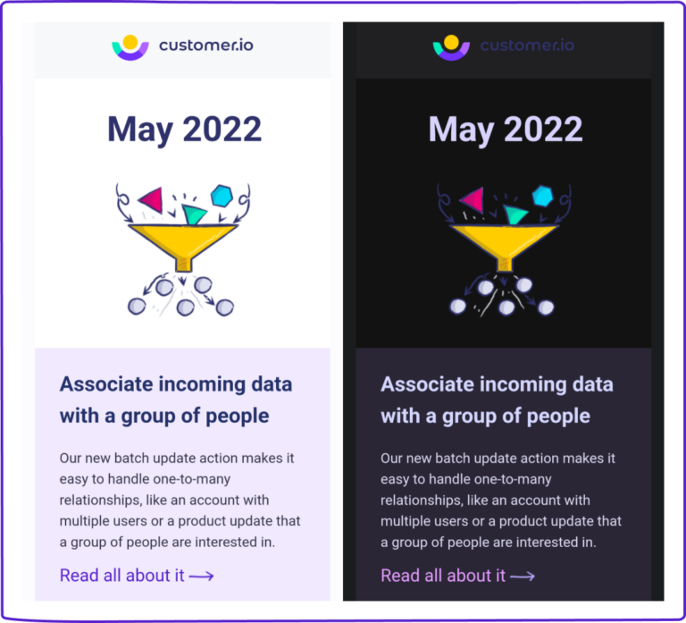
Remember, your email is a branded communication, and it’s important it looks like your brand even in dark mode. Here’s a good example of an email from Lyft in light and dark mode. Both versions convey the same color story with a lighter and darker green. The text is legible, and the different content blocks are clear.

Email text
This is probably the element that comes to mind when designing emails for dark mode. Managing text in dark-mode emails is easiest when your text is always black on a white background. Unfortunately, that usually doesn’t align with your brand’s look. You’ll often want to use a brand color for the background, text, or both!
For example, in this Alaska Airlines email, their text is in different shades of blue and gray to reflect their brand colors. When you switch to dark mode, the blues become a light blue, and the grays become a light gray, which maintains Alaska’s branding while staying legible.

Email links
In most cases, the goal of your email is conversion: getting people to click a link. That’s why choosing the best link color for light and dark-mode emails is so important. Link colors are broadly about psychology, and there are three factors you should consider.
- Legibility
- Attention
- Clarity
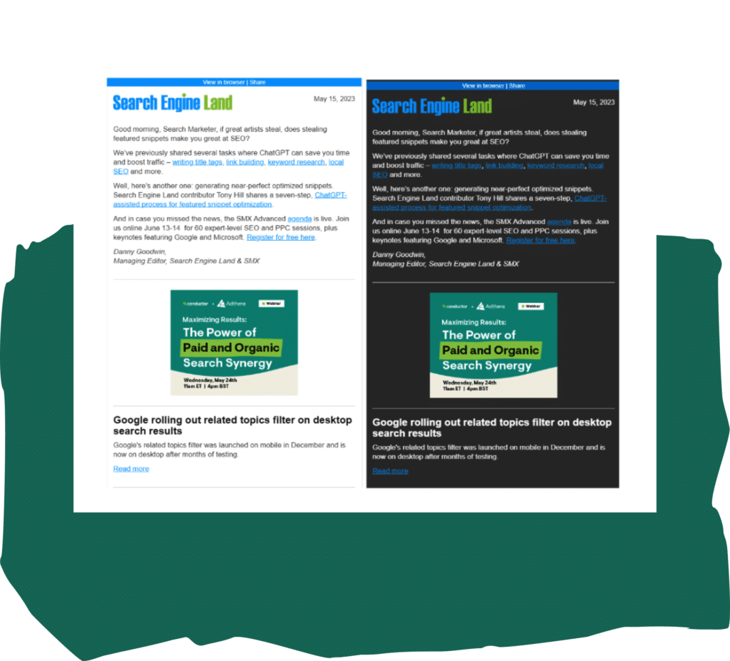
To satisfy those three needs, your link must contrast with both the background and the rest of the text in your email. This is often achieved by contrasting a neutral text color with brightly colored links, as shown in this Search Engine Land newsletter. At a glance, it’s very clear what elements of this email are clickable, no matter how you view it.
Email images and logos
Handling images in emails involves multiple considerations. Best practices for HTML images are even more important in dark mode, which can make images look out of place. Here are some key considerations you should consider when designing your next email.
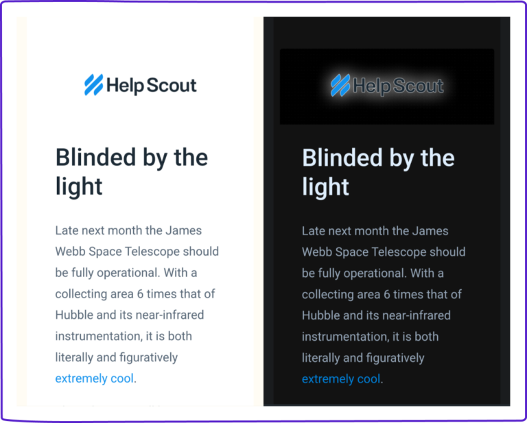
Add white borders and shadows to your images and logos so they don’t get lost in the background of a dark-mode email. With this approach, you also avoid the risk of images with bright backgrounds looking awkward when the email background is darkened.
Here’s an example of one of our old emails. When we designed this, we didn’t entirely optimize it for a dark-mode email. Our logo gets lost in the dark-mode version, and the graphic is muddy, too.
Contrast that with how HelpScout’s logo looks with the white border and shadowing. You can’t see it in light mode, but it makes the logo legible in dark mode.
Dark-mode emails by client: Apple, Outlook, and Gmail
Depending on which client a person uses for email, dark mode will affect your message differently. There’s tremendous variation in how email clients handle dark mode. Three of the biggest—Apple, Outlook, and Gmail—all support dark mode in their UI, but how they change actual emails is wildly different.
Apple Mail dark mode
Apple Mail only applies dark mode to plain-text emails, automatically inverting the black text to white and the white background to black. When a customer uses dark mode, Apple Mail will invert the app’s UI but won’t change how an HTML email is rendered. So, in most cases, HTML emails will look the same in light and dark mode. While this might sound positive when you’re designing emails for dark mode, it’s not always a great customer experience. If your email has a light background, it can be jarring and overly bright when rendered against the UI’s dark background. For most, you’ll see no impact to your emails in Apple Mail.
Outlook dark mode
Outlook web, mobile, and desktop clients all support some form of email dark mode. In most cases, Outlook will darken the background color, lighten fonts, and allow for dark mode–specific styling. However, Outlook dark-mode email backgrounds may vary depending on the application version, year, and individual customer settings. That can make it tricky to predict how your email will render in different inboxes, even if most customers use Outlook.
Google Mail dark mode
Like Apple Mail, Google Mail (or Gmail) desktop only applies dark mode to the UI; HTML emails aren’t usually impacted. On mobile, however, email dark mode is an entirely different story. The Gmail mobile app applies full-color inversion that affects every aspect of your design.
3 approaches for dark-mode emails
You have a few options for dealing with dark mode in your email design, but only some approaches work for each inbox. When deciding how to design emails for dark mode, keep the variations across email clients in mind. In fact, you may want to review your data to see the breakdown of clients and devices in your unique audience. Then, you can base your strategy for designing emails for dark mode on what’s likely to work for most of your customers.
Approach #1: Use CSS customization
Some clients (like Apple Mail) support CSS that can dynamically change text and background color and even swap out images for better results in dark-mode emails.
The upside: You can control your design with a fair degree of precision if you write code and develop two different email versions for light and dark modes. If you’re coding responsive emails (and you should be!), CSS can even detect if a device is in dark mode and adjust email elements accordingly.
The downside: Not all teams have the resources for extensive coding, and it’s not always easy to toggle light and dark mode CSS when building an email. Plus, since support for CSS is limited, the extra time and effort might not be worth it if most customers don’t use a relevant email client.
Approach #2: Design for partial or full-color inversion
Some clients (such as most Outlook clients and Gmail’s mobile apps) take a middle ground by using color inversion: making dark colors lighter and light colors darker. Partial inversions usually include backgrounds and text only. Full-color inversions, on the other hand, invert every color in your email.
The upside: As long as you follow dark mode best practices, you can intentionally design your email for optimal impact, whether colors are partially or totally inverted in dark mode. Partial inversions generally preserve readability and tend to make less drastic changes. However, strategic design choices can ensure your email performs well even with full-color inversion.
The downside: How your emails display in these clients is wildly unpredictable, so you’ll have to pay extra attention to designing emails for dark mode and testing in multiple clients. You’ll also need to be incredibly thoughtful about the effects of full-color inversions; they can even take an email with an intentionally dark color scheme and make it light, doing the opposite of what customers want from dark mode.
Approach #3: Plan for no dark mode support
Some clients (primarily desktop, web, and legacy mobile email clients) render an email the same whether viewed in light or dark mode. This is how your emails are rendered in Gmail desktop and Apple Mail dark mode. The email client’s UI may support dark mode, but it doesn’t change the look of the emails themselves.
The upside: What you see is what you get: the design of an email will look the same in light or dark mode. That means you can save time when designing emails for dark mode.
The downside: If an email has a light background, it can look painfully bright within a dark mode interface, a massive turn-off for customers who enable dark mode to avoid just that. So, you should still make allowances for how your email will look within the UI of an email client in dark mode.
Time to embrace email dark mode
Dark mode isn’t going anywhere—customers have adopted it, and if you want to meet them where they are, you’ll have to embrace your dark side, too. That means you’ll need to be comfortable with some degree of uncertainty. Most email clients simply don’t support dark mode very well, at least not yet. Unless you’re willing to greatly simplify your designs while spending significantly more resources to create them, your results may not always be flawless.
What matters, then, is following dark mode best practices that give your emails the greatest chance to shine when they hit the inbox. If you get to know the email clients your customers use, take a strategic approach to designing emails for dark mode, and test rigorously, you’ll be in great shape to deliver engaging emails in both light and dark mode.
Of course, dark mode is only one factor affecting an email’s performance. Learn to design and code every aspect of a successful email with our free How to HTML guide.