Campaign and Broadcast Metrics
When you start a campaign or trigger a broadcast, it begins generating metrics on the overview page.
This page focuses on your Campaign Metrics, which provides a complete overview of the journeyA person or data object’s path through your campaign. and messageThe instance of a message sent to a person. When you set up a message, you determine an audience for your message. Each individual “send”—the version of a message sent to a single member of your audience—is a delivery. metrics for a campaign, but Customer.io also presents you with metrics in a few different places:
- The Dashboard, which shows aggregate metrics for all of your campaigns.
- The Analysis page, where you can manipulate metrics and compare campaigns, newsletters, broadcasts, etc.
- The Campaign Workflow tab, where you can see metrics for the individual actions in your campaign.
When you click a campaign, you land on the Overview page, which contains high-level metrics and configuration details that can help you understand how your campaign has performed overall. The Metrics page contains more specific information about how people progressed through your campaign, and how the individual messages in your campaign performed—were people clicking links in them, or did they convert?
How we calculate metrics
A journey is the instance of a campaign that a person experiences. A message is an individual message in the campaign. So, a person who receives a message might be in progress in their campaign journey, but have opened or clicked a message in that campaign. Their interaction with the message is done, but they’re still working their way through the journey.
Metrics do not report actions on the date they occur. Instead, metrics are reported against the date a journeyA person or data object’s path through your campaign. or a messageThe instance of a message sent to a person. When you set up a message, you determine an audience for your message. Each individual “send”—the version of a message sent to a single member of your audience—is a delivery. is created.
It may be helpful to think of metrics as an answer to the question: of messages and/or journeysA person or data object’s path through your campaign. created on a particular date, how many achieved a particular status?. This also means that corresponding metrics for journeys and messages may report on different dates because journeys can take a while and messages are more immediate.
For example, imagine that you have a campaign that sends messages over a five day period. A person enters the campaign on January 1st; they open and convert based on the last message—sent and received on January 6th. The converted metric for this journey is reported on the 1st—because the journey, created on the 1st, has converted. The converted metric for the message is reported on January 6th, because the message was created on the 6th.
Dates and frequency of metrics
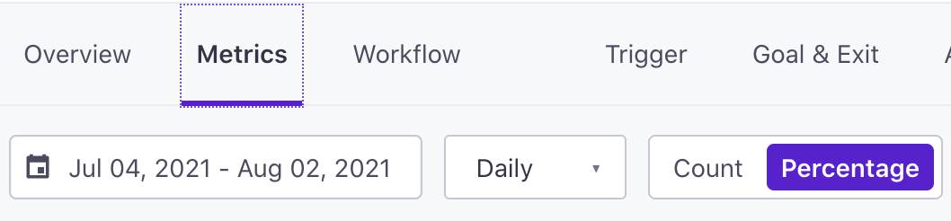
The date-picker determines the period of time over which we show charts and metrics. By default, we show metrics for the past 30 days on a daily basis, but you can change the scope of metrics to show how your campaign has performed over a longer or shorter period. If you set a long enough period, you can also set the metric frequency to weeks or months rather than days.
Use the date picker to select the specific dates you want to see metrics for.
Select Daily or Weekly to set the frequency for metric calculations—the X-axis in charts, the number of messages calculated in performance metrics, etc.
Campaign Overview
The Overview tab shows metrics about messages in your campaign, to help you understand if your messages reach their audience and if they’re having the desired affect on your audience.
You can pick the channelsA messaging channel—email, SMS, etc. Each channel has its own delivery provider(s) and settings in your workspace. you want to see metrics for on this page, if you only want to see metrics for some of the messages in your campaign.
The page also shows your campaign Details, to remind you how people trigger your campaign and your campaign goal. Click Edit to change any of your campaign settings.
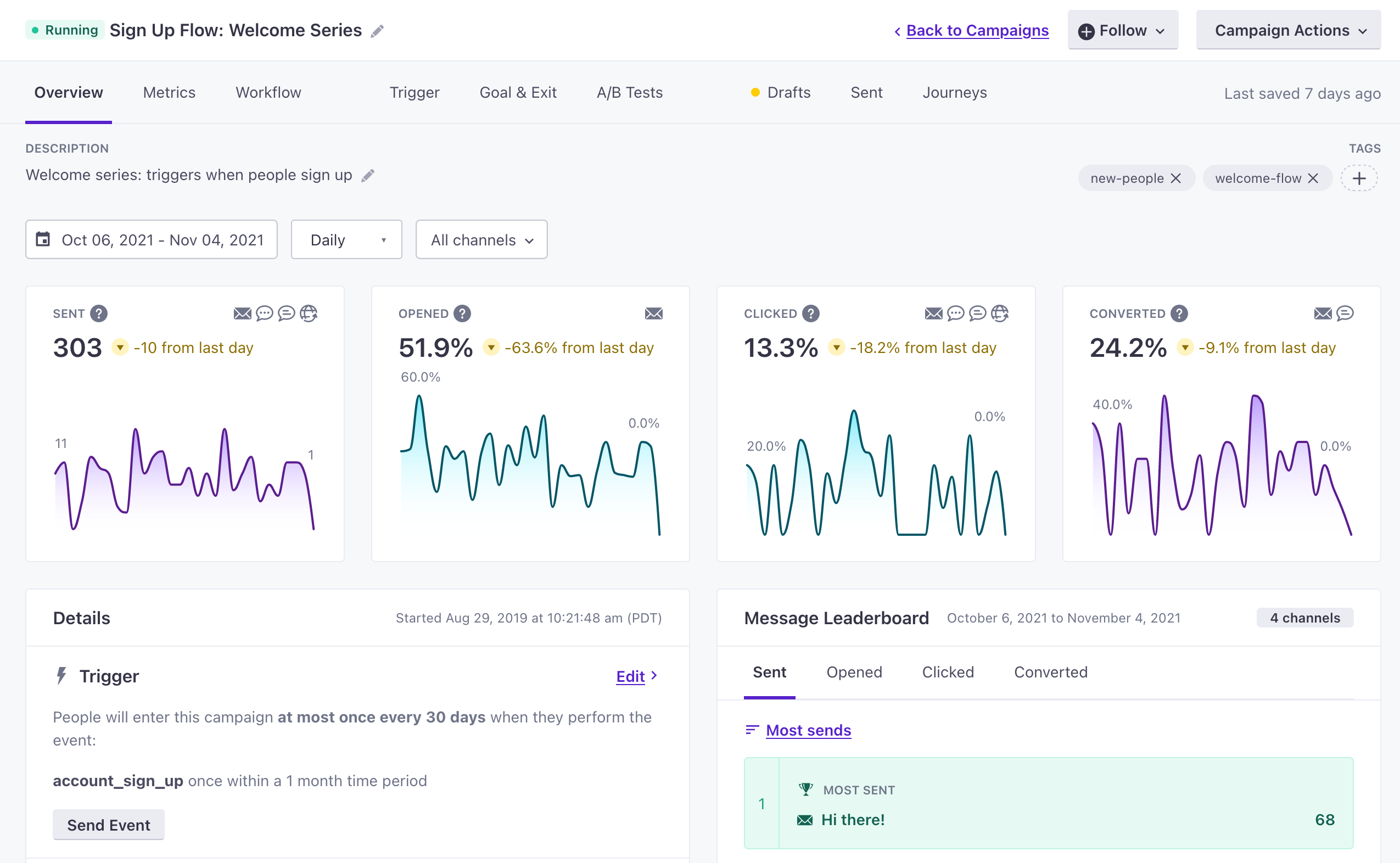
Sent, opened, clicked, and converted charts
These charts reflect message metrics for the channelsA messaging channel—email, SMS, etc. Each channel has its own delivery provider(s) and settings in your workspace. you selected; active channels appear in the upper right of each chart.
Outside of the Sent and Delivered metrics themselves, we try to calculate metrics based on the number of messages we can confirm were Delivered, where possible.
Delivered represents messages that verifiably reached a person, where sent represents messages that left Customer.io, but we may not have information from the delivery provider to verify that the message actually reached a person.
Sent reflects the total number of messages sent from your workspace in the time frame you selected.
Opened shows the percentage of messages that your audience opened, out of the total number of messages delivered or sent, if you did not disable open tracking at the workspace level. We calculate opened messages based on messages delivered where possible.
Clicked shows the percentage of messages that your audience clicked, out of the total number of messages delivered or sent.
Converted reflects the percentage of messages that resulted in a conversion, if your campaign has a conversion goal. We recommend using conversion goals to determine the effectiveness of your campaigns: are your campaigns having their desired result? Are people making purchases, joining your service, etc based on the messages you send?
Empty Charts
Some of the charts in your campaign overview may be empty at times. If a chart is empty, it might mean that we don’t have data for the time period you selected, but there are also other reasons that we might not have data to populate your charts.
- The Opened chart might be empty if you disabled open tracking at the workspace level, and your campaign only includes emails.
- The Clicked chart might be empty if you didn’t include any tracked links in your messages.
- The Converted chart is empty if your campaign doesn’t have a conversion goal.
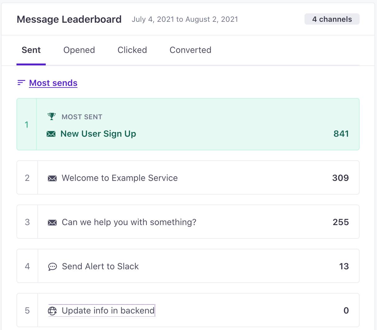
Message Leaderboard
The leaderboard shows how your messages performed in terms of sends, opens, clicks, or conversions. Click the tabs to see how your campaign’s messages perform across the different metrics.
The leaderboard shows the number of channels you send messages to in your campaign.
Click or to change the sort order for the leaderboard.
Active Tests
If your campaign included A/B tests, the Active Tests card shows the metric splits for each test—how each message in the test performed. The winner for each metric in a test is marked with a .
Determining the winner in an A/B test helps you learn about the tactics your audience appreciates, so you can format your future messages to improve message performance and maintain a relationship with your audience.
Metrics
The Metrics tab shows more in-depth stats about your campaign. This tab can help you better understand how your campaign, and specific messages in your campaign, have performed over a specific time frame.
At the top of the Metrics tab, you can select whether you want to see a metrics by Percentage or in raw Count totals.
Copy Links to Metrics
Charts the Metrics tab have icons. Click this icon to copy a link to your chart, exactly as you have it configured, and share it with someone else.
When you change chart settings, we add query parameters to the URL in your browser. These parameters represent your settings on the metrics page, so that you can bookmark or share your insights with other members of your organization. These links help you and your team learn how your messages perform, so you can improve communications to better support your audience.
Delivery Metrics
This chart shows how your messages in each channelA messaging channel—email, SMS, etc. Each channel has its own delivery provider(s) and settings in your workspace. perform, in terms of the metrics each channel generates—sent, delivered, clicked, converted, etc. If you’re on the Journey Metrics chart, click Delivery Metrics to see this chart.
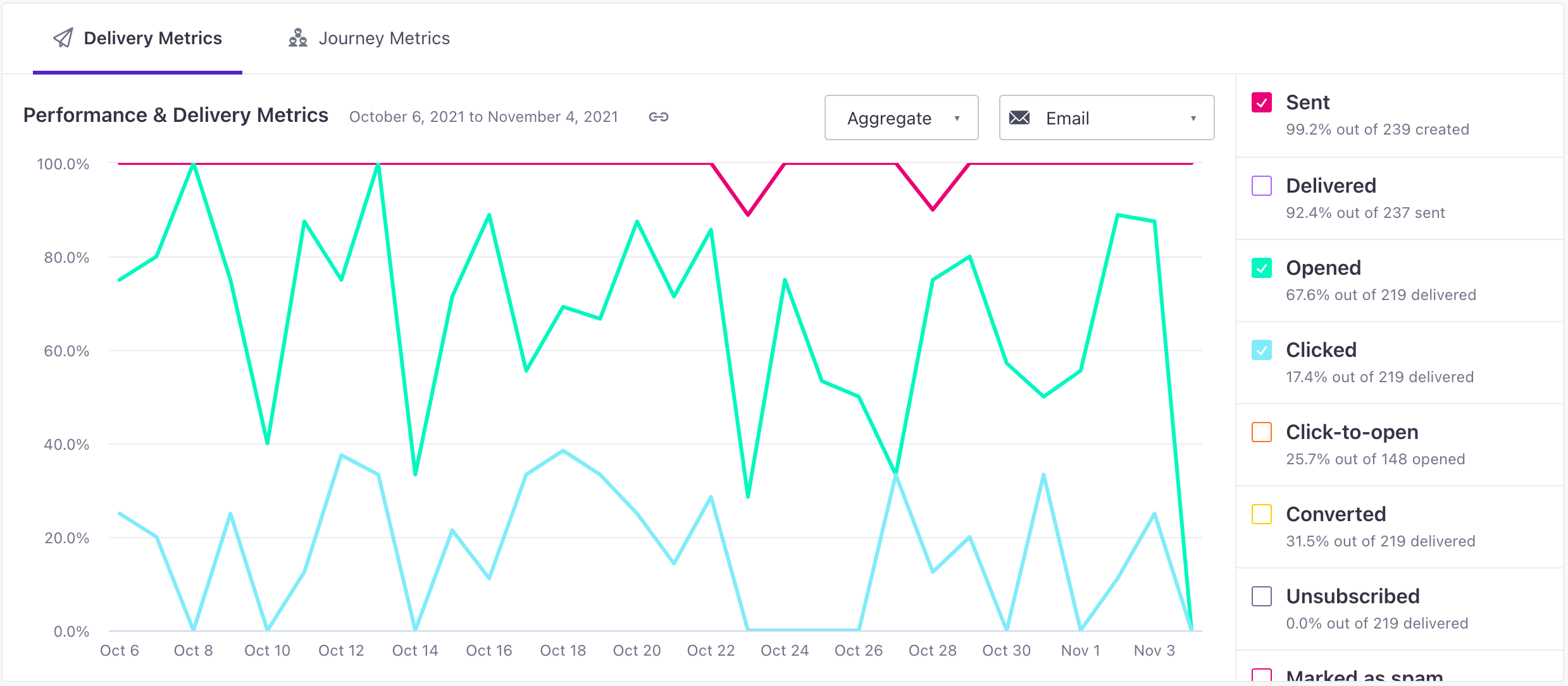
By default, the chart shows Aggregate metrics for all messages in the channel. Change this to Individual to compare messages in the same channel—e.g. compare emails in the campaign. When you switch to individual metrics, you can select the metric you want to compare.
In the top right of the chart, you can change the channel of messages you want to see Performance and Delivery metrics for.
Click any metric to turn it off or on in the chart.
Your message was successfully sent from Customer.io to the delivery provider. It is their responsibility to ensure the message is properly delivered, and we’re waiting for further information to determine if the user interacted with it. Delivered means that we’ve received confirmation from the delivery provider that a message was delivered to the recipient’s email service provider (ESP). The user opened your message. For email, we count the open when the recipient’s email client loads an invisible image (tracking pixel) or when the recipient clicks one of the links in the email. If a customer has images disabled in their email client and an open is tracked based on a click event, the “Opened Email” and the “Clicked Email” events will show as having occurred at the same time. To track opens for push notifications, you need to send us an event. If you are not sending the “opened” events for push notifications but are using tracked links in the push content, the “Opened Push” and “Clicked Push” will occur at the same time based on the tracked click. The Open Rate is calculated by dividing the total number of opened messages by the number of messages delivered, measuring the percentage of your messages that people opened. As an increasing number of email clients provide privacy settings that let people block tracking pixels, open metrics may appear misleadingly low. You can disable email open tracking at the workspace level, so that you aren’t distracted by potentially unreliable open rates. In general, we recommend that you focus on Converted and Clicked metrics instead; these metrics reliably measure customer actions based on your messages. The user clicked on any link in a message where link tracking was enabled. We also track clicks on individual links. This measures the rate at which people click tracked links in messages that they open, and is calculated by dividing Clicked metrics by Opened metrics. A message is marked as converted when an end-user meets your conversion goal and that was the last message received before the conversion goal was met, by default. Learn more about how conversions work. A message is counted as unsubscribed when a user unsubscribes from all messages. You can read more about how global unsubscribes work in Customer.io. Unsubscribed from topics counts each subscription topic that a user unsubscribed from through a delivered message. As such, you may see a percentage above 100; say you have 4 subscription topics and 5 messages are delivered to five users. Two users unsubscribe from 3 topics each (6 total). We would divide this by the number of delivered messages (5) to get 1.2 or 120% unsubscribed from topics. You can read more about how our subscription center works in Customer.io. For emails, this means that the end-user marked the email as ‘Spam’ via their email service provider. All subsequent emails are then marked “suppressed.” A failed message never made it to the delivery provider. We have a separate article to help you diagnose why your message never left Customer.io. For email, this means the user’s email address wasn’t valid. This could be a hard bounce (usually a permanent issue like a non-existent email address) or a soft bounce (a temporary issue like a full mail box). In the case of hard bounces for emails, subsequent messages to those addresses will be given the “suppressed” status. A message is marked as suppressed if:Sent
Delivered
Opened
Clicked
Click-to-open
Converted
Unsubscribed
Unsubscribed from topics
Marked as spam
Failed
Bounced
Suppressed
Journey Metrics
A journey is the instance of a campaign workflow experienced by an individual person. The Journey Metrics chart shows how many people have experienced different aspects of your campaign within a timeframe—how many people started a journey, received a message, etc.
If you’re on the Delivery Metrics chart, click Journey Metrics to see this chart.
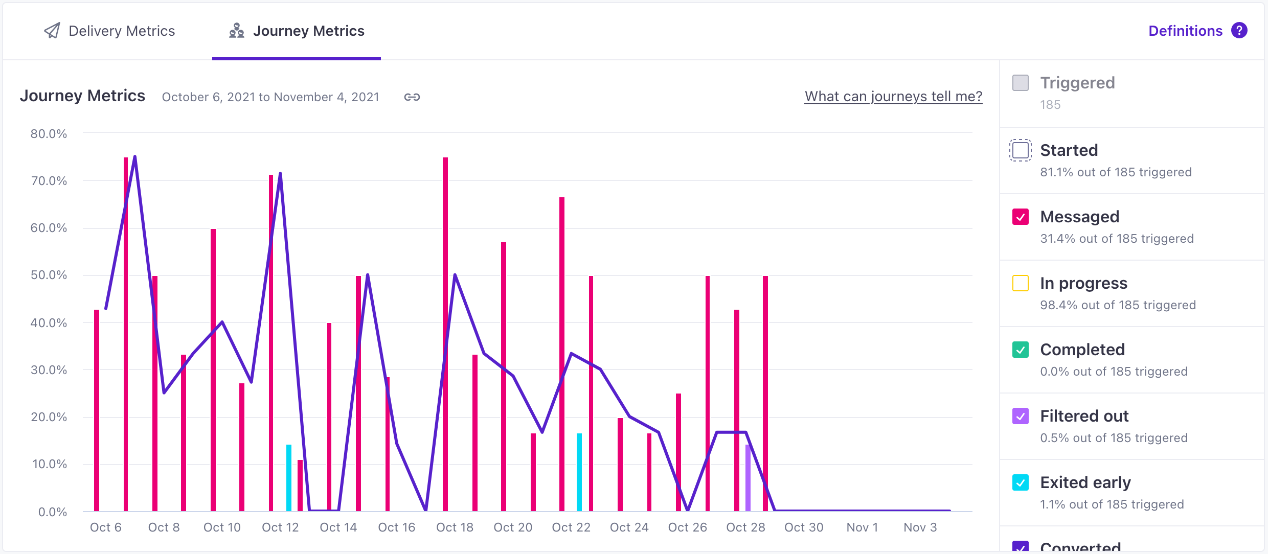
Remember that journey metrics are calculated against the day that a journey is created. The Journeys chart tells you, for all people who triggered a campaign journey on a particular day, how many are messaged, in-progress, converted, etc.?
A campaign trigger doesn’t necessarily represent someone who experienced your campaign. People can trigger a campaign, but be filtered out before they start the campaign (Started) or receive a message (Messaged).
Click the individual metrics to turn them on or off. The chart can show:
People who matched the campaign trigger. People who trigger your campaign can be filtered out before they start it, representing a discrepancy between this metric and Started. You may want to compare this metric to Started to determine if the scope of your campaign is too wide or your filter is too narrow. You can only see this metric when you use the raw Count. People who matched the campaign trigger, filter(s) and completed a non-delay action. Because you can potentially filter out people after they meet your campaign trigger, the Started metric effectively represents the total number of people eligible to experience your campaign. People who experienced a message action in your campaign—an email, SMS, push notification, webhook, or Slack message. This includes drafted messages. People who have Started your workflow, and are waiting in a delay in your workflow, but have not yet exited, converted, or been filtered out. People who completed your campaign workflow by making their way to an exit action. People who matched your campaign trigger, but did not experience a journey/workflow. These are people who exited the campaign before experiencing a Started or Messaged state due to your campaign filters or other criteria during a delay action at the start of your campaign. People who exited a campaign before completing an exit action. This may happen if a person stops matching the trigger and filter conditions while in a delay, their profile is deleted, or you manually remove them from a campaign. People who achieved the conversion goal for the campaign. People are “converted” when they enter or exit a designated segment in response to, or within a set time of, a delivery. If your campaign does not have a conversion goal, this metric is empty.Triggered
Started
Messaged
In Progress
Completed
Filtered Out
Exited Early
Converted
Journey metrics are scrollable
Depending on the height of your screen, you may not see all of the metrics listed above. The list scrolls, so you can find and turn each metric on or off—without taking up your whole screen.
See recent journeys
On any campaign, you can go to the Journeys tab to see people who have started your campaign. Click an entry in the table to see the actions that the person has completed and what’s next.
This list is organized by how recently people started a campaign, and can provide you a general sense of what happens when people start your campaign.
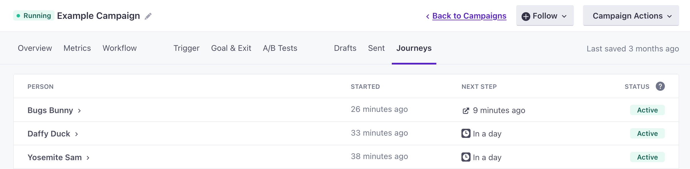
If you want to find a specific person’s journeyA person or data object’s path through your campaign., you can find that person on the People page and go to their Journeys tab.
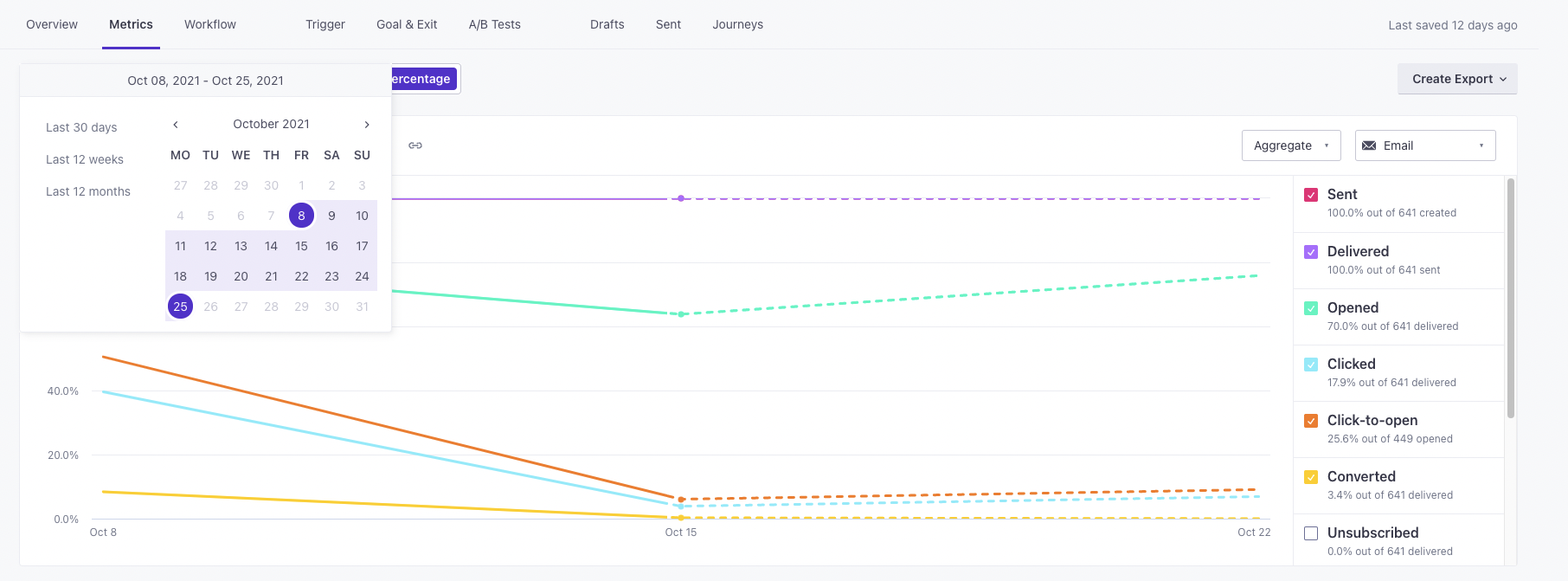
Charts with Dashed Lines
Metrics graphs show dashed lines when you opt to view metrics on a weekly basis, but your date range includes an incomplete week. The dashed line shows that an increment on the graph doesn’t represent a full week of data.
For example, if you start your date range on a Friday and end on a Thursday, all of your metrics will show solid lines because your date range does not contain an incomplete week. But, if you start your metric range on that same Friday and end on a Wednesday, your graphs will show a dotted line for the final, incomplete week of metrics.
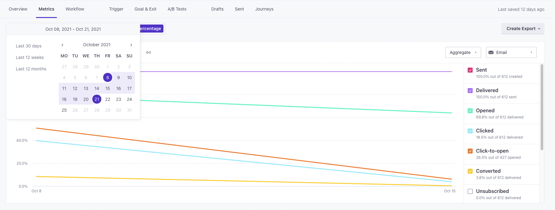
This is an example with an incomplete week of metrics. The start date is Friday, Oct. 8 and the end date is Monday, Oct. 25:
Here is an example of metrics with complete weeks—it starts Friday, Oct. 8 and the end date is Thursday, Oct. 21.
Links
The links chart shows the total clicks for each tracked link in your campaign. This list helps you determine how well links in your campaign perform.
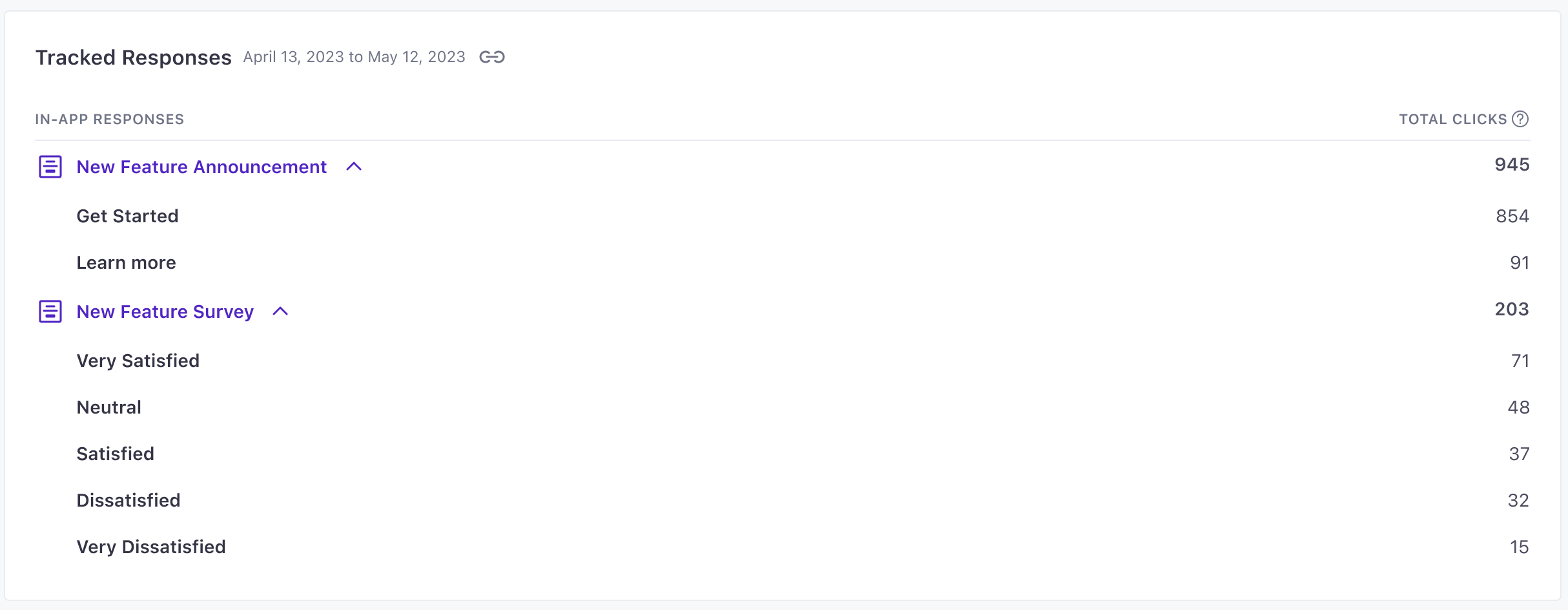
Tracked Responses
If your campaign or broadcast includes in-app messages and the Track Clicks option is enabled for actions in your message, you’ll see a Tracked Responses section in the metrics tab. This section shows the ways that people respond to your in-app messages and whether they engage with your calls to action, broken down by message and Action Name.
Learn more about Tracked Responses.
Message Metrics
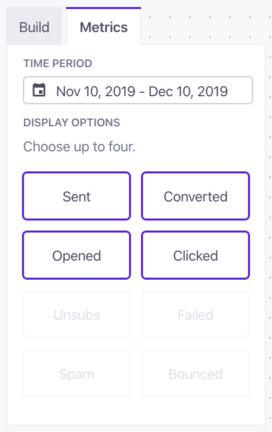
The Message Metrics table shows stats for each message in your campaign for the time frame you set at the top of the page (defaulting to 30 days). Click to select up to five metrics that you want to see in the chart, and use the Channel drop down to determine the types of messages you want to see in the chart.
Click any of the metrics in the table header to sort messages by that metric in ascending or descending order.
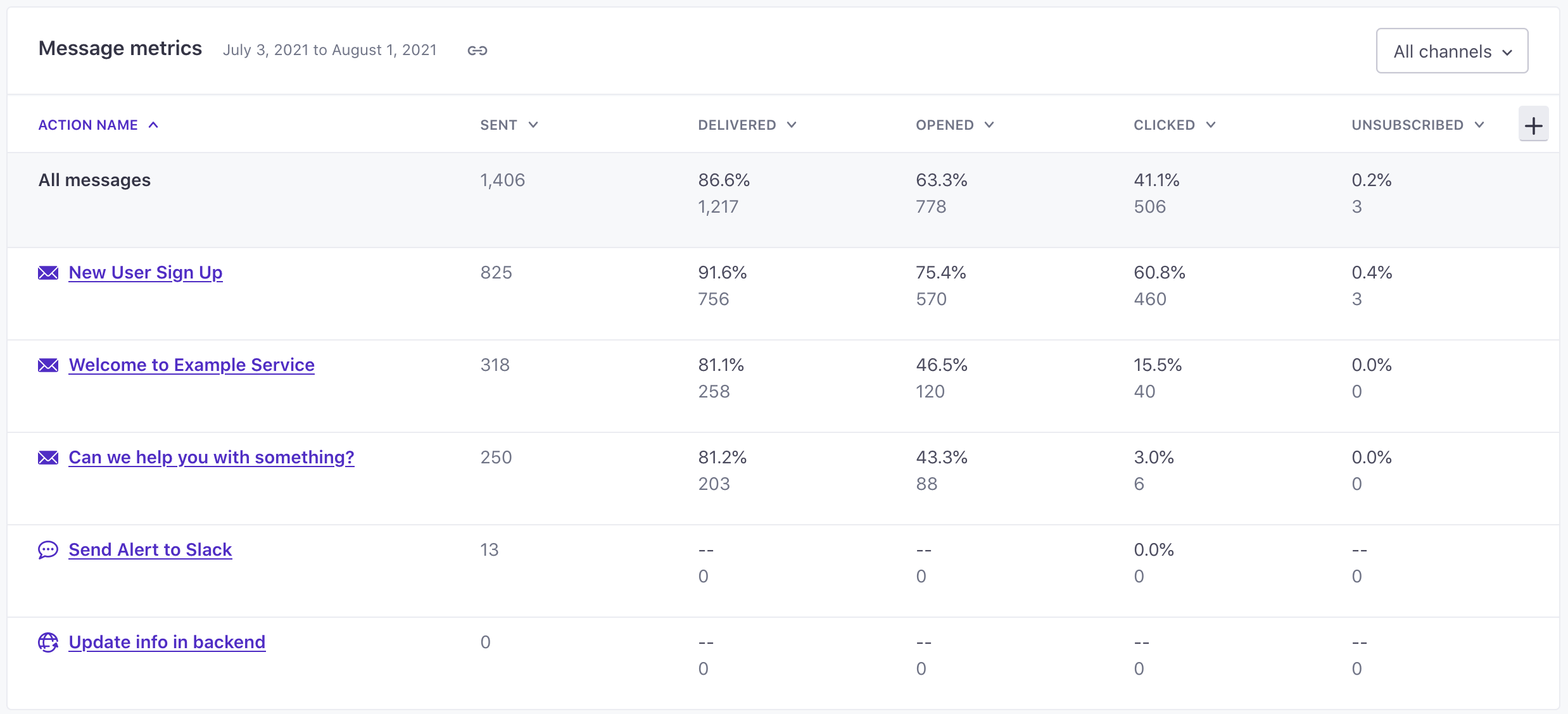
Hover over any metric to see how we calculated it. Where possible, we base metrics on the number of messages Delivered—messages that actually reached a person—because it produces the most trustworthy metrics. If we don’t have a Delivered metric, we calculate metrics based on messages Sent.
You can toggle the following metrics in the chart, up to five at a time.
Your message was successfully sent from Customer.io to the delivery provider. It is their responsibility to ensure the message is properly delivered, and we’re waiting for further information to determine if the user interacted with it. Delivered means that we’ve received confirmation from the delivery provider that a message was delivered to the recipient’s email service provider (ESP). The user opened your message. For email, we count the open when the recipient’s email client loads an invisible image (tracking pixel) or when the recipient clicks one of the links in the email. If a customer has images disabled in their email client and an open is tracked based on a click event, the “Opened Email” and the “Clicked Email” events will show as having occurred at the same time. To track opens for push notifications, you need to send us an event. If you are not sending the “opened” events for push notifications but are using tracked links in the push content, the “Opened Push” and “Clicked Push” will occur at the same time based on the tracked click. The Open Rate is calculated by dividing the total number of opened messages by the number of messages delivered, measuring the percentage of your messages that people opened. As an increasing number of email clients provide privacy settings that let people block tracking pixels, open metrics may appear misleadingly low. You can disable email open tracking at the workspace level, so that you aren’t distracted by potentially unreliable open rates. In general, we recommend that you focus on Converted and Clicked metrics instead; these metrics reliably measure customer actions based on your messages. The user clicked on any link in a message where link tracking was enabled. We also track clicks on individual links. This measures the rate at which people click tracked links in messages that they open, and is calculated by dividing Clicked metrics by Opened metrics. A message is marked as converted when an end-user meets your conversion goal and that was the last message received before the conversion goal was met, by default. Learn more about how conversions work. A message is counted as unsubscribed when a user unsubscribes from all messages. You can read more about how global unsubscribes work in Customer.io. Unsubscribed from topics counts each subscription topic that a user unsubscribed from through a delivered message. As such, you may see a percentage above 100; say you have 4 subscription topics and 5 messages are delivered to five users. Two users unsubscribe from 3 topics each (6 total). We would divide this by the number of delivered messages (5) to get 1.2 or 120% unsubscribed from topics. You can read more about how our subscription center works in Customer.io. For emails, this means that the end-user marked the email as ‘Spam’ via their email service provider. All subsequent emails are then marked “suppressed.” A failed message never made it to the delivery provider. We have a separate article to help you diagnose why your message never left Customer.io. For email, this means the user’s email address wasn’t valid. This could be a hard bounce (usually a permanent issue like a non-existent email address) or a soft bounce (a temporary issue like a full mail box). In the case of hard bounces for emails, subsequent messages to those addresses will be given the “suppressed” status. A message is marked as suppressed if:Sent (default)
Delivered (default)
Opened (default)
Clicked (default)
Click-to-open
Converted
Unsubscribed (default)
Unsubscribed from topics
Marked as spam
Failed
Bounced
Suppressed
Export campaign metrics
On the Metrics tab, you can export metrics for your campaign to CSV files.
Go to the Metrics tab in the campaign you want to export metrics for.
Click Create Export and select the type of metrics you want to export.
- All-time metric totals: aggregated message metrics over the life of your campaign.
- Message metrics: Message metrics per day over the date range you select.
- Journey metrics: Journey metrics per day over the date range you select
For journey and message metrics, select the date range of metrics you want to export and click Export. Metrics are organized daily by timestamp from oldest (row 2) to newest.
Go to Data & Integrations > Exports to download your export.
Metrics in the Workflow View
On your campaign’s Workflow tab, you can click Metrics to see deliverability stats within the context of your visual workflow.
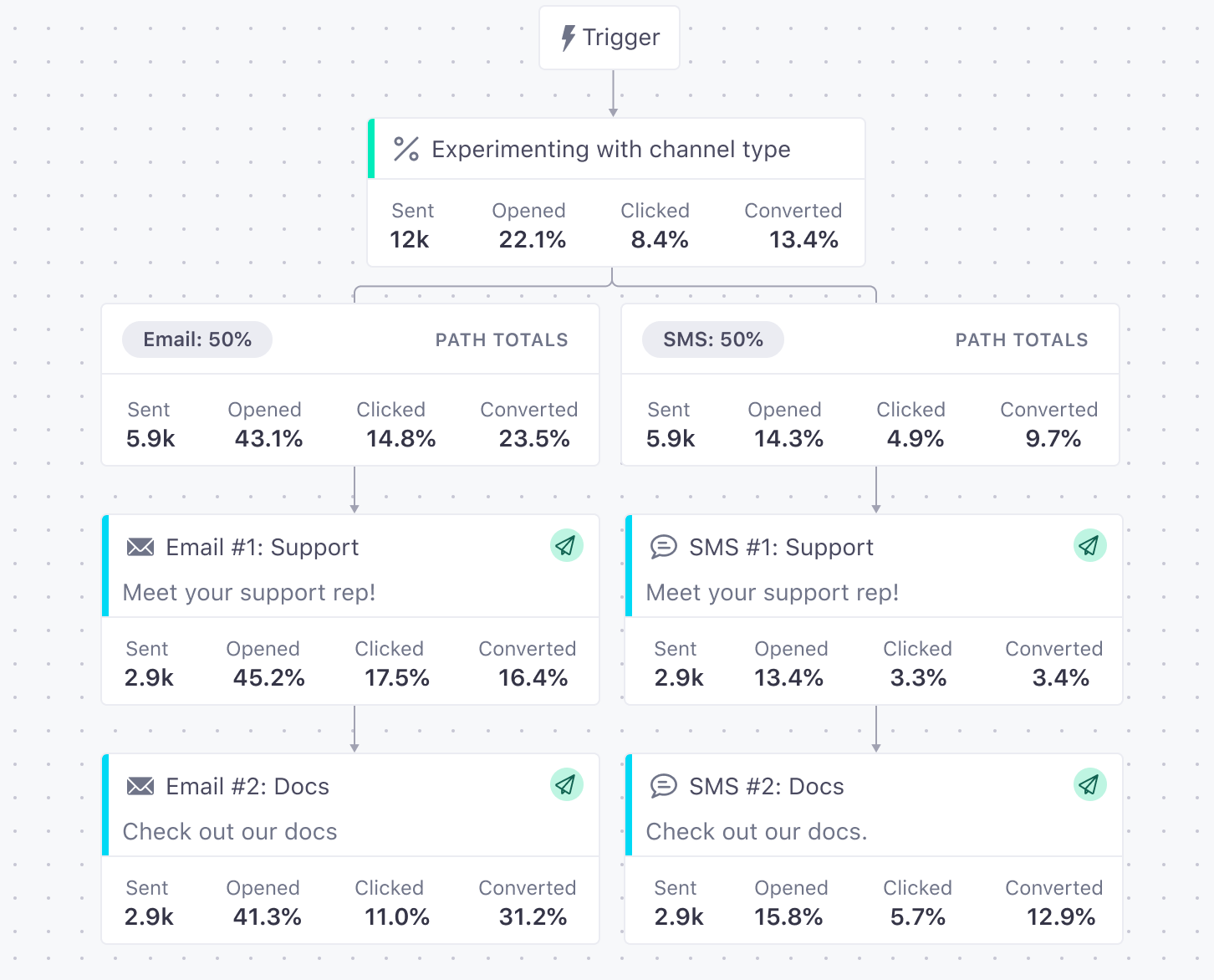
In this view, each metric appears on the bottom of the workflow item. You can toggle the metrics you’d like to view and the time period presented in the side tray.
Unsubs represents unsubscribing from all messages, not unsubscribing from indivdual subscription topics.
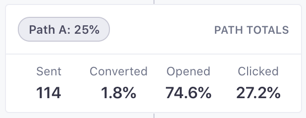
Total Path Metrics The Path Totals workflow items at the beginning of each branch path show the cumulative metrics for every item from the beginning of the path through to the reconnection point or exit block. This allows you to compare the performance of each path.
Each metric total is calculated using only the workflow items that have a value for that metric. For example, if a workflow item does not track clicks, the total path Clicked metric will not include that item.