In-App visual editor
We’re actively developing this feature!
This feature is new, and we’re continuing to improve on it. If you run into a problem or have feedback for us, please get in touch so that we can build the best possible feature for you!
How it works
Our in-app editor lets you drag-and-drop components like text, media, and buttons to build in-app-messages. You can style each component so that your message looks and feels like a part of your app or website.
If you’re HTML-savvy, you can even switch to a full HTML-code view to edit your message’s HTML code directly.
The old editor experience
If you enabled in-app messaging with Customer.io before July 8, 2024, you’ll see two editor experiences—Drag-and-drop (new) and Standard (legacy). You’ll want to use the Drag-and-drop editor to develop new messages.
For messages you already created before July, 8 2024, you can use the Legacy editor to pick and populate your message. In many cases, you’ll want to rebuild your messages in the drag-and-drop editor to take advantage of the new features and improvements we’ve made.
Building your in-app message
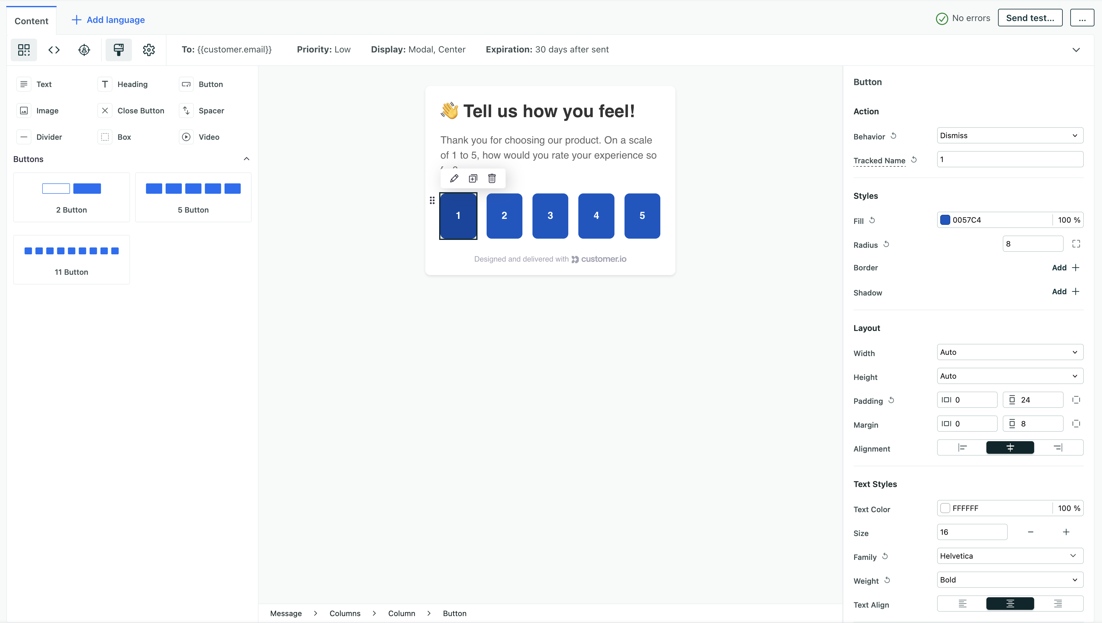
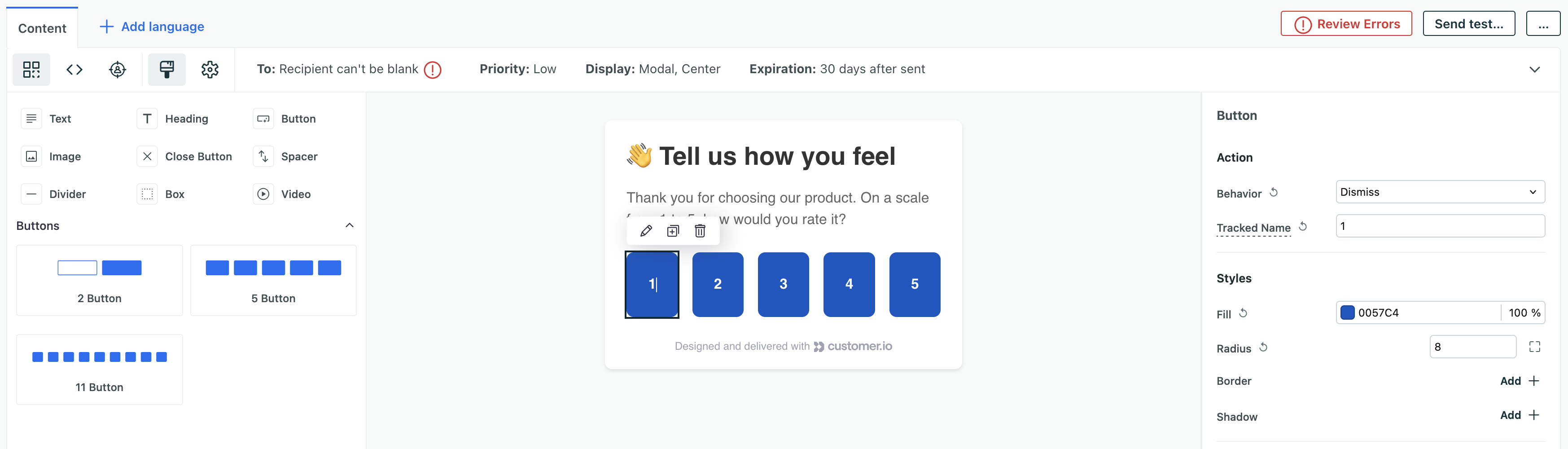
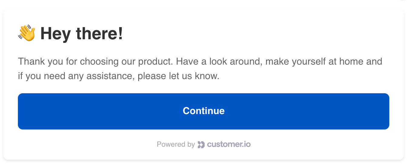
Messages are already set up so that you can start adding components right away—headings, text, buttons, and so on. In general, most messages should contain a heading, text, and at least one button—a call to action that you want your audience to perform or a clear way to dismiss your message.
Text and headings are fairly self-explanatory, but buttons need an Action. An action determines what happens when someone interacts with a button or a part of your message. Some components, like the Close Button already have an action set up for you. See buttons and actions below for more information.
You can drag combinations of 2, 5, or 11 buttons into your layout, but you’re not limited to these numbers of buttons. You can click the row to customize the number of buttons and the width of each button. Beyond that, you can even use the row and column components to customize the layout of your message.
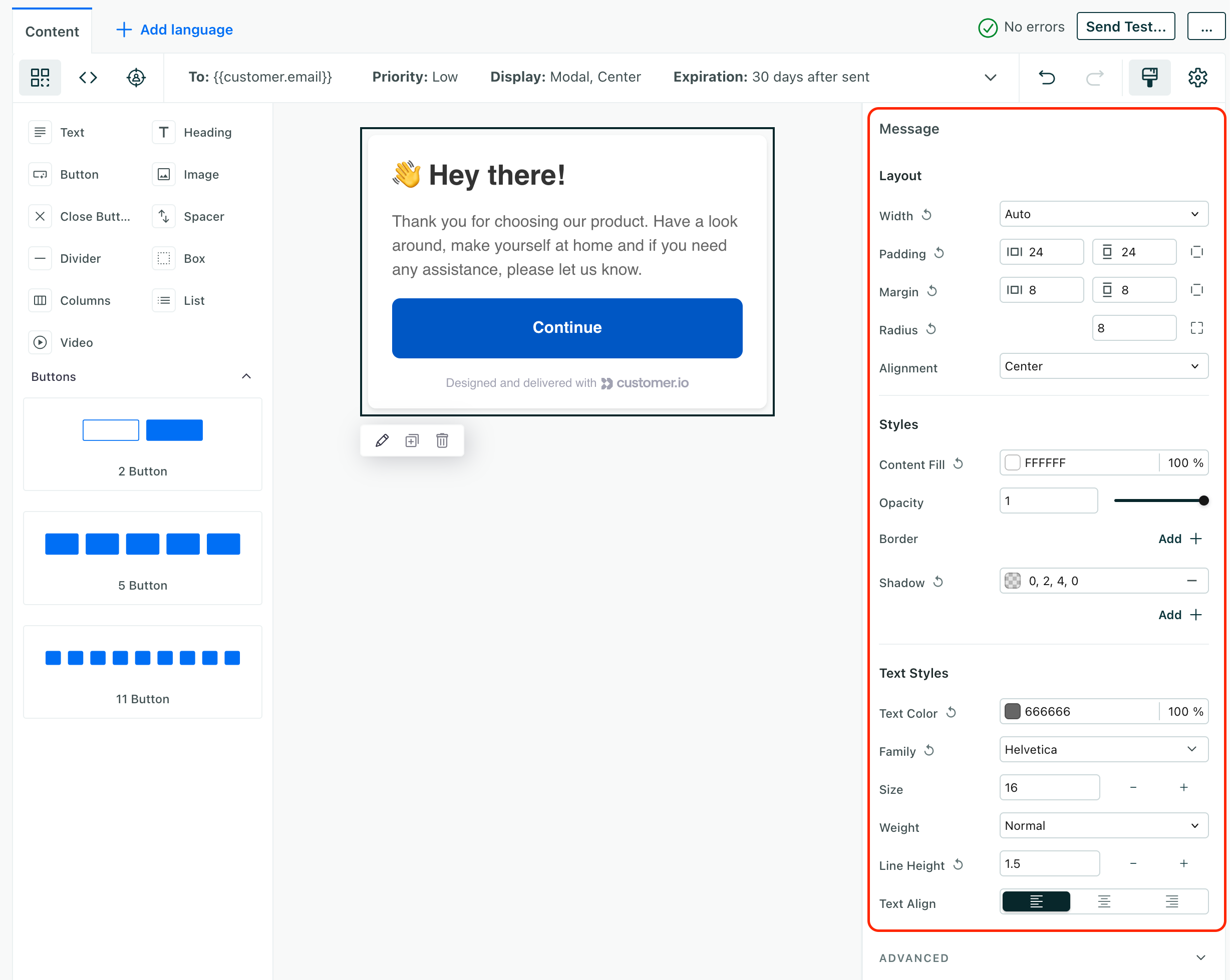
Styling your message
Click on any component in your message to see and change its settings on the right side of the editor. The settings for each component are common CSS properties like font-size, color, background-color, and so on.
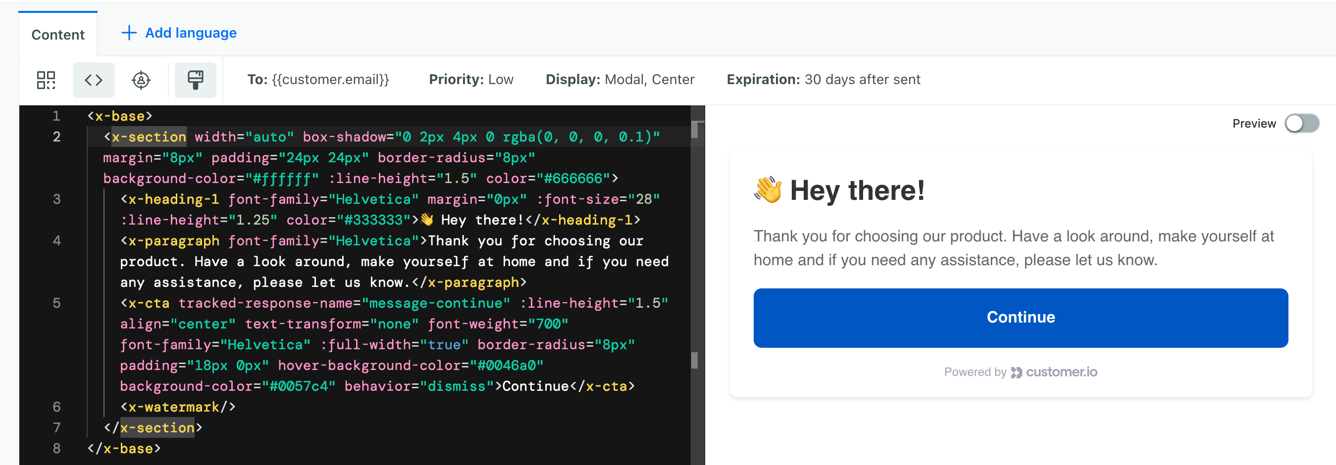
You can switch to the HTML-view of your message using the code button if you’re comfortable working directly in HTML. The first thing you’ll notice is that our HTML looks a little different from what you’re used to.
We use extended HTML components to support our drag-and-drop editor. For example, our Heading 1 component is called x-Heading-1, not h1. In the code view, you can apply CSS style and class attributes.
Because your message is essentially an iframed HTML document, you can include a complete list of styles or import a style sheet and apply classes to your components if you don’t want to repeat styles across different components in your messages.
You can also use standard HTML elements in your message (as opposed to our extended components). But, keep in mind that our drag-and-drop editor relies on these extended components. You won’t be able to style or drag standard HTML elements with the drag-and-drop editor.
Top-level message styles and settings
You can set your message’s background color, font settings, border color, and other settings by selecting the message frame itself.
Message styles cascade from parent containers to child elements. So, for example, if you set a font color on the message frame, all components in your message will inherit that font color unless you change the setting on a specific component. That’s because the message frame is the top-level container for your message.
Ignore the settings icon unless you start from scratch
In the top-right corner, you’ll see a icon. While you can click this to reveal top-level settings like font colors, background color, and so on, our default templates override these settings. If you start with one of our templates, these settings won’t have any effect on your message!
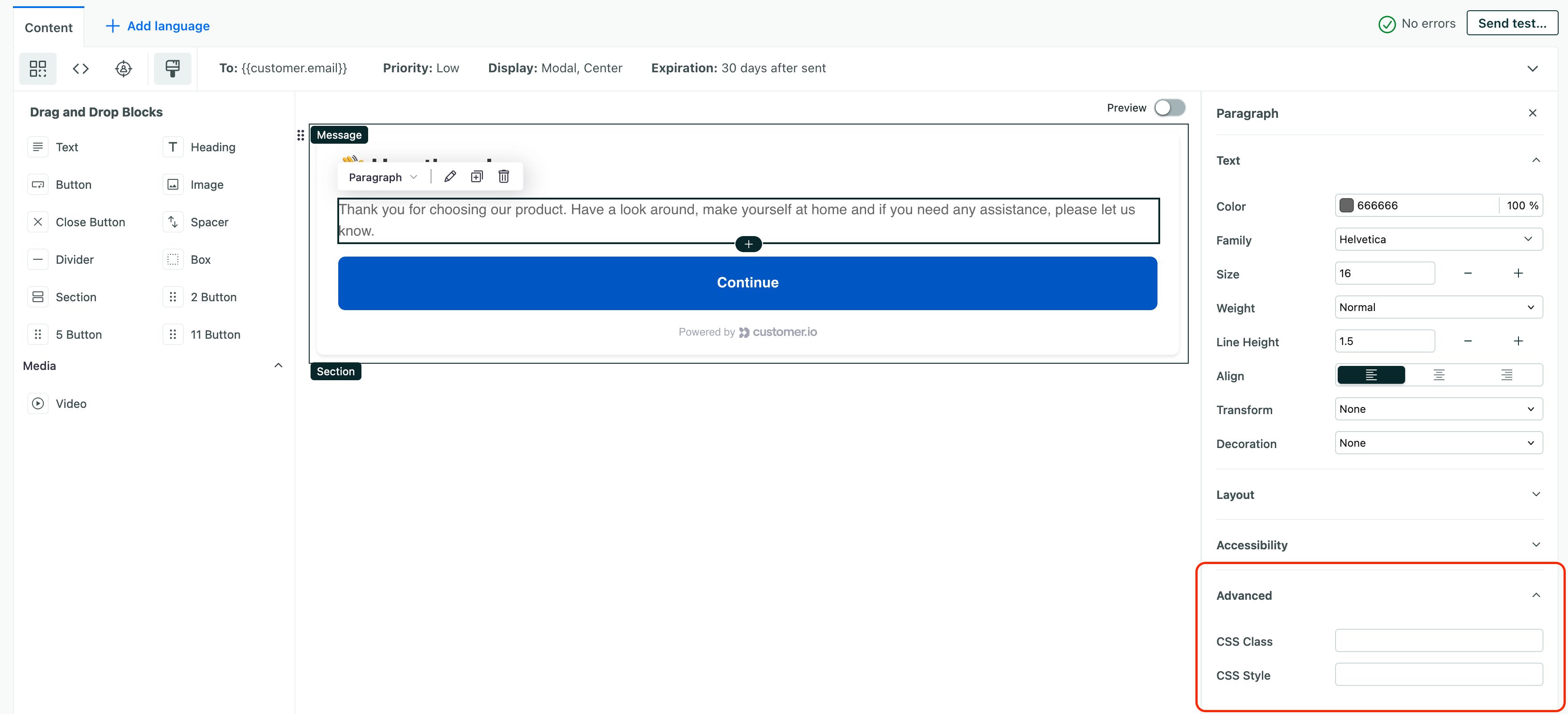
Advanced properties: custom CSS and styles
While you can style all the aspects of your message itself, you may simply want to write your own stylesheet and apply CSS classes to components in your message—so you don’t have to manually adjust styles for each component.
You’ll find CSS Class and CSS Style settings under Advanced when you select a component. Both work like standard HTML attributes. Where the contents of each field are the classes you want to apply.
Remember that classes are separated by spaces and styles are separated by semicolons:
- CSS Classes:
style1 style2 anotherStyle - CSS Styles:
font-weight: bold; font-family: Roboto;
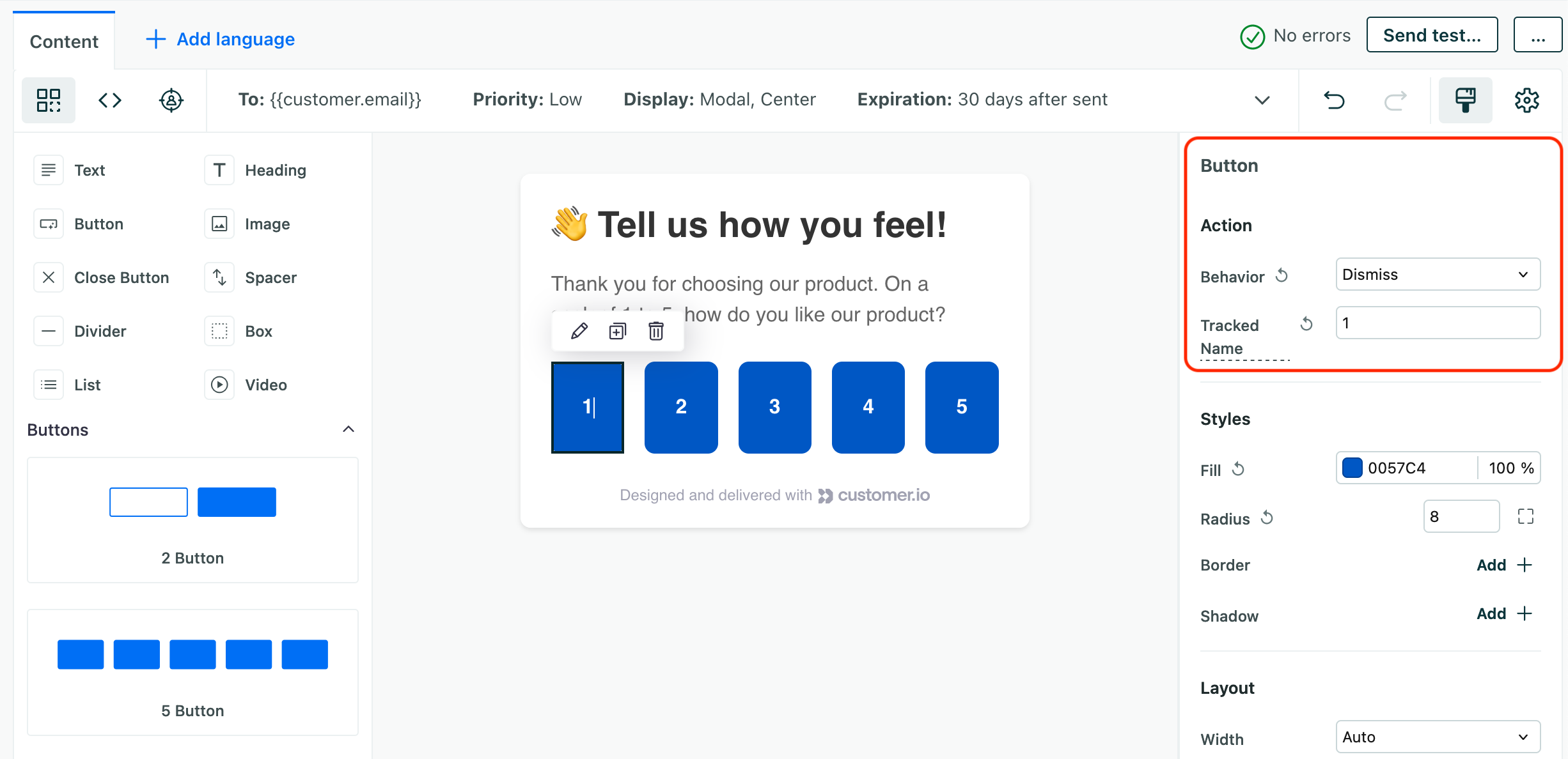
Buttons and actions
An Action is something you want your message to do when your audience clicks or taps a component. Button components have default actions, because they’re obvious for people to interact with. Your buttons typically carry a call to action. But you can add actions to other components, like images.
For each action, you can set two values:
- Behavior (Required) determines what the action does
- Tracked Name the Tracked Response that we record whens someone clicks or taps a button. This value appears as
action_namein events sent to Customer.io.
You’ll notice that we have a dismiss action and other actions. All actions dismiss your message. Other actions both dismiss your message and do something else; for example, the Open URL action both opens a web page and dismisses your message.
| Behavior | What it does |
|---|---|
| Dismiss | Dismisses the message. This is the default action for the Close Button |
| Open Url | Opens a URL in a new tab. |
| Open Deep Link | Opens a deep link in your app. |
| Perform Action | Trigger a custom action—a function already set up in your app. |
Tracked Name and Responses
When you set up an action, you’ll see a Tracked Name field. We use this value to aggregate responses to your message, so you can see how everybody responds to your message.
It’s important that you provide a meaningful Tracked Name for each action so it’s easy to understand your metrics.
This value also appears as an action_name in events associated with your message, and you can use this value to trigger follow-ups or other campaigns based on how people interact with your messages. For example, if you send a survey where people rate your app from 1 to 5, you might set the Tracked Name values from 1 to 5. If people rate your app as a 5 out of 5, you might thank them for the good review; if people rate your app as a 1 out of 5, you might ask them for feedback!
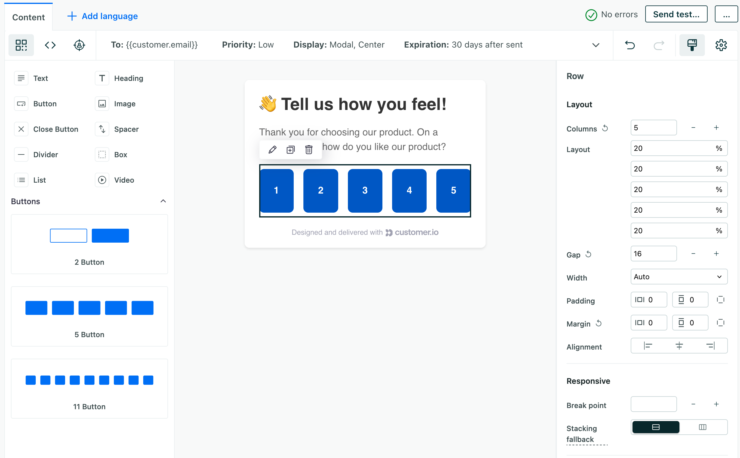
Rows and columns
In most cases, your message is a single column—content flows top to bottom. But, when you drag buttons into your message, we create a row component with columns for each button.
While we have options for 2, 5, and 11 buttons, you can add or remove columns from a row to set the number of buttons you want. You can also set the widths of columns to customize your layout. You can also delete individual buttons and replace them with other content if you simply want to use the row and columns to customize the layout of your message.
To customize a row or columns inside it, drag a set of buttons into your message and click the space between or arround buttons to select the row itself. You can then set the number of columns and the width of each column.
Video
The in-app editor supports video. We don’t host videos ourselves. You’ll provide the URL to a video hosted on YouTube, Vimeo, Wistia, Loom, and other video hosting services that provide an embeddable URL.
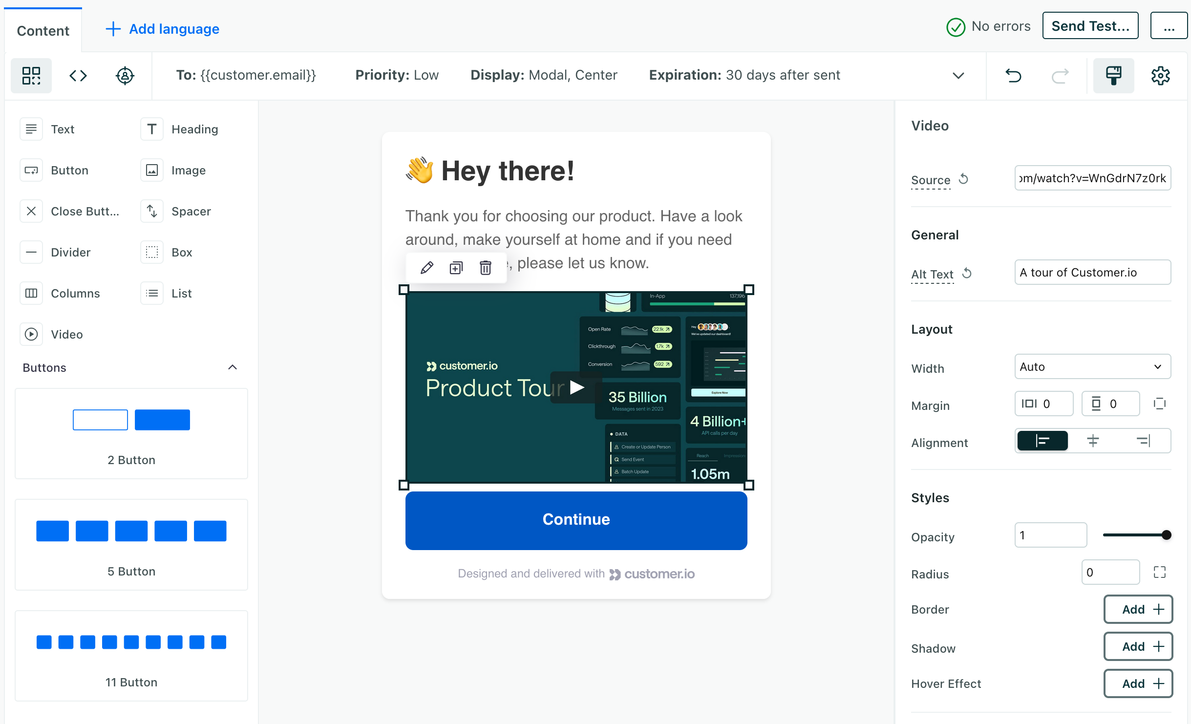
If you use an unsupported platform, we’ll show a black preview and link to the video.
We don’t have any constraints on video size or dimensions, but you’ll see the best results when you use a video that’s optimized for your audience’s medium. For example, if you send your message to mobile devices, you might want to use a smaller or shorter videos so it better fits your mobile audience’s needs and plays well whether they’re on cellular or WiFi connections.
We don’t support YouTube shorts
You can’t link to a video with /shorts in the path. You’ll need to link to a standard, full-length video (that typically contains /watch in the URL).
Advanced: trigger an event from your message
If you use our code editor, you can write your message in HTML and include <script> tags in your message. If you use our Data Pipelines JavaScript library, you can send events in Customer.io when people interact with your message (the analytics.track function in the example below).
For example, you might add onClick handlers to elements in your message to trigger events when someone rates your app in a survey. You could then use this event to trigger a follow up campaign based on their rating.
After you trigger an event, you’ll still need to track the interaction and dismiss the message. That’s what the message.performAction and message.dismiss functions do in the example below. These are regular actions you can perform on any message with the Data Pipelines JavaScript SDK. You’ll find a complete list of message functions below.
<script>
// attach to button as `onClick="submitFeedback(event, this)"`
function submitFeedback(event, el) {
    event.preventDefault();
    let rating = el.getAttribute('aria-label');

    const payload = {
        NPS_campaign: '{{message.name}}',
        NPS_rating: rating,
        NPS_method: 'inapp_cio',
    }

    //trigger event to workspace
    analytics.track('Completed NPS Survey', payload);

    //track click
    message.performAction('trackClick', {name: rating});
    message.dismiss();
}
</script>
Advanced: set and call message actions with JavaScript
You can use the following functions in your message’s JavaScript corresponding to button action behaviors listed above.
All functions take an options object. This object just carries a name property (corresponding to the Tracked Name of the action) and, in the case of message.openUrl, the _target.
message.dismiss({name: "action name"}): Dismisses the message.message.openUrl(url, {name: "page/screen name", target: '_blank'}): Opens a URL in a new tab.message.openDeeplink(url, {name: "page/screen name"}): Opens a deep link in your app.message.performAction('myCustomAction', {name: "action name"}): Triggers a custom action.message.isClientWeb(): Returnstrueif the message appears in a web browser. Lets you perform custom handling if you intend to send a message to both your website and mobile app.
Advanced: accessibility settings
When you change the settings for a component, you’ll see Advanced at the bottom right. This often includes accessibility settings, which help people who navigate your app with screen readers or other assistive technologies.
You should keep these users in mind as you develop messages!
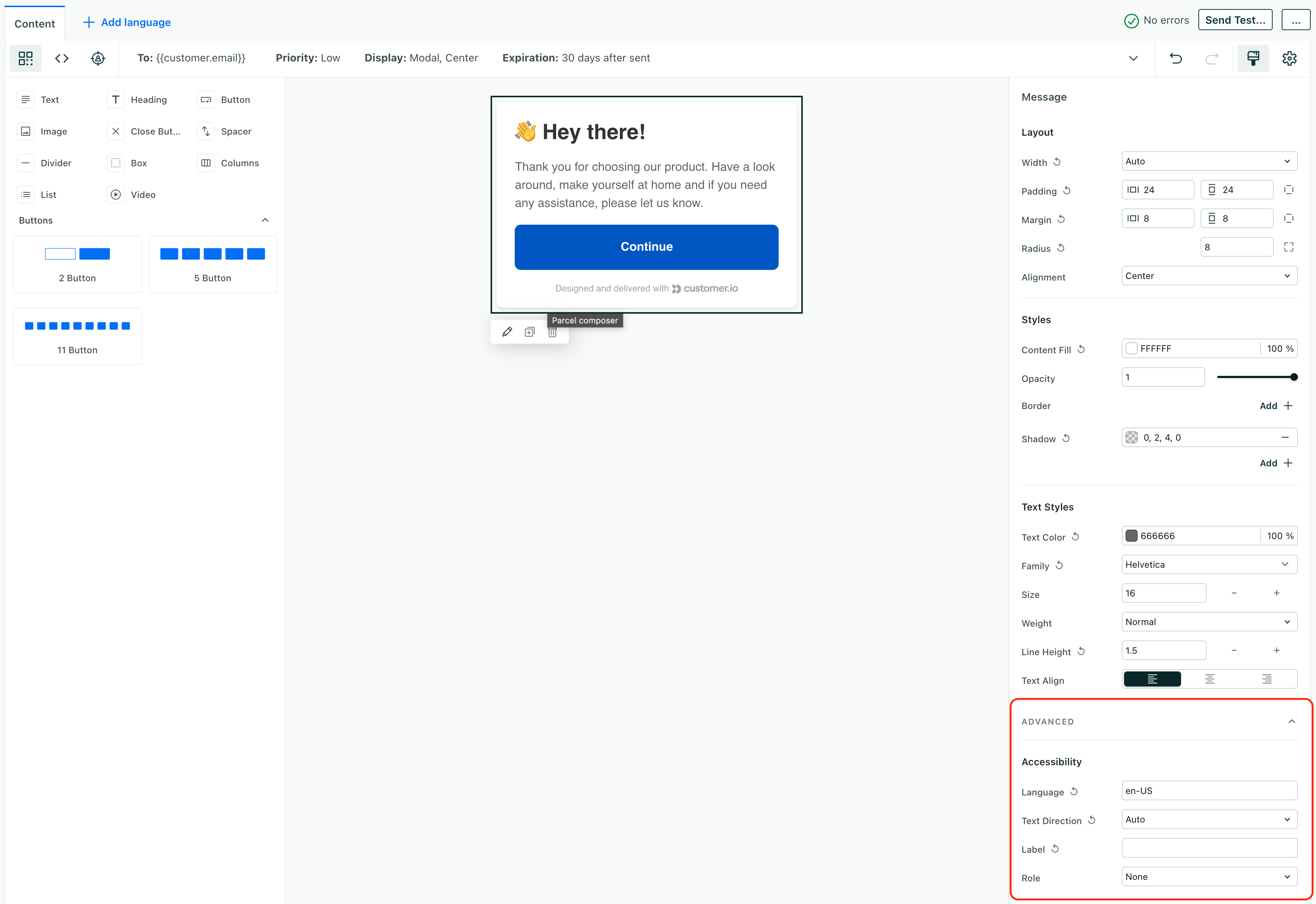
- Language sets the
langattribute for an element. This tells browsers and screen readers what language content is in. It can help screen-readers understand how to pronounce text and and can help when a user needs to translate your message in their browser. It takes a two letter or four letter language code, likeenoren-US. This does not affect how we send and deliver localized messages. - Text Direction determines the direction of text in your message. This is important for languages that read right-to-left.
- Label sets a
labelattribute for your message or component. These describe fields or buttons in your message for folks using assistive technologies. For example, thelabelmight let your users know that they’re reading an in-app message! - Role sets the
roleattribute for your message or component. This tells assistive technologies what kind of element they’re looking at. For example, aroleofbuttontells a screen reader that a component is a button. This is particularly important when an element doesn’t match its default role. For example, if adivacts like a button, you should set itsroletobutton.
What’s next for the in-app editor?
Multi-screen (linked) messages: For now, you can’t easily create multi-part messages without custom code, CSS, and JavaScript. We’re actively working to make this easier with our new drag-and-drop experience.
Global styles: For now, you need to style messages on a message-by-message basis. Soon we’ll have global styles, so you can set up global styles and apply them as defaults to all your messages.
Reusable templates: For now, you’ll build your messages directly in campaigns and broadcasts, but we’re working to support reusable templates in our drag-and-drop editor. This will make it easier for you to reuse messages and make sure that you don’t accidentally affect live messages.