Customizing Email Layouts
Customize our starter layouts to quickly produce reusable email layouts that fit your brand and style.
Our Layout Starters are built using a framework called Foundation for Emails. This framework ensures that our starter email layouts are generally supported across clients, while still letting you to customize the look and feel of your emails.
Choosing a Layout Starter
Go to Content > Layouts to see starter layouts. Choose the starter that works best for you, set a name for your layout, and then you can customize the HTML and CSS to fit your needs.
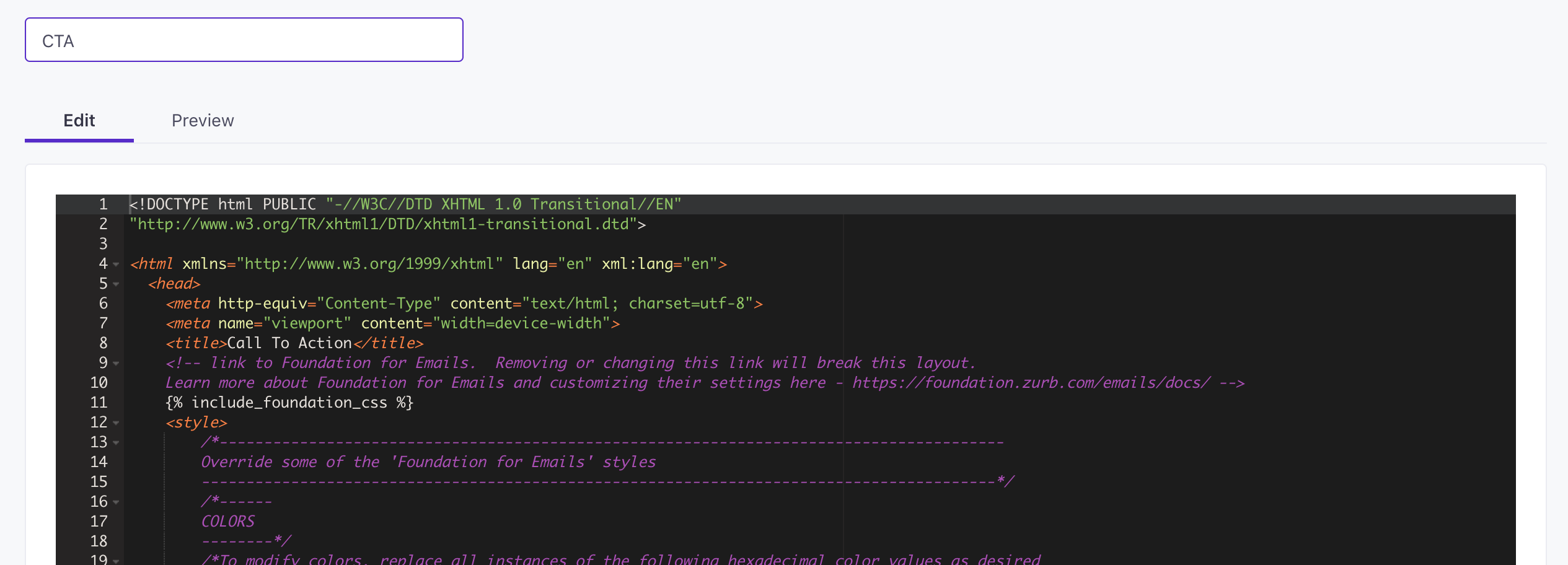
Find your way with code comments
Because email code can be overwhelming sometimes, we’ve added comments to help you find the various areas you might want to customize. You can remove the comments if you’d like. Below, we’ll show you which comments to look for to easily customize things like your logo, background, and even set columns in your layout.
In HTML, comments look like this:
<!-- This is an HTML comment: it doesn't affect the code! -->
And CSS comments, like this:
/* ...and this is a CSS comment. It doesn't affect the code either, but it helps us annotate it! */
Do not remove Foundation CSS
Removing the link to the foundation CSS will break your layout! That piece of code looks like this:
<link href="https://cdnjs.cloudflare.com/ajax/libs/foundation-emails/2.2.1/foundation-emails.min.css" rel="stylesheet">
Adding your company information
Our layouts include spaces for you to add your company’s copyright information and address. They look like this:
©{{ "now" | date:"%Y" }} [[YOUR COMPANY NAME HERE]]
[[YOUR ADDRESS HERE]]
Adding a logo
The logo is defined in this block of code below. Just change the URL in src="" to your logo image, and that’s it!
<!-- To add your logo image, modify the src here. -->
<img src="https://s3.amazonaws.com/fast.customer.io/email-templates/logo.png" align="center" class="float-center">
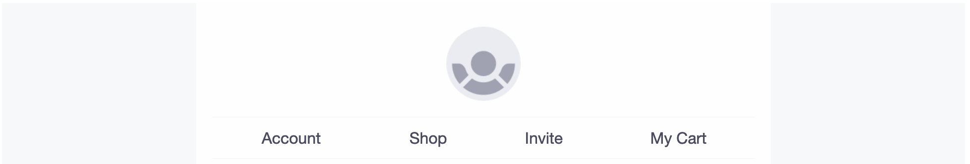
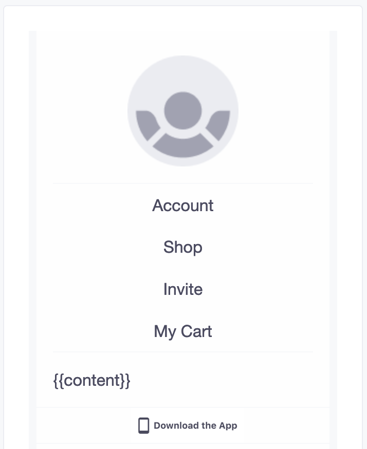
Adding links and changing menus
Some starters have a set of links. For example, the Menu Layout starter has a set of links at the top. You’ll obviously want to add your own. To add your own links, search for the following section.
<!-- make sure to add correct titles and links for all your menu items! -->
<th class="menu-item float-center"><a href="#">Account</a></th>
<th class="menu-item float-center"><a href="#">Shop</a></th>
<th class="menu-item float-center"><a href="#">Invite</a></th>
<th class="menu-item float-center"><a href="#">My Cart</a></th>
This is where you can add or remove the links themselves and customize the text. For example, I could add the following links to update the menu.
<th class="menu-item float-center"><a href="http://example.com/products/new-releases">New Releases</a></th>
<th class="menu-item float-center"><a href="http://example.com/products/anvils">Anvils</a></th>
<th class="menu-item float-center"><a href="http://example.com/products/rollerskates">Rollerskates</a></th>
<th class="menu-item float-center"><a href="http://example.com/products/bird-seed">Bird Seed</a></th>
<th class="menu-item float-center"><a href="http://example.com/products/cement">Cement</a></th>

Change the typeface
By default, we use the Helvetica Neue font. If you want to change it, no problem! Find this comment and the associated CSS styles:
/* Replace all instances of "Helvetica Neue" with font of your choice */
font-family: "Helvetica Neue", Helvetica, Arial, sans-serif;
The fonts you use might depend on the email clients you want to support. Some fonts are better supported than others.
Safe Fonts
The safest typefaces to use are Arial, Verdana, Georgia, Times New Roman, and Courier: these fonts are universally supported. In the example above, we use Arial as a fallback if Helvetica doesn’t display.
Use a Web font
Web fonts, acquired through services like Google Fonts or MyFonts, can help you get creative with your font use! Web fonts aren’t 100% supported, but for the most part, web fonts will work in:
- iOS Mail
- Apple Mail
- Android (the mail client, not the Gmail app)
- Outlook 2000 and the Outlook.com app
- Thunderbird
If you’re comfortable with that level of support, you can go to Google Fonts (or another font provider) and choose a font. When you use a font, Google will give you a URL like this:
<link href="https://fonts.googleapis.com/css?family=Modak" rel="stylesheet">Add it to the top of your Layouts code, under Foundation.
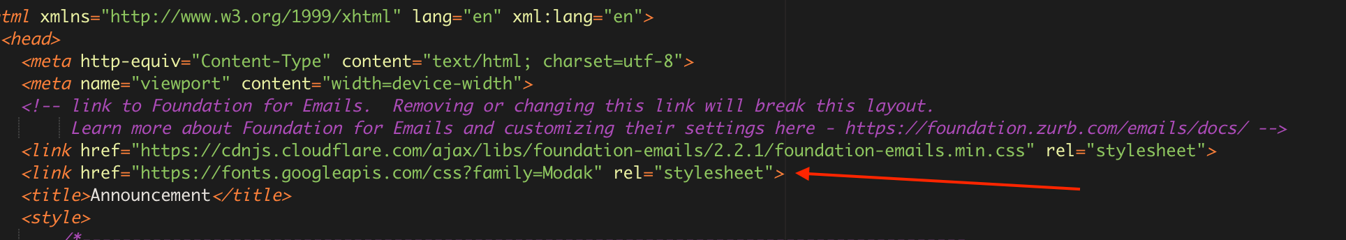
Then, find instances of your font families and replace them with your new font declaration.
- Find this comment:
/* Replace all instances of "Helvetica Neue" with font of your choice */ - Replace font declarations below the comment with your new font:
font-family: "Modak", Arial, sans-serif;
- Find this comment:
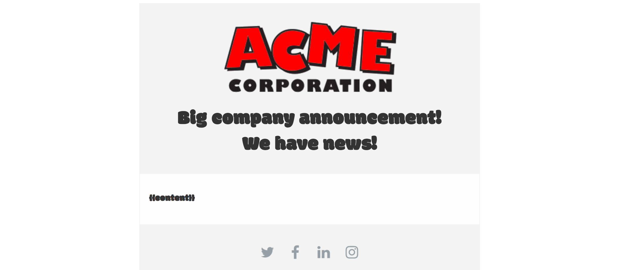
Webfonts can be tricky; make sure that you set a fallback to a safe font. You can see that we’re using Arial as a fallback again, but you can choose whatever safe font you like! If you click Preview, you can see your new font choice, along with any other changes you’ve made. Here’s an example in the Announcement Starter where I’ve added a logo also:
Adding buttons
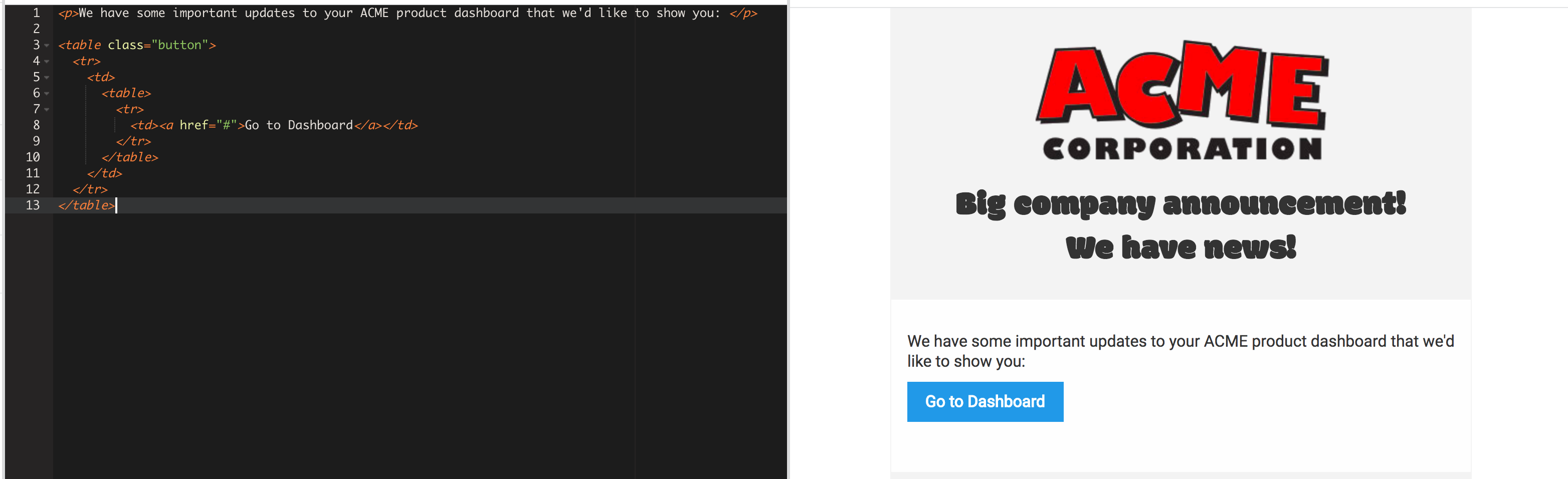
The following code adds a button and works in all email clients. You’ll notice hat our button is in a table: that’s one of the difficulties in ensuring that your message behaves the way you expect across all clients.
<table class="button">
  <tr>
    <td>
      <table>
        <tr>
          <td><a href="#">Button</a></td>
        </tr>
      </table>
    </td>
  </tr>
</table>
You can add this same code to your email’s content when composing an email.
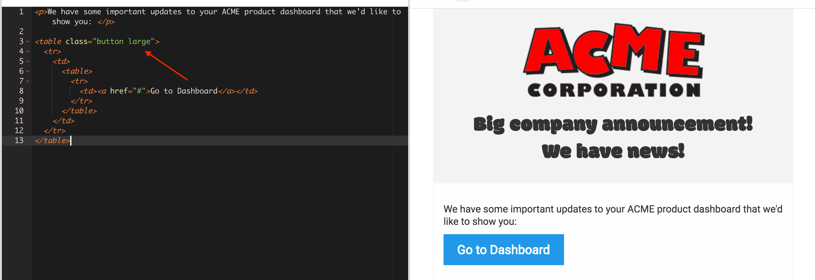
Customizing a button
You can use Foundation’s Button docs as reference to customize buttons.
To change a button’s size, add one of the tiny, small, or large classes. Here’s a large button:
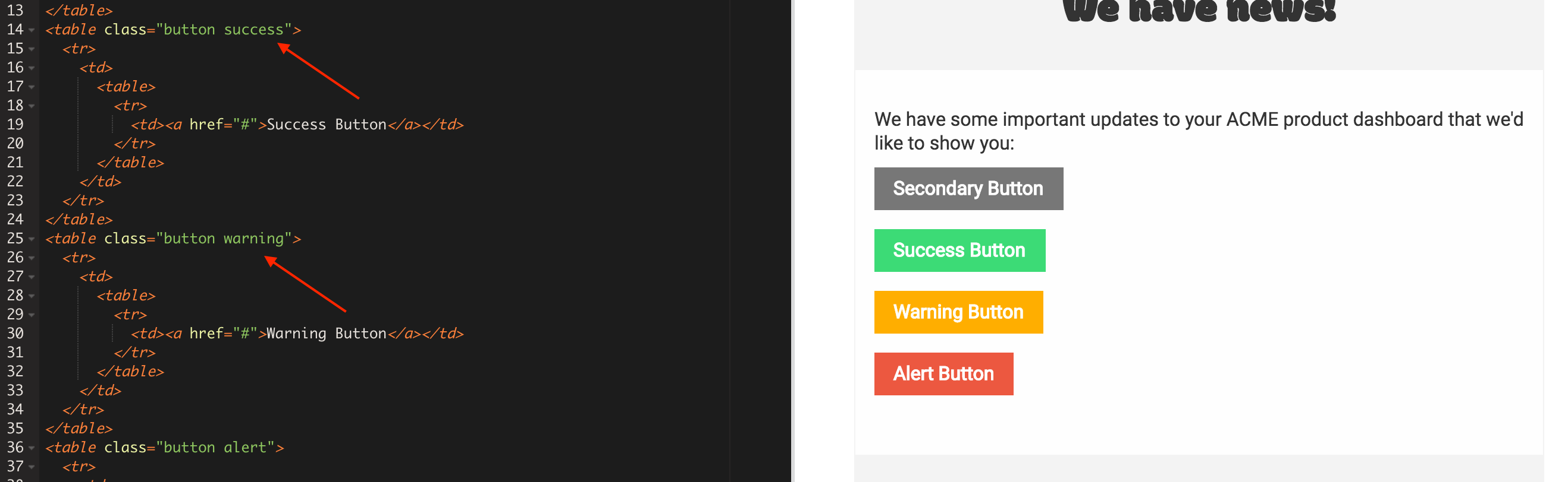
To change a button’s color, add one of the secondary, success, warning, or alert classes, like this:
If you want to define your own color, you need to return to the Layout editor and add your own class. In this example, I’ve used acme-primary
<table class="button acme-primary">
  <tr>
    <td>
      <table>
        <tr>
          <td><a href="#">Success Button</a></td>
        </tr>
      </table>
    </td>
  </tr>
</table>
Then, in your Layout, add this code in the Foundation Overrides area of the styles, setting the color that you want to use for the button.
table.button.acme-primary table td {
    background: #YOURCOLOR;
    border: 0px solid #YOURCOLOR;
}
table.button.acme-primary table a {
    border: 0px solid #YOURCOLOR;
}
Menu stacking
On small screens, the navigation in our Menu Starter stacks. Here’s an example from an iPhone:
If you want to prevent menus from stacking and keep links layed out horizontally on small screens, find the menu in the code and remove the small-vertical class.
<table class="menu main-menu small-vertical"><tr><td><table><tr>
	<!-- make sure to add correct titles and links for all your menu items! -->
	<th class="menu-item float-center"><a href="#">Account</a></th>
	<th class="menu-item float-center"><a href="#">Shop</a></th>
	<th class="menu-item float-center"><a href="#">Invite</a></th>
	<th class="menu-item float-center"><a href="#">My Cart</a></th>
</tr></table></td></tr></table>
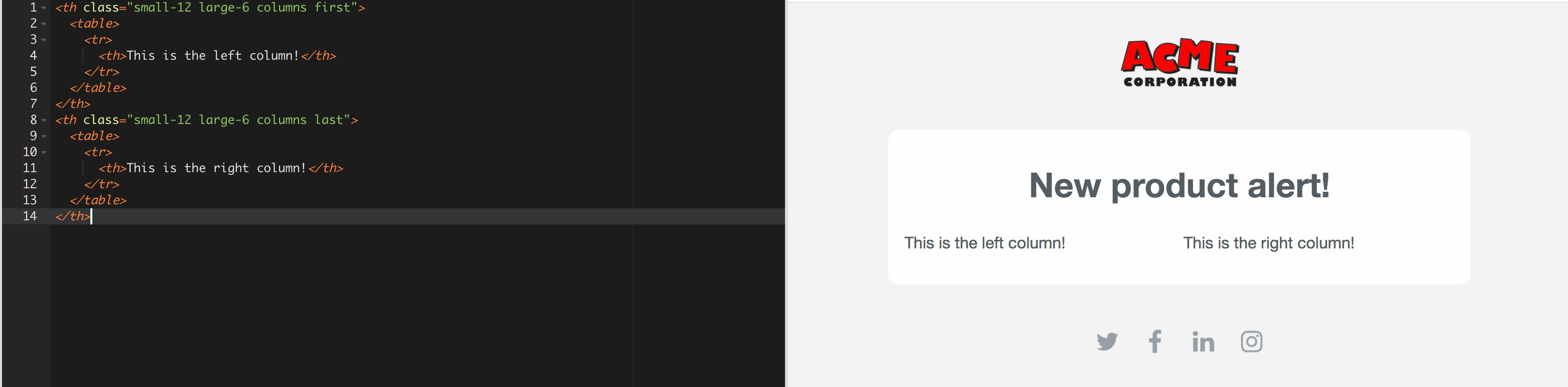
Adding columns
You may want your emails to have multiple columns, or a grid. We generally recommend that you do this in your email’s content, rather than in the layout itself, because you’ll likely want the content within your grid to be dynamic. Dynamic content should reside in your message composer!
For example, here we’re use Foundation’s Grid syntax to write our HTML. This means that column code uses the small-12 and large-6 classes to set the size of the column. The grid is divided by 12, so a two-column grid is made up of two large-6 columns:
<th class="small-12 large-6 columns first">
  <table>
    <tr>
      <th>One</th>
    </tr>
  </table>
</th>
<th class="small-12 large-6 columns last">
  <table>
    <tr>
      <th>Three</th>
    </tr>
  </table>
</th>
Columns in the Layout
You can make more complex grid-based customizations with some careful code wrangling. This is the code you’ll need to replace:
<th class="small-12 large-12 columns first"><table><tr><th>
  <table class="wrapper" align="center"><tr><td class="wrapper-inner">
    <!-- We'll replace this content tag with whatever you write in your email -->
   {{content}}
  </td></tr></table>
</th>
For example, if you want a two-column grid with a static sidebar, you could change your layout code as follows. Remember that the content in the left bar here will be editable in the Layout only; you cannot edit it in your emails.
<th class="small-12 large-6 columns first"><table><tr><th>
  <table class="wrapper" align="center"><tr><td class="wrapper-inner">
    Static sidebar content!
  </td></tr></table>
</th>
<th class="small-12 large-6 columns last"><table><tr><th>
  <table class="wrapper" align="center"><tr><td class="wrapper-inner">
    <!-- We'll replace this content tag with whatever you write in your email -->
  {{content}}
  </td></tr></table>
</th>