Release Notes
Check out the latest features and fixes for the Customer.io platform. This page covers releases beginning in 2021. Go to our blog to see a history of releases before 2021!
Want to see what we're working on? Take a look at our roadmap!
Meeting Apple’s App Store Privacy Requirements
Mobile sdkBeginning May 1, 2024, Apple’s App Store requires mobile apps and the SDKs you use to build your app to include privacy manifests. This includes Customer.io’s SDKs. We’ve updated our SDKs to include privacy manifests. Update your app to one of the versions listed below (or later) before May 1st, 2024 to ensure that your apps meet Apple’s requirements and aren’t rejected from the App Store.
- iOS: ≥ 3.1.0 or ≥ 2.13.0
- React Native: ≥ 3.6.0
- Flutter: requires iOS ≥ 2.13.0. Follow our update instructions to update the iOS native package in Flutter.
- Expo: requires React Native ≥ 3.6.0. Install the latest React Native SDK and run
expo prebuild --clean.
Add/remove an individual from a manual segment
Messaging Ui improvements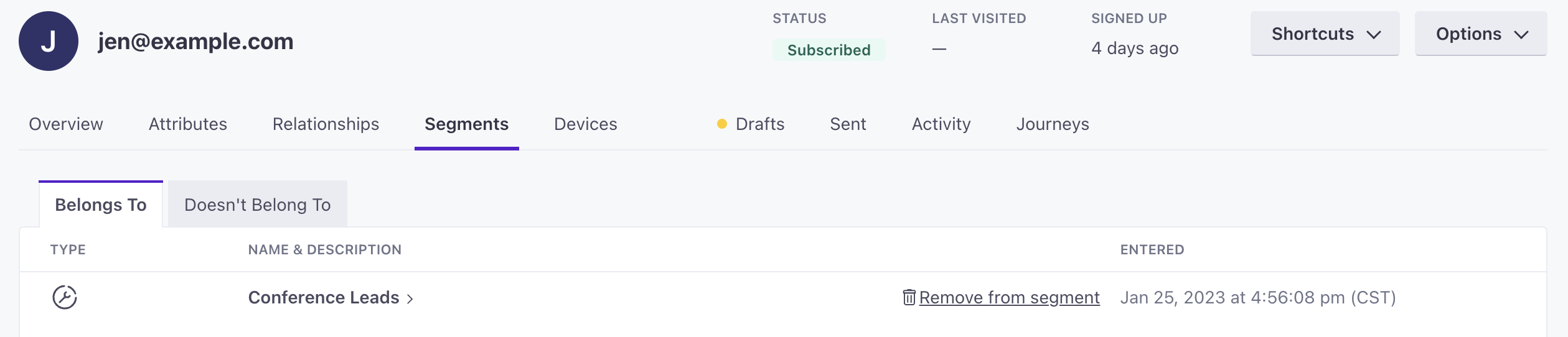
You can now add a person to or remove them from a manual segment through their profile page. Go to a person’s profile then click the Segments tab. Go to the tab Doesn’t Belong To then click Add to segment beside any manual segment so they join it. Or, under Belongs To, click Remove from segment so they leave it. Keep in mind, after you remove people from or add them to manual segments, they may trigger campaigns.
Go to the docsiOS 3.0 release
Mobile sdk
The latest version of our iOS SDK is out, providing a seamless integration with Customer.io Data Pipelines. This update makes it easier to support both Customer.io and your data to downstream destinations—like your analytics platform, CRM, or data warehouse—and lets you track anonymous users.
Read more
Upgrade your liquid version for new messages in Workspace Settings
Messaging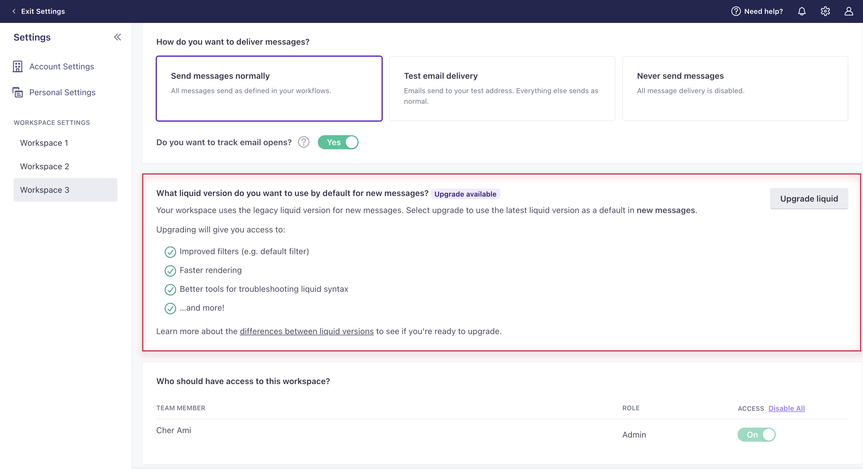
This applies to accounts created before Nov 28, 2023; all other accounts use our latest liquid version. You can now upgrade your workspace so that all new messages moving forward use our latest liquid version. The latest liquid version offers improved filters (e.g. default filter), faster rendering, and better tools for troubleshooting liquid syntax. Take a look at the differences between our latest and legacy versions of liquid to see if you’re ready to make the switch. Then go to General Workspace Settings to upgrade. Keep in mind, you will still have to manually upgrade existing messages. If you run into unexpected syntax issues with the latest liquid, use our fallback logic.
Download your billing invoice
Ui improvementsAs an Admin, you can now download your billing invoice from Account Settings > Plans & Billing > Billing History. Click Download invoice beside any billing period for a PDF.
Go to the docsCheck your DMARC policy
Ui improvementsWe now check your DMARC policy when verifying your email sending domains to enforce Gmail and Yahoo’s new sending requirements. Visit your Workspace Settings and click Manage Domain to check the state of your DMARC policy and whether we recommend you update it. These requirements are designed to help prevent email spoofing and phishing attacks.
Go to the docsUpgrade to the latest liquid version
Messaging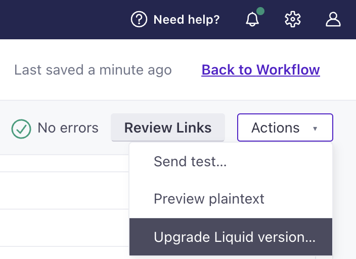
If your account was created before Nov 28, 2023, you now have the ability to upgrade to our latest liquid version, which provides faster rendering and new functionality. Check out what’s new and deprecated with the latest version. You can update a message through the Actions dropdown while editing.
Go to the docsGenerate liquid for objects and relationships with AI
Messaging Ui improvements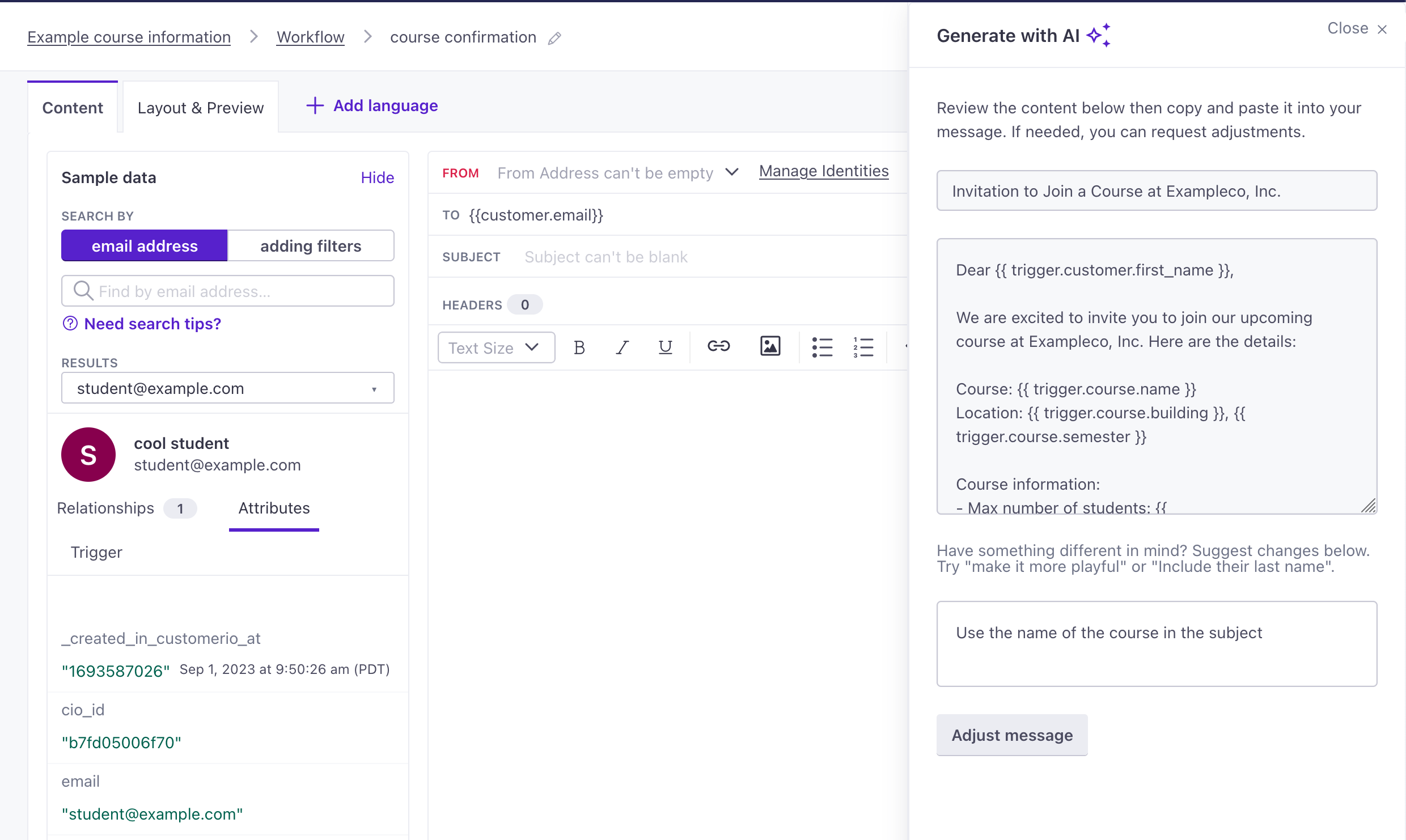
We know that liquid is complicated, even moreso when you need to reference objects, relationships, and people in the same message. To make things easier, we built a tool that uses AI to generate your message and liquid for you.
Because AI features are tricky, we’ve made this an Experimental feature so you can use it if you’re comfortable taking advantage of AI-style features. To enable the feature, go to the icon in the upper right corner and click Experimental Features. From here, you can enable Email Content for Object Campaigns.
Then, in campaigns triggered by objects or relationships, you can click Generate with AI to generate messages and associated liquid. The AI tool works like most AI-chat applications, so you can continually refine your prompt to get the results you want. Then copy the results into your message and you’re ready to go.
Go to the docsWe support images up to 3MB again
MessagingA couple of weeks ago, we changed the file size limit from 3MB to 1MB to scale our file storage and follow best practices for email. But after considerable feedback, we’re changing it back to 3MB to better support your needs. We’ll continue looking for solutions to storage and deliverability optimization.
We appreciate your feedback and are always looking for ways to improve our product—whether by adding new features or fixing recent changes! If you have feedback on this or any other feature, please let us know.
Go to the docsSimplified push messaging setup for iOS
API developers Mobile sdkWe’ve released updates for our iOS-supporting SDKs, so they’ll automatically register device tokens and capture opened metrics for push notifications. Now that we handle these things, you can remove some code, simplifying your integration and improving reliability when you update our SDKs in the future.
This release updates the platforms below. We’ve linked to upgrade documentation for each SDK, highlighting the code you can remove from your app when you upgrade:
- iOS 2.11
- React Native 3.4
- Flutter (affects iOS native SDK)
- Expo: Upgrade to
1.0.0-beta.14and runexpo prebuild --clean.
Reverse ETL: updates to sync interval calculation and suppressed profiles
API developers Automation Data integrations Ui improvementsWe’ve made two updates to enhance your reverse ETL integrations. First, we added a setting that allows you to decide how imports handle suppressed profiles. Second, we updated our import logic such that all reverse ETL imports start at a predictable time based on when your imports first started and your interval setting. For more information and examples, go to your database’s documentation. For more on our suppressed profile setting, go to Add a sync > Step 4. For more on interval calculation, go to Sync intervals and skipped syncs.
Go to the docsUpload images smaller than 1MB
MessagingWe changed the limit for image uploads from 3MB to 1MB. This helps us control the scale of file storage and follows best practices for image sizes in emails.
Go to the docsTrigger campaigns by objects and relationships
Messaging Ui improvements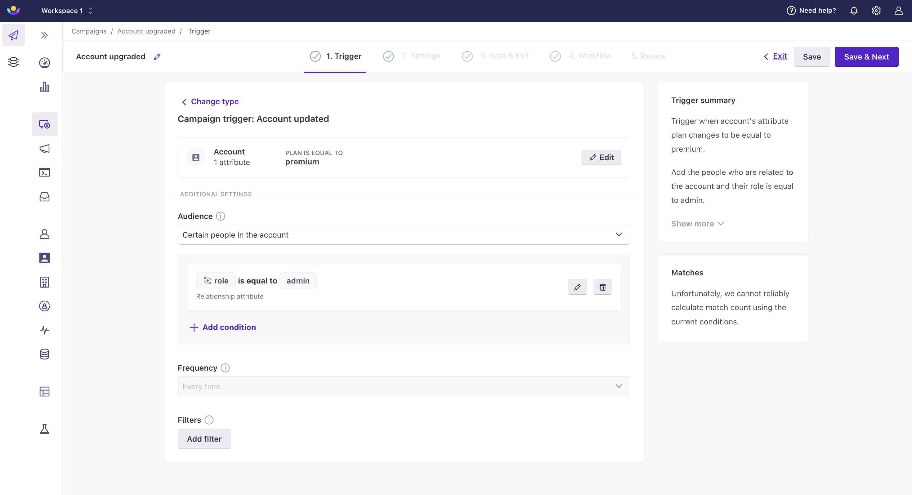
Your toolbox in Customer.io just expanded! You can now trigger campaigns based on an update to an object, an update to a relationship, or the addition of a relationship to an object. This is helpful when, for instance, you want to send a person through a journey when an account object they’re a manager of is updated or when their role at the account has changed. Go to Campaigns in the left hand navigation and click Create Campaign in the top right to get started.
Go to the docsNew and improved setup for campaign triggers
Messaging Ui improvements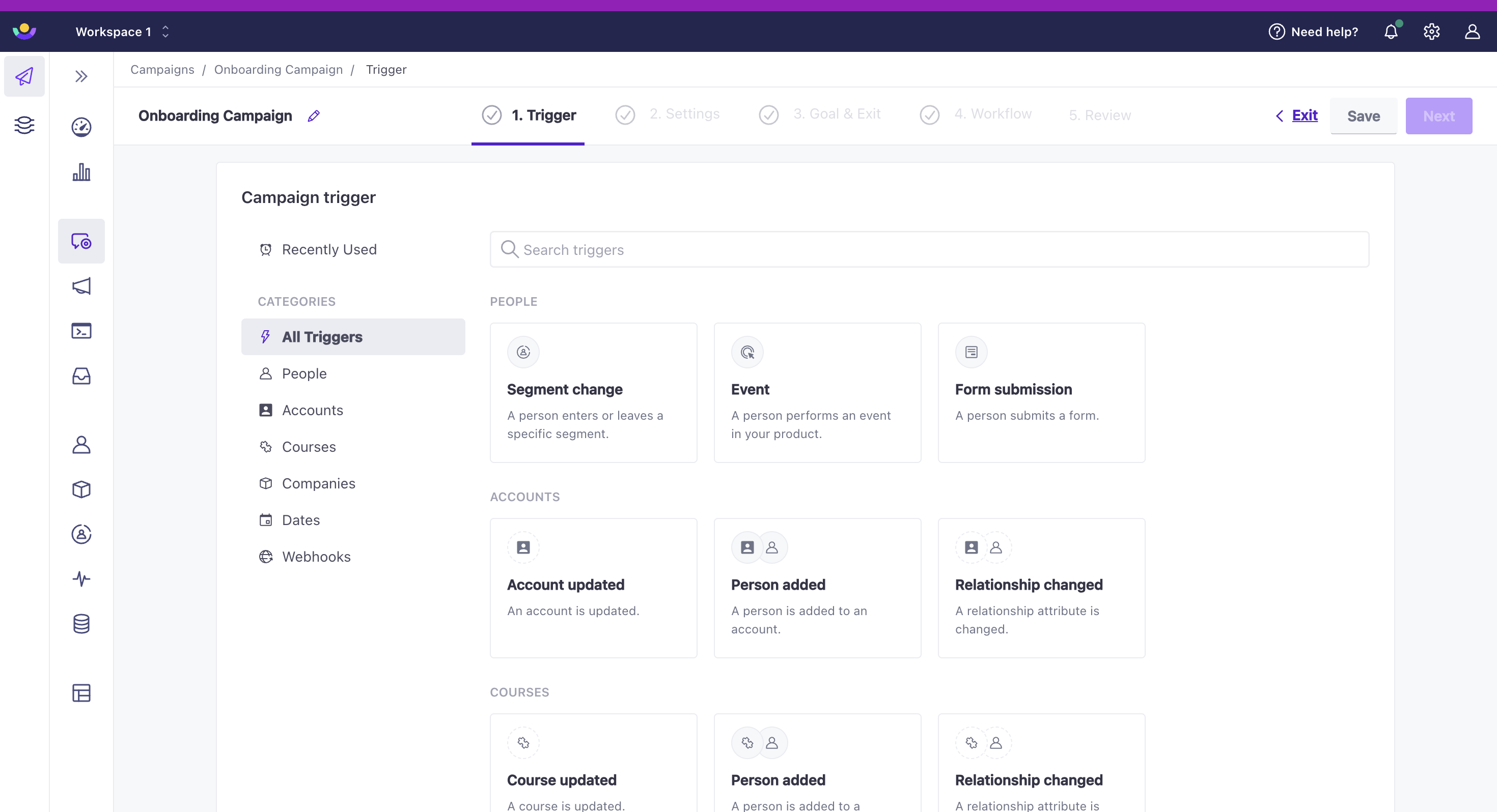
We revamped our campaign creation experience so that it is easier for you to find and refine the triggers you need. Go to Campaigns in the left hand navigation and click Create Campaign in the top right to get started.
Go to the docsImport objects via CSV
Data integrations Ui improvements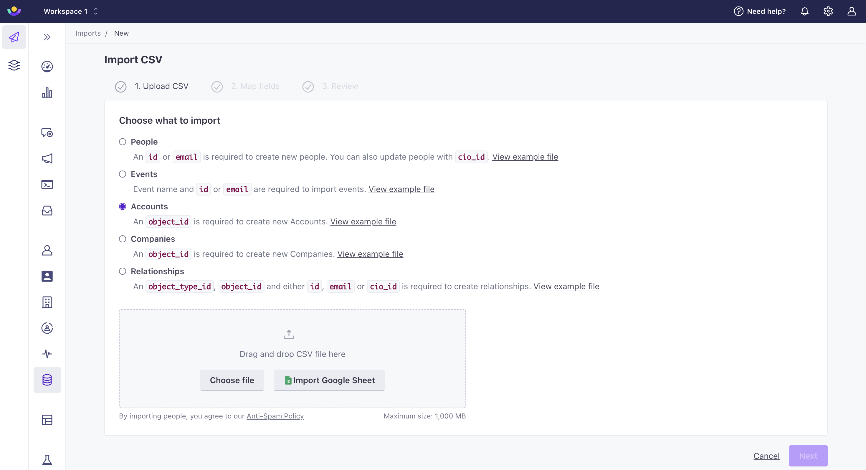
You can now import a CSV of objects or relationships through our UI or API. This is helpful if the data is not available through an integration or you are just getting started and need to quickly backfill data. To import objects or relationships through our UI, go to Data & Integrations > Imports. To import them through our API, use our import endpoint. Note: the people and objects referenced in your relationship CSV must already exist in your workspace for the import to succeed. Also, keep in mind that importing objects and relationships can trigger campaigns! Check that your CSV is correct before initiating import.
Go to the docsUse in-app messages with our Data Pipelines JavaScript
Data pipelines MessagingUntil now, if you wanted to take full advantage of Data Pipelines and send in-app messages to your web audience, you may have had to use both our Data Pipelines JavaScript SDK and our Journeys Web SDK. Handling multiple SDKs for the same platform can be a pain, so we’ve added in-app support to our Data Pipelines JavaScript snippet. Now you can do everything in Customer.io with a single JavaScript SDK.
Go to the docsRetrieve and update language variants for messages through our API
API developers MessagingYou can now retrieve and update translations of messages using our App API. This includes campaigns, newsletters, API-triggered broadcasts, and transactional messages.
Go to the docsExport object and relationship data
Ui improvementsYou can now export object and relationship data from the people or object summary pages as well as from individual people and object pages. This gives you flexibility to share this data with your colleagues that do not have access to Customer.io.
Go to the docsSet custom widths for in-app messages
Messaging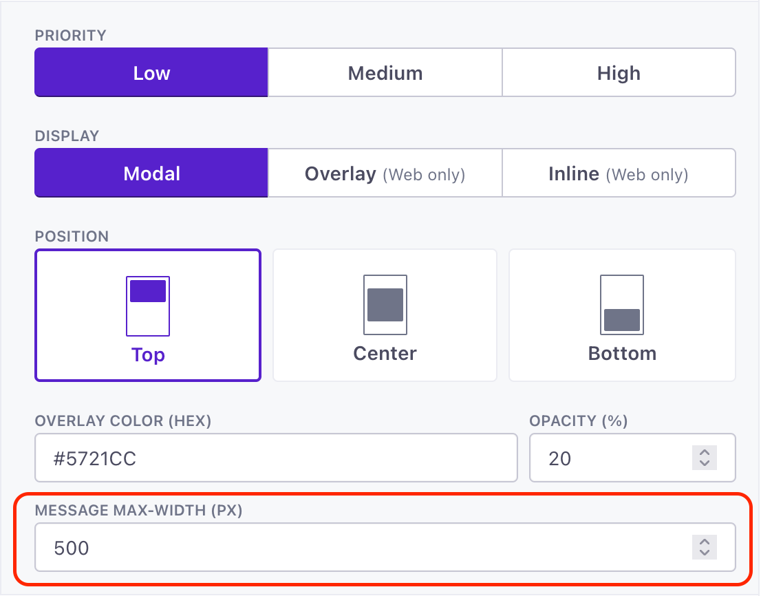
By default, our in-app messages have a maximum width of 414px—a common breakpoint for mobile design. But that might be too narrow for non-mobile mediums, like your desktop website. Now you can set a custom max width for in-app messages, expanding your message on larger screens while still being responsive when your message appears on screens smaller than the max-width value.
Go to the docsCustomize the overlay color of modal in-app messages
Messaging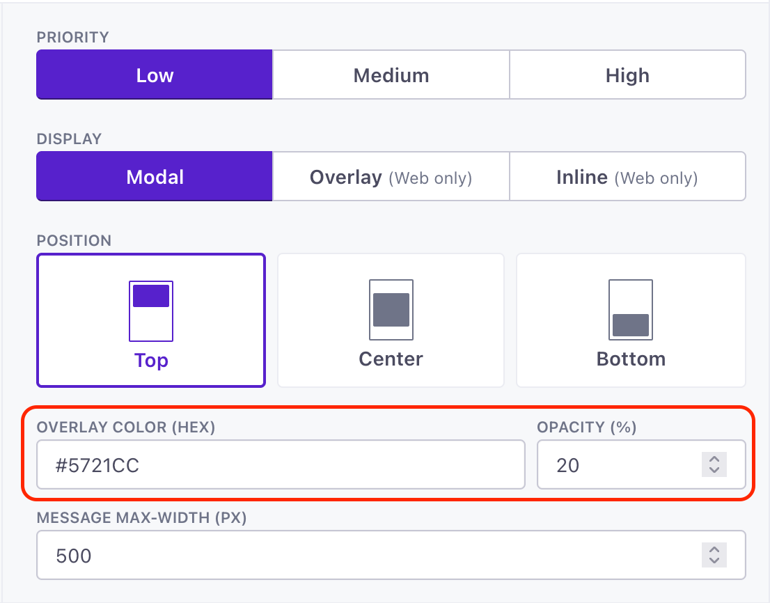
By default, we display modal in-app messages on top of a background overlay colored black with 20% opacity. Now you can customize the modal overlay color and opacity to better fit your brand and ensure that your messages are accessible to all of your users.
Go to the docsHide sensitive data for Authors
Admin billing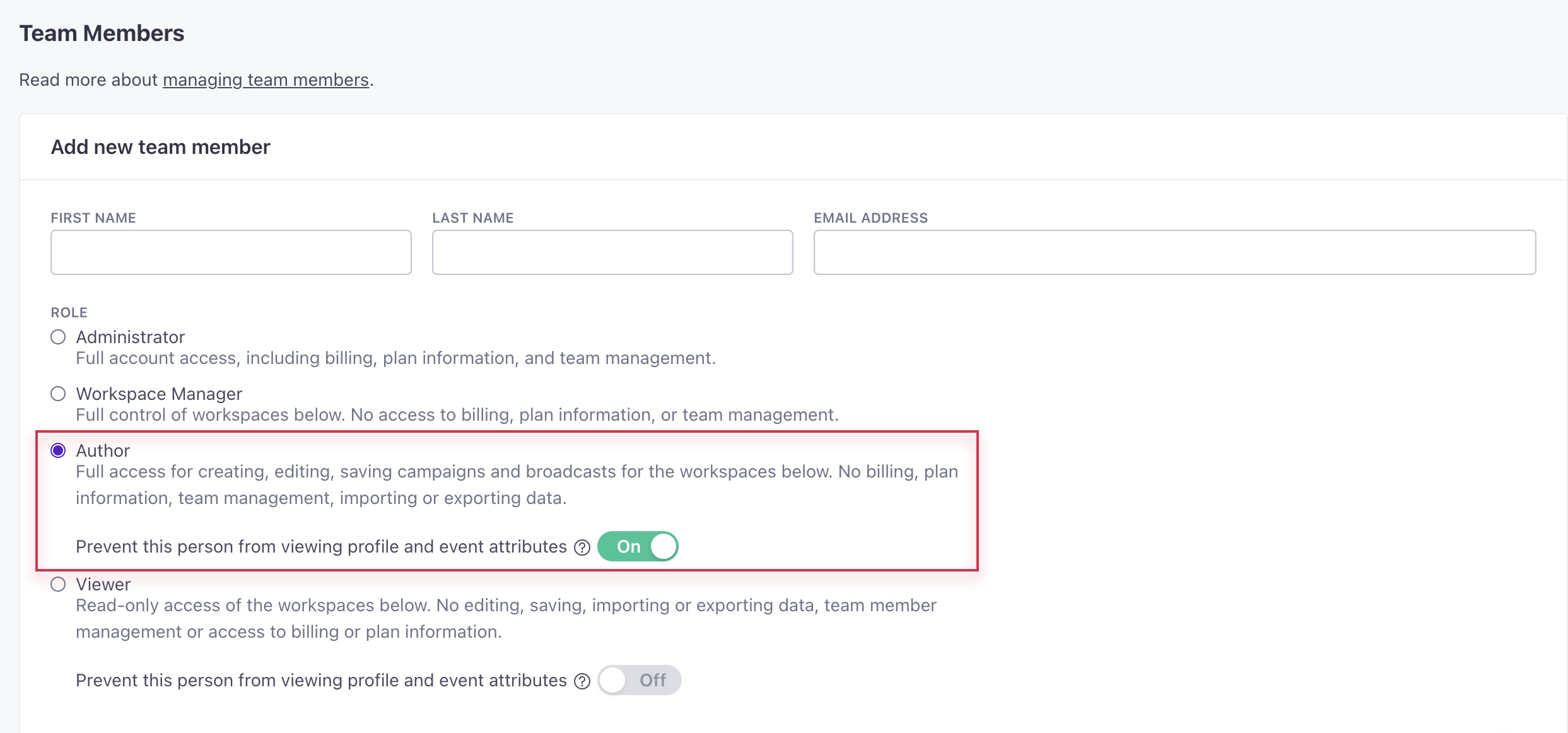
You can now hide profile and event attributes from team members with the Author role to limit who has access to personal information in your workspace. Admins can manage this setting in Account Settings > Team Members. When creating or editing a team member with the Author role, toggle on Prevent this person from viewing profile and event attributes. Authors with reduced access cannot manage segments, objects and relationships, or webhooks. They also cannot edit people or attribute conditions for broadcasts.
Go to the docsData Pipelines is now available in our EU Region
Data pipelinesIf your account is in our European Union region, you can now take advantage of Data Pipelines to send data from your various sources to destinations where you can activate that data. Now our full suite of features—both Journeys and Data Pipelines—are available to you, wherever you are.
Use Data Pipelines for Free!
Sign up for Data Pipelines and receive unlimited API calls through the end of 2023. If you’re already a customer, you can turn on Data Pipelines and use it immediately, with your Journeys data automatically integrated.
Multiple page rules for in-app messages
Messaging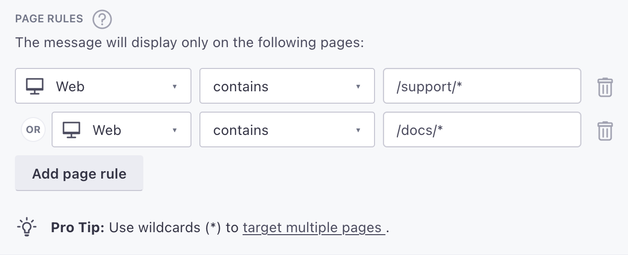
Now you can set up multiple page rules for an in-app message, making it easy to show your message on any page relevant to your message and audience.
Go to the docsData Pipelines Zendesk destination
Data pipelinesThe Zendesk destination helps you identify your users, so you can keep a record of your users and can easily identify the people and organizations who ask you for help.
Go to the docsSet up in-app messages that persist across pages and sessions
Messaging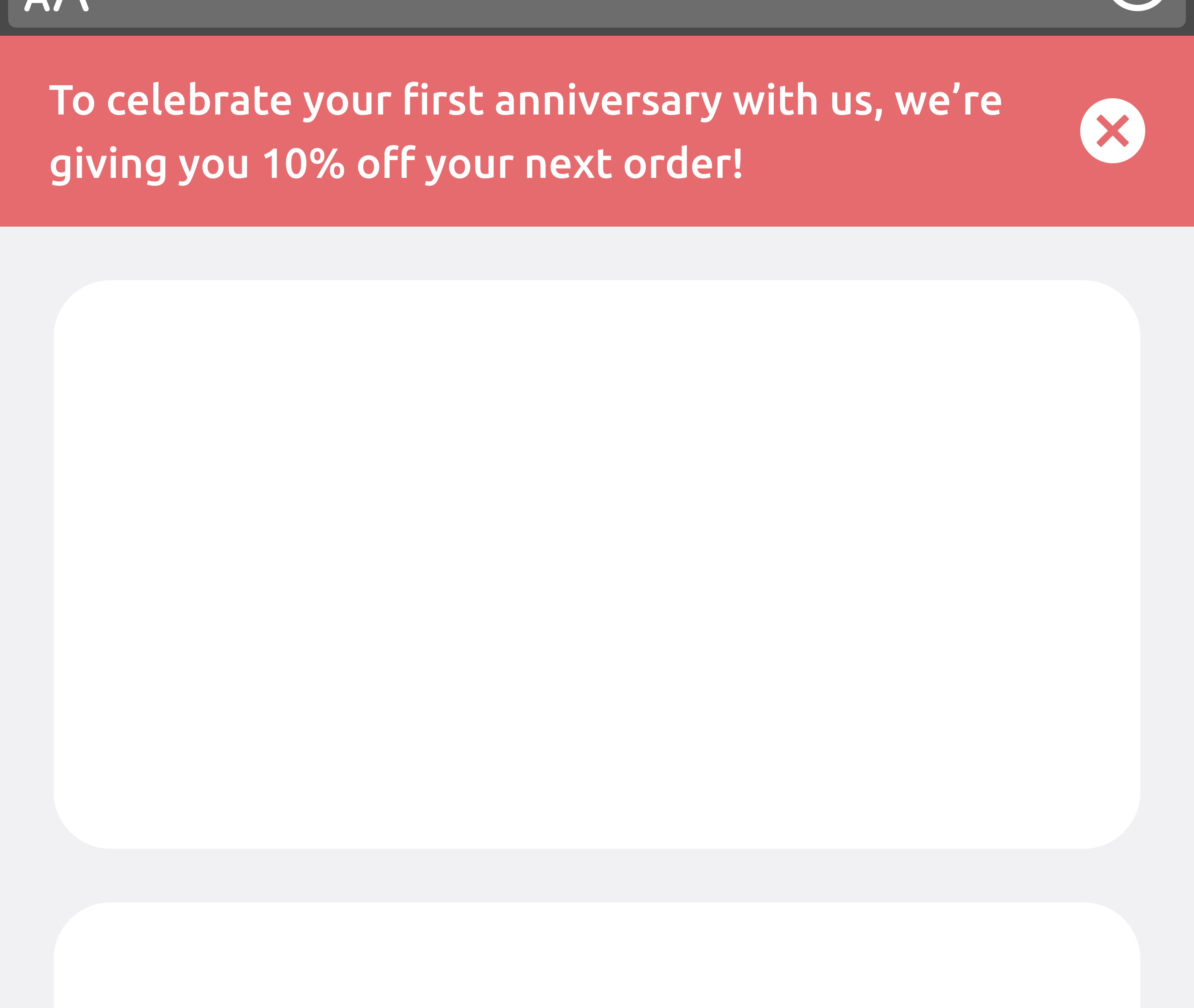
You can now keep banners and messages on your web or mobile app until a set expiration date. This option is perfect for announcing upcoming conferences, webinars, promotions, and more.
If you use our Web SDK, you can start sending persistent in-app messages today. If you use our Mobile SDKs, you’ll need to update to the latest version to take advantage of this feature. Persistent messages are available starting in:
Go to the docsPass delivery metrics from third-party providers
API developers Data integrationsIf you use outgoing webhooks to trigger messages from a third-party provider that is not natively integrated with Customer.io, you can send incoming calls to our Track metrics API to capture metrics in Customer.io. This allows you to see delivery metrics for all of your messages in one place.
Go to the docsRetrieve a list of all workspaces
API developersYou can now retrieve a list of all workspaces and high-level data, like people and object counts, through our App API. This is useful if you need to track usage outside of Customer.io.
Go to the docsHide sensitive data for Viewers
Admin billing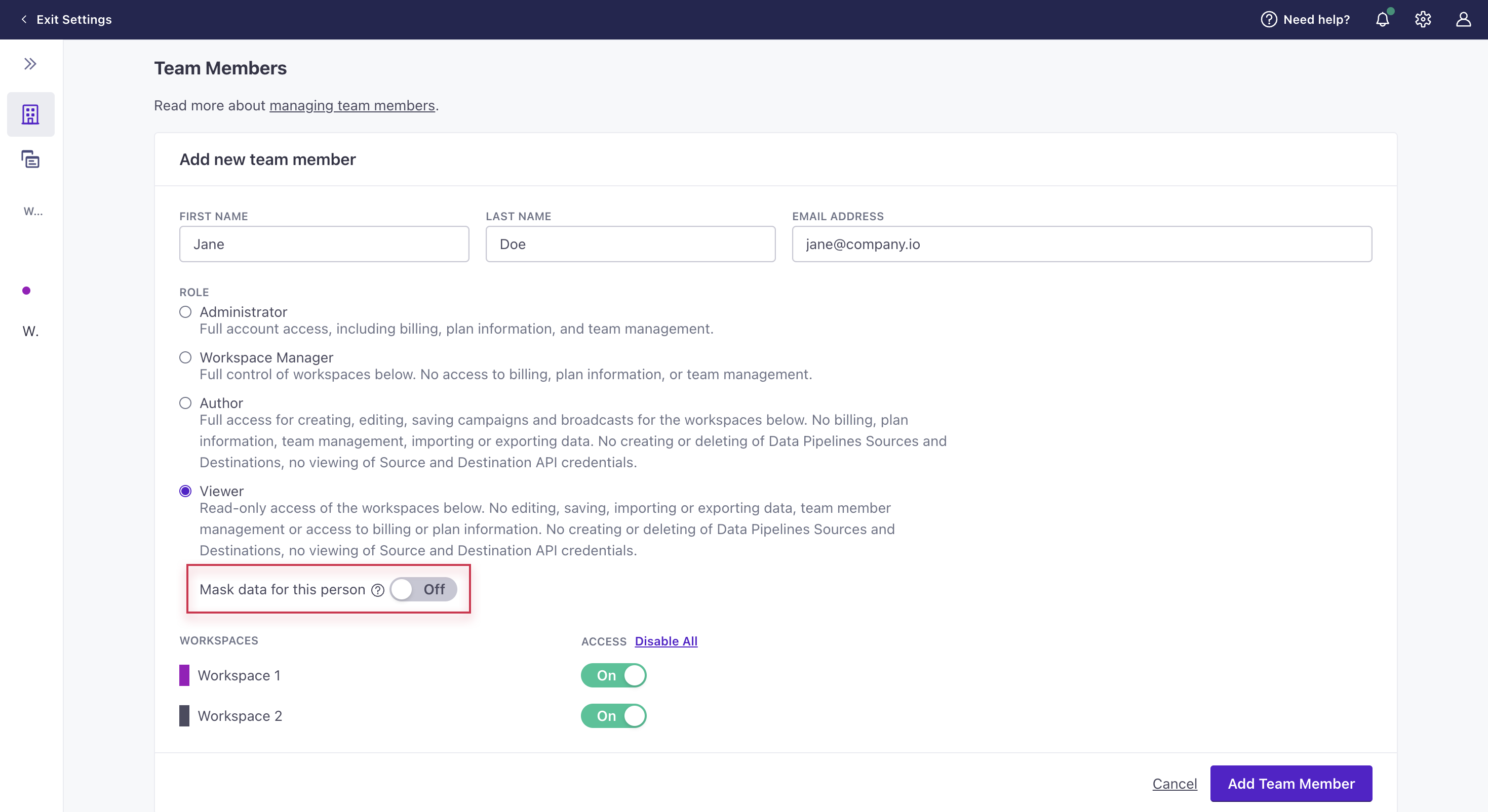
You can now hide profile and event attributes from team members with the Viewer role. Admins can manage this setting in Account Settings > Team Members. When creating or editing a team member with the Viewer role, toggle Prevent this person from viewing profile and event attributes to on.
Go to the docsGoogle Tag Manager (GTM) destination
Data pipelinesThe Google Tag Manager (GTM) destination helps you take advantage of GTM through your Data Pipelines implementation. You won’t have to drop in the GTM snippet or call gtag directly.
Reorganize in-app messages with drag-and-drop
Ui improvements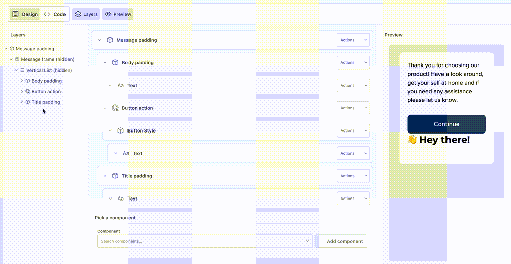
Following our last update, we’ve made it even easier to build in-app messages. Now you can drag-and-and drop components. This gives you the flexibility to build your message in any order and reorganize it later—you can simply change your layout and move elements to the right places at any time.
Go to the docsJump to components in your in-app messages
Ui improvements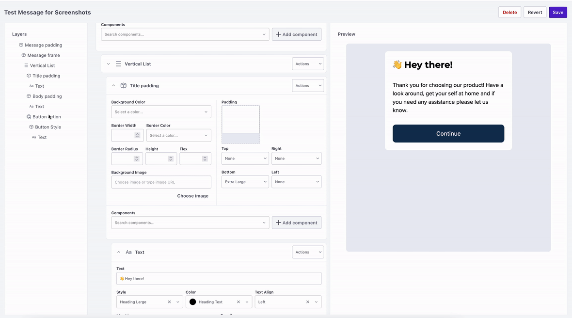
In-app messages often contain groups of nested components, which can make it hard to find the part of the message you want to edit. That’s why we added a new panel to our in-app message creator: to help you easily find and jump to the parts of your message you want to edit.
With the new message navigation panel, you can:
- See the structure of your message at a glance
- Click to a component to go directly to it in your message
- Hide and show components, making it easier to focus on what matters
Assign subscription topics in bulk to live campaigns and broadcasts
Ui improvements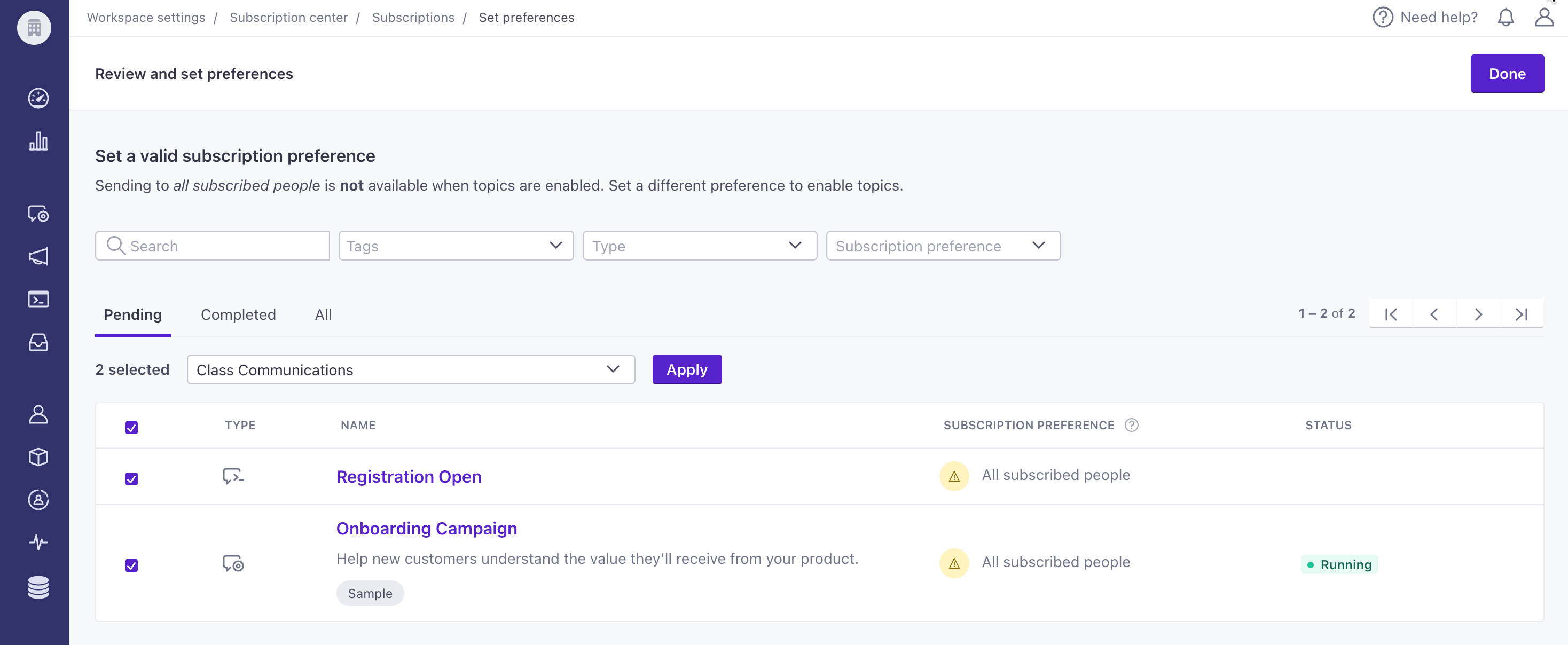
You can now enable your subscription center faster by assigning a topic to multiple campaigns and broadcasts simultaneously. Note, to enable your subscription center, all your running campaigns, API-triggered broadcasts, and scheduled newsletters need a topic. To identify which message workflows still need a topic, go to Workspace Settings > Subscription center. Then go to the Topics table and click Review.
Go to the docsData Pipelines is live!
API developers Data pipelines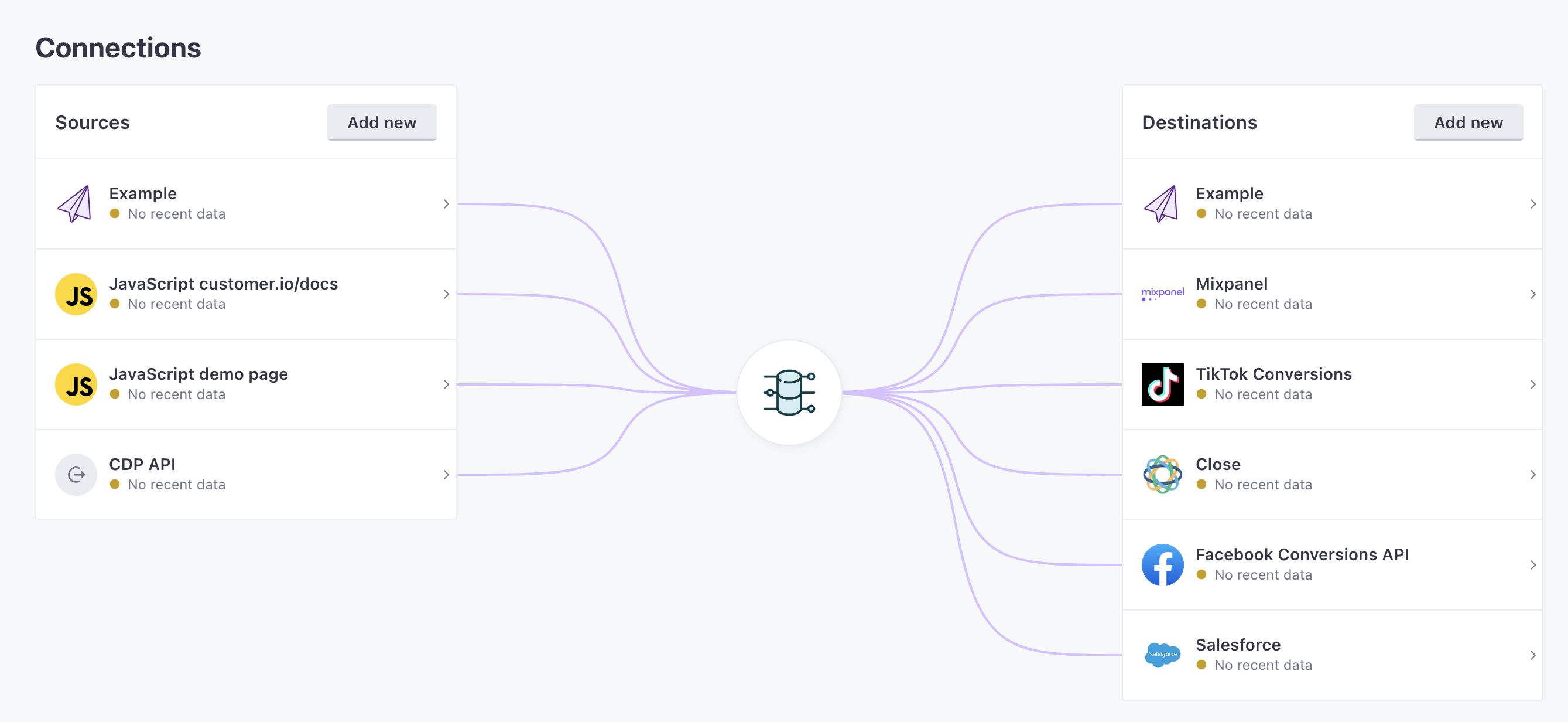
Customer Data Platforms (CDP) are a great way to get data into Customer.io, but they become expensive as you grow. We wanted everyone to be able to afford access to clean, unified data, so we built our own CDP: Data Pipelines. Now you can easily and affordably collect, transform, and send data to Customer.io, and all the other tools in your stack.
Read more
In-App Microsurveys
Messaging Ui improvements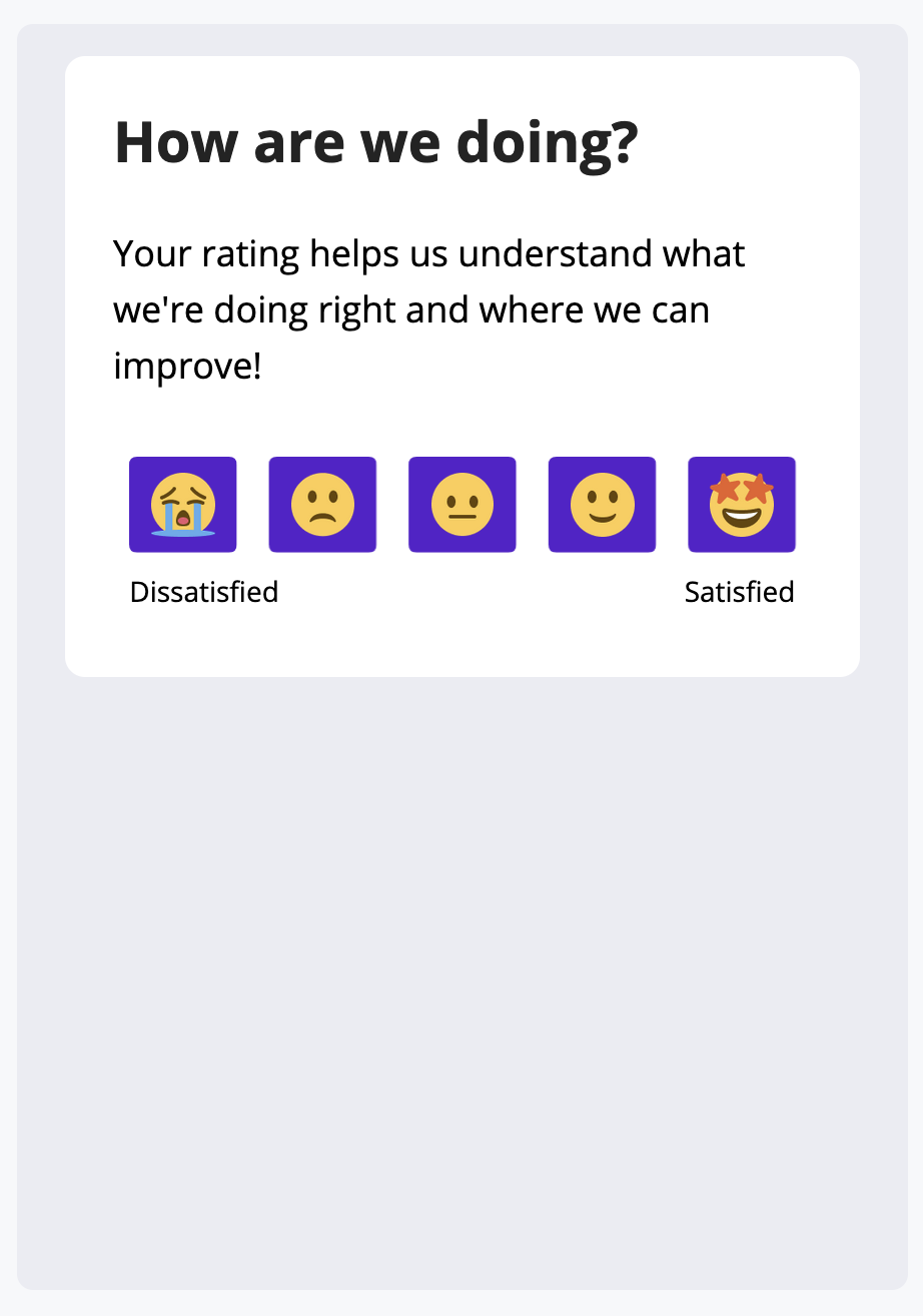
In-app messages are a great way to connect with people who are already engaged with your app, but it hasn’t always been easy in Customer.io to build or track in-app messages with multiple choices. With our new Microsurvey components, we’ve made it easier to send messages with quick, recognizable calls to action. This release also adds the ability to track responses to your in-app messages and surveys.
Read more
Track metrics for subscription center topics
Messaging Ui improvements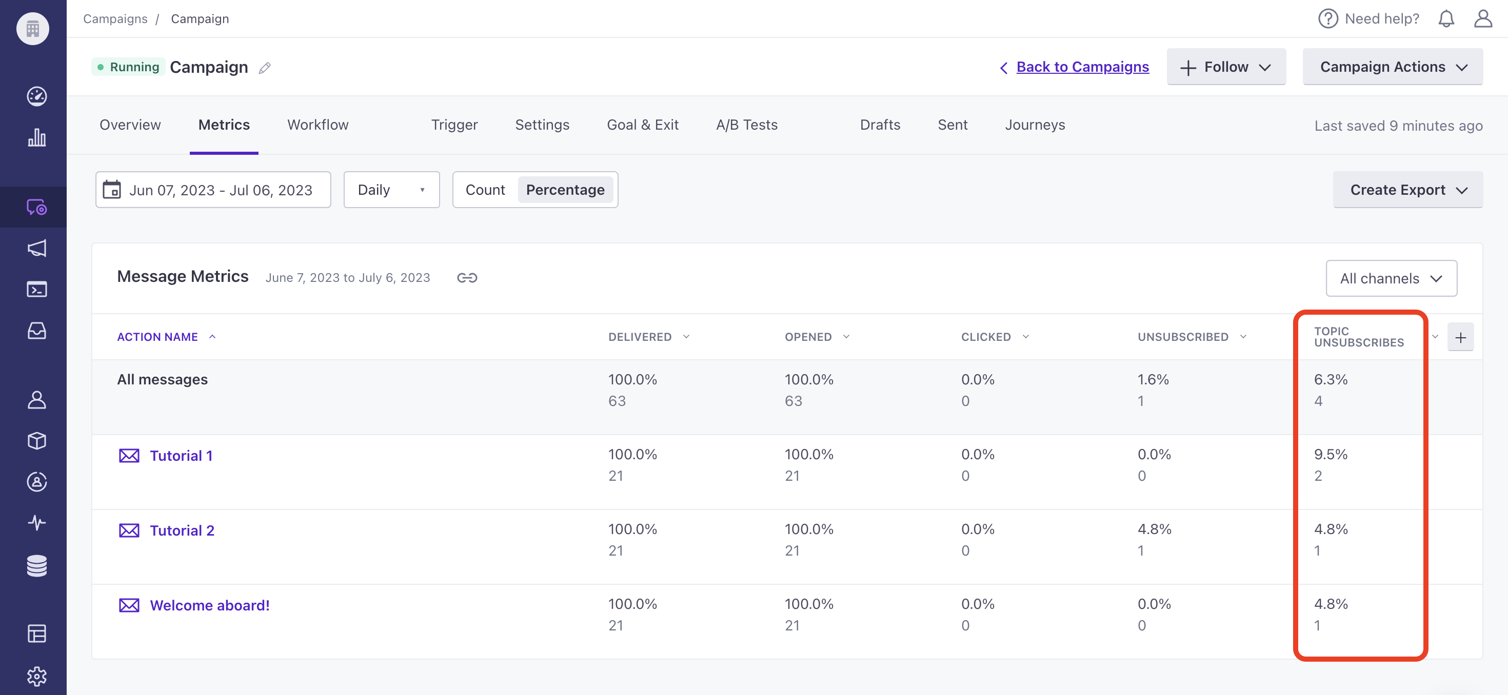
You can now view unsubscribe rates for subscription center topics when viewing Performance & Delivery Metrics or Message Metrics for campaigns and API-triggered broadcasts within the Metrics tab. For newsletters, go to the Overview tab. You can also compare metrics through your Analysis Dashboard. This data can help you determine subscription topic interest by monitoring unsubscribe rates.
Go to the docsReact Native SDK 3.0
Mobile sdkReact Native SDK v3 is live! Automatically update native SDK releases and integrate rich push easier. Follow our migration document (you only need to modify your Podfile) to upgrade, today.
Go to the docs