
Tips, tricks, and best practices for creating responsive emails
It’s no secret that responsive emails are a must in today’s digitally-connected world. If you’re like 85% of people, you regularly check email on your phone. That means your customers do, too.
As a result, the success of your email marketing depends on your emails working as they should across devices (including—and especially—on mobile). Luckily, with some time and coding chops, you can build emails optimized for all your customers’ devices.
Here’s what’s on the agenda today:
- What is a responsive email?
- Why are responsive emails important?
- The benefits and challenges of responsive emails
- Responsive email design examples
- 5 steps to coding responsive emails
- 6 things to consider when building responsive emails
- Questions to ask before diving into responsive design
- How to make the call on responsive design
What is a responsive email?
A responsive email is like a chameleon—it changes its appearance to fit whatever device you use to read it. So, whether you’re looking at it on your computer, phone, or tablet, the email adjusts itself so it is always accessible.
This way, you can open emails on any device, and they’ll always look just right without you having to zoom in or struggle to read tiny text. It’s a smart way to ensure emails are user-friendly, no matter what gadget someone uses.
Technically, there are three main approaches you can take to create mobile-friendly emails:
- Mobile-first design is the simplest, lowest cost method, but gives you limited control over styling.
- Hybrid design offers lots of control over styling and support for virtually all email clients but requires far more coding expertise—and can get tricky with complex layouts.
- Responsive design offers more control over styling than mobile-first design and is lower cost than hybrid design. When built well, it’s the best of both worlds!
Why are responsive emails important?
Imagine if you got an email, and when you opened it on your phone, the text was so tiny that you had to squint to read it or keep zooming in and out. That would be frustrating, right?
Responsive emails prevent this from happening and subsequently deliver so much more:
Accessibility
If creating accessible emails for all your subscribers is top of mind, then responsive design is essential. Responsive design allows for seamless visual consumption of the email across devices. Because your subscribers might open email on their phone and later on their desktop, you want to avoid features becoming incredibly small or blown out of proportion depending on the device used. For example, if you have trouble clicking on small buttons or links on your touchscreen device, responsive emails use code to make these buttons and links bigger and easier to tap. Responsive emails are like a friendly gesture, ensuring everyone can easily access and understand email content.
Better user experience
In your email marketing campaigns, providing a great customer experience is essential. Responsive emails play a vital role in ensuring subscribers have a smooth and enjoyable interaction with your messages. Receiving emails that are easy to read and navigate on any device creates a positive experience. This not only leaves a lasting impression but enhances your brand’s reputation. Responsive emails build trust and loyalty, ultimately strengthening your relationship with your subscribers.
Higher engagement
You don’t just want your subscribers to open your emails. You want them to take action. Responsive emails make it easier for people to do this because they can access content without any hassle. If an email is hard to read or use on a small screen, your subscribers are more likely to ignore it.
The benefits and challenges of responsive design
Responsive email design delivers styling and layout optimized for each device. Plus, you can eliminate frustrating issues on mobile devices, like horizontal scrolling and mangled navigation. That’s a huge win for you and your subscribers. Some elements you can code to respond to different devices include:
- Changing email width
- Changing font sizes and colors
- Converting multiple columns to a single column
- Scaling background images for different screen sizes
- Showing or hiding certain content (aka, progressive disclosure)
- Optimizing navigation bars and menus
For example, you can send a fixed-width email for easy reading on desktop while delivering the same email at a width of 100% to people using phones and tablets.
That said, responsive email design usually requires more technical knowledge and longer development time because of media queries. Of course, most drag-and-drop email editors will ensure your email is responsive, but if you want more control over the look and feel of your email, CSS media queries come into play.
And while email clients widely support CSS media queries, that support isn’t universal. It’s always good to brush up on this list from Can I Email to check media query compatibility by email client.
Let’s talk about media queries for a minute
CSS media queries power responsive design. The principle is simple: an if-then query triggers a set of conditional rules. Basically, the media query calls out to each device and says, “Hey, what are you?” and then responds with the appropriate code.
Armed with info about each recipient’s device, you can adjust various elements of your email for factors like:
- The width and height of the screen/device
- The screen resolution of the device
- Whether the device is in landscape or portrait mode
- If the device is in standard or dark mode (read more on dark mode here)
Yet, since CSS media queries aren’t universally supported, plan ahead to ensure you can deliver an email that performs well for most subscribers. Clients that don’t support media queries will strip the <head> area (including your media query)—so you’ll need to inline your CSS styling as a fallback. Check out this article for more info on using an inliner to do it.
For email clients that support media queries, your embedded styles will display as planned. When you add media queries and media query style rules to <head>, mark each style with an !important declaration—this will override your inline styles and apply your media query styles according to the media query rules.
Here’s a code sample to get you started:
<head>
    <style>
        .special-heading{
            color:blue;
        }
        @media only screen and (max-width:600px) {
            .special-heading {
                color:red !important;
            }
        }
    </style>
</head>
One caveat: while most Gmail clients support media queries, there are some extra details you need to pay attention to in your code because Gmail converts the doctype to <u></u>. You can find the code you need to target Gmail clients (and code examples for many other clients) at HowToTarget.email (and FreshInbox has a handy breakdown of the how and why).
Gmail’s app also doesn’t support <style> tags for non-Gmail accounts—yikes! That means no one will see your media queries without a Gmail account who happens to be using the app on iOS or Android.
In this use case, the hybrid design method is preferred since everything is crafted within the body of the email and won’t be stripped out. Remember, hybrid design does require more time and coding effort—so weigh the pros and cons before you dive in.
Responsive email design examples
Let’s take a look at some real-life examples of responsive email design. These examples will show you how different businesses use this smart technique to make their emails look great across devices.
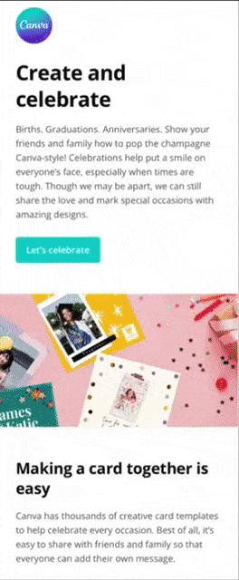
Responsive email example #1: Canva

While this email contains a lot of information, the marketing team at Canva has successfully adapted the information with responsive design to different screen sizes. It’s easily readable on both mobile and desktop.
Responsive email example #2: AllTrails
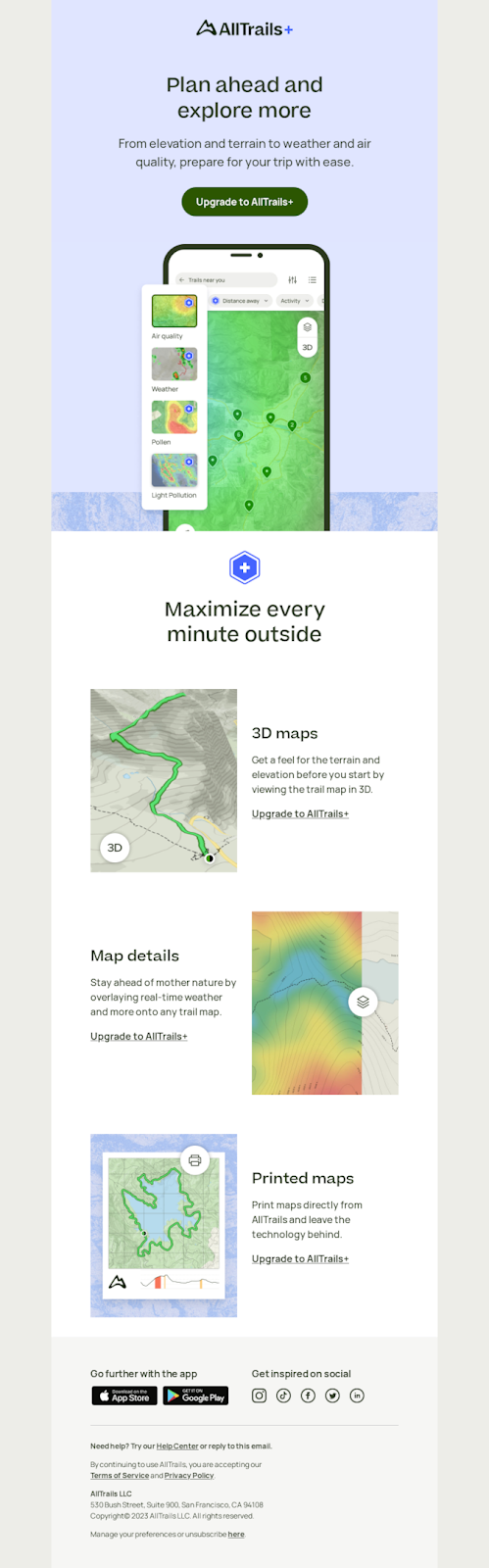
This email from AllTrails leverages light copy and catchy visuals to entice users to upgrade to their Plus plan for more sophisticated mapping features. What’s great is that, although they use imagery and different text layouts on desktop, the email flows well on mobile, too. Bonus? The font size is large across both devices, making it more accessible for everyone.

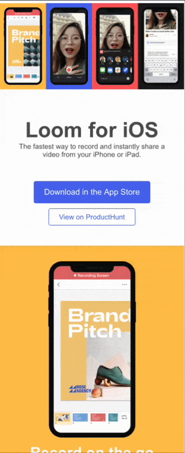
Responsive email example #3: Loom
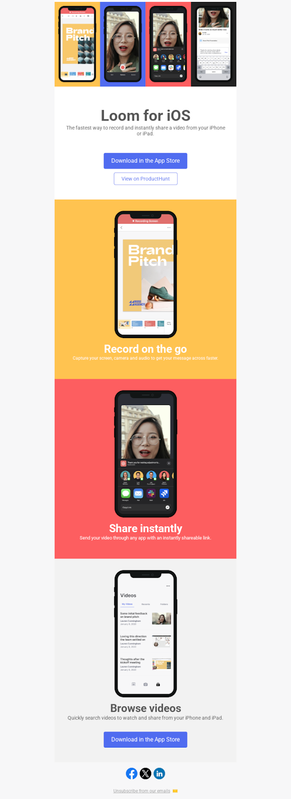
Loom is one of our favorite tools here at Customer.io for internal communications. We’re happy to see the team practicing responsive email design for their own communications, too! This email is bright and image-forward, focused on enticing the user to download Loom’s iOS app. (In fact, with that topic as the focus, it would have been a big miss if they hadn’t optimized it for mobile.)
5 steps to coding responsive emails
Ready to roll up your sleeves and give responsive email design a go? Here’s a high-level overview of the steps you’ll need to take:
- Decide what elements need to be responsive.
- Code a standard HTML email with inline CSS. (You’ll need to inline CSS for email clients that don’t support media queries.)
Tip: Make sure to add classes to the HTML elements. Classes help tie the mobile CSS rules to the element itself. - Add a <head> area. This is where you’ll put additional code for media queries and media query styles.
- In the <head> area, write a CSS media query (@media) to check the recipient’s device and update each element’s styling as desired.
- Test your email across devices and email clients before you send! You should always do this. The more complex your code is, the more troubleshooting it can require. This resource from Parcel is a great guide to email client-specific targeting.
6 things to consider when building responsive emails
Now that you see what responsive emails can do for your marketing, let’s dive into a few techniques to ensure your emails are truly customer-focused. That means considering more than just the layout and design—you’ll want to think about how the email as a whole shows up in someone’s inbox.
Tip #1: Consider keeping it simple with a single column layouts
A single-column design is a tall and narrow format, which aligns with how people scroll on mobile devices. Since it’s meant for a specific audience, the text is often larger than usual, and links are styled to look like buttons, making them easy to tap and open.
So, instead of having lots of content side by side, like a newspaper, it’s better to stack things on top of each other for readability. This way, when people open the email on a small screen, they don’t have to squint or move things around to read it.
Still want to use a multi-column layout design? Keep it to desktop! You can use media queries to switch your multi-column layout to a single-column one for mobile devices and tablets.
Tip #2: Opt for live text
When you opt to use image-only text in your email, you automatically exclude a majority of your subscribers from accessing or viewing that text properly across devices. That’s because image-only text doesn’t scale with responsive design. If you design an image with text for desktop, it’s likely to be too tiny to read on mobile.
You can, of course, create one set of images with text for desktop and one set for mobile, but that’s a lot of extra work! Instead, opt for using live text in your responsive designs instead. That way, you can adjust the size of your fonts—we recommend at least 16px regardless—according to the device’s viewport with media queries.
Here’s the media query code to make that happen:
<style>@media only screen and (max-width:480px) { bodyContent{font-size:16px !important;}} </style>
Tip #3: Use clickable CTA buttons instead of links
Instead of just plain underlined words, use buttons that people can easily tap on their mobile devices. Buttons are like big, inviting targets that make it easier for readers to click.
Make sure to add space around your buttons. That way, mobile users can scroll on touchscreens without accidentally clicking a button they weren’t ready for yet.
Tip #4: Include whitespace and padding throughout your email
We’ve talked about whitespace around buttons and whitespace in your preheader text. Well, whitespace and padding are your friends throughout your entire responsive email!
Cramming everything together will detract from the customer experience. Instead, leave space around your text and images, too. It looks cleaner and makes it less likely for people to accidentally tap the wrong thing on smaller screens (oops!).
Tip #5: Don’t forget the unsubscribe link
An unsubscribe link is added by default in the Empty Layout used for new Rich Text and Code-based emails in Customer.io. Of course, you can edit this layout in your Workspace, but we don’t encourage it. If you are sending marketing emails, you should adhere to all local laws about customer communication.
What’s more? Making your unsubscribe link visible with clear language across devices only enhances the customer experience—and your reputation.
Tip #6: Optimize images for faster loading times
The size of your email matters because it influences how fast it appears when people open it. If your email is large and filled with many images, it can take a long time to load. This can be annoying for the folks reading it and might make them less interested in sticking around to see what you have to say.
Now, consider those who check their email on their mobile devices. If your email has big images that take forever to show up (or seem like they won’t show up at all), you could be gobbling up data in customers’ data plans.
This guide covers everything you need to know about using images in HTML emails. From sizing to file type, there’s a lot to consider when using images in responsive emails throughout your marketing campaigns.
3 questions to ask before diving in
Responsive design is a powerful way to ensure your email looks great to everyone in your audience. But that benefit comes at a cost. Here are three questions to ask yourself before you create responsive emails.
Do you have the time and resources to code a responsive email?
Because responsive design code is more complex, there are more places for it to break. That means more time to write the code, plus additional testing and troubleshooting with your target email clients. If you don’t have adequate time and resources, you’re better off coding a solid mobile-first design—because a rushed, buggy responsive design will only hurt your brand.
What specific benefits will you get that you couldn’t achieve with mobile-first design?
Mobile-first designs are cheaper and faster to implement than responsive designs, and they solve a lot of the same problems. It’s a smart strategy, but only when there’s a clear benefit that will significantly increase conversions.
What devices and clients are your audience using?
You can’t know if the additional costs of responsive design are worthwhile if you don’t know what devices your audience uses to view your emails. If 90% of your audience opens your emails on mobile, it’s probably not worth the cost to optimize for desktops! Make sure you’re mining your data, and do market research if you’re seeking new audiences.
How to make the call on responsive design
Once you’ve answered the questions above, you can do a cost/benefit analysis about whether responsive design makes sense for the email you’re crafting. Remember, you don’t always have to use responsive email design! There are other options, like using a drag-and-drop editor that will do the heavy lifting for you. Of course, in some cases, responsive design can make a significant difference in conversions. For example, it may be worth it when:
- Your data shows a wide mix of desktop and mobile email opens
- A two-column layout is important for getting more info above the fold on desktop
- You often use the same layouts and can build responsive templates to reuse
- You want control over the look and feel of your email beyond what drag-and-drop editors can provide
Responsive design is just one of many tools in your toolbox for building high-performing HTML emails. Keep the big picture in mind when you choose your approach, and you’ll keep your costs down and your customers happy.
If you want to take your email skills to the next level, we recommend brushing up on the dos and don’ts of email deliverability. After all, who wants to spend all that time coding the perfect responsive email—for it not to land in the inbox? Check out our 5-part email series to learn everything you need to become a deliverability expert today.