
Lessons from an Epic Analysis of 50 Welcome Emails
How do you create a valuable welcome email? The “Hello! Hi! Welcome!” part is clear enough, but what else should you consider?
Welcome emails aren’t just a formality but a crucial opportunity. Minutes before, your customer was excited enough about your service to sign up for an account. A good welcome email capitalizes on the momentum of that sign-up, rewarding customers for their behavior and enticing them to stay engaged.
We analyzed 50 welcome emails to figure out how to best guide customers along their customer journey. Let’s dive into the data we found.
The Anatomy of a Welcome Email
We looked at welcome emails from 50 subscription services, with a mix of B2B and B2C. We learned that every good welcome email has these three things:
- Welcome Message. This is where you welcome, invite, and inform your customer. (Tip: use the goof-proof Princess Bride welcome copywriting formula!)
- Images. Appeal to visual learners and provide brand context.
- A call-to-action. Invite your customers to start getting value from your service. For example, if a customer just signed up for your survey tool, you’d invite them to make a survey.
Check out this welcome email for Dropbox Teams, which includes all three components.

- The welcome text explains your new benefits now that you’ve signed up.
- The image breaks up the text, makes the email visually appealing, and promotes the message of collaboration.
- The call-to-action prompts you to “Get started” in Dropbox Teams with a clear next step.
Let’s dig into some of the data to discover best practices for each component.
Welcome Text: Engage Your Customers Immediately—Or Lose Them
A study from the Nielson Group about email newsletters showed that recipients only allocated about 51 seconds to read each email, and often just glanced at the content.
Even though newsletters don’t serve the same purpose as welcome emails, the takeaway is the same: no one will pore over your email’s flowery language. Customers should get your most valuable information right away, from day one, and that can help retain them down the road.
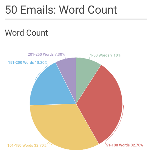
Optimize your word count
In our findings, a good majority (65.4%) of welcome emails had between 50 and 150 words. About a quarter of the emails were over 150 words. Here’s the exact percentage breakdown:
The variation in copy length makes sense—the amount of text you use depends on what you have to convey to new users. It can take longer to explain to someone how they can generate leads than it might to show them a dress to buy.
Despite the variation, it’s possible to be both concise and thorough. This email from Zillow, coming in at only 32 words, is a good model. It has all the component parts (welcome text, image, CTA), and explains all of Zillow’s core functions (home listings, mortgage pre-approval, and “zestimating”).
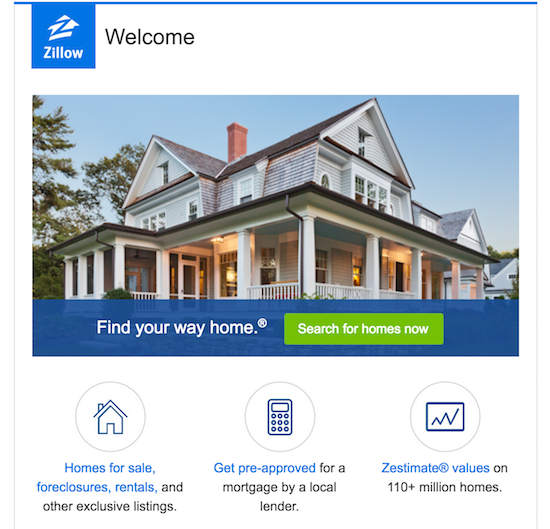
Zillow sums up the basics of their service and invites you to use it, showing that you don’t have to use a lot of words in order to be comprehensive.
Personalize your message to increase conversion rates
Personalization improves click-through rates. And most marketers claim to prioritize personalization.
In our analysis, we looked for two types of personalization:
- Name personalization: Think “Hi, Ellen!” or “Welcome, Jake!”
- Content personalization: Tailoring content based on information you have about a customer, like whether a customer downloaded your productivity tool for business or personal use.
For name personalization, only 11 out of the 50 emails we analyzed used our names (or usernames) in the greeting. That’s just 22%.

It’s not hard to address your customers by name, as long as you’ve got that information. (In Customer.io, you use a simple Liquid tag.) And because personalization tends to increase conversions, any little effort is worth trying.
In terms of content personalization, we found that none of the emails we received were personalized based on use personas. Because few companies are doing this, this is an opportunity to make your welcome emails exceptional.
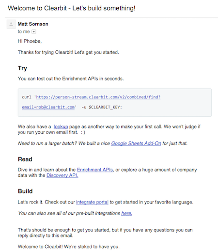
Clearbit, a business intelligence tool, gathers data to determine their customers’ job roles and sends different welcome messages based on those roles. A new user’s job affects how they approach and use Clearbit’s products.
Here’s a marketer-focused welcome, offering integrations with tools they’re likely to already use and calling out the potential to “becoming a marketing god.”

In contrast, here’s what Clearbit sent to their developer customers. The message prompts them to test and learn about their enrichment APIs—which may turn off a marketer who isn’t very technical.
The important takeaway here isn’t about inserting a name or other personalized field but about delivering relevance. Understanding your recipients’ motivations is key to an effective message.
In the case of a welcome email (and many other lifecycle messages), the text aims to invite customers to engage in some way, so you have to make that invitation appealing. And different elements of your service or ways to frame your message can effectively appeal to different segments of people.
Images: Use Graphics to Help Customers Understand Your Brand
65% of people are visual learners. Beyond adding visual appeal, images help your customers process information. Using images in welcome emails might seem obvious, but only a little more than half of our data set did—30 out of 50.
Including an image isn’t a necessity—and when used incorrectly, it can actually distract from the goal of getting customers back inside your app. Still, images in welcome emails are unique opportunities to help cement your message.
Researchers showed that people are 83% more likely to remember text when paired with an image. Images have also been proven to help you process messages faster and more thoroughly, trigger emotions, and motivate learning.

Here are two simple tips on how to capitalize on how images can help people absorb your message:
Use supporting images
The best images support the messages you want your users to take away, adding helpful context. This email from book-creating tool Blurb uses three different types of images to get its message across, using the header, body, and footer of the email.
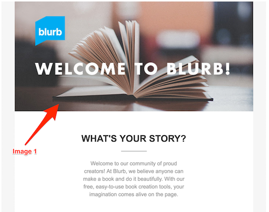
The first image, which includes the logo and a picture of a book, occupies the email header—helping you understand what Blurb is all about.
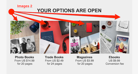
The second set of images gives you a visual representation of the types of publications you can create with Blurb, showcasing the product’s core benefits.
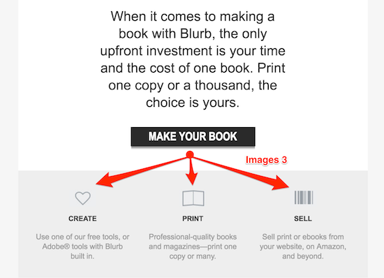
The third set of images are small, but our associations with the heart, the book, and the barcode help us understand the process of using Blurb at a glance.
The way Blurb uses images helps customers get the gist of each element of their messaging, even if they end up scanning the email.
Join the Blue Email Group
The color of welcome email images—in addition to the content—can also affect the way your customer perceives your company. It’s basic color psychology: green is associated with growth/nature, purple with luxury/royalty, black with exclusivity. But one color stood out in our findings.
Out of the 50 emails we analyzed, 30 of them prominently featured the color blue—60% of the total. That’s 36% more than any other color.

While some of these companies had blue in their logo, not all did. So it wasn’t necessarily overall branding that led to a blue choice, which often showed up specifically for their welcome email.
The color psychology surrounding blue aligns with the mission of the welcome email. A welcome email is supposed to help give a positive first impression and build trust, and the color blue symbolizes trust, integrity, and efficiency. For a subscription service, you need to present these qualities to help keep your customers around.
Of course, a blue welcome email isn’t a must-have, but incorporating blue into your color scheme may give you a little boost, as you’re acclimating customers with your service and earning their trust.
Call-to-Action: Maintain Momentum to Prevent Early Churn
It’s easy to lose the interest of new users when you haven’t yet proven your value and built habits of engagement. And when it comes to apps, the numbers are brutal: less than 25% of people will open an app after the first time they use it.
Your first call to action is essential. Your customers decided to download your app or create an account because they’re curious about your service. But that curiosity is fleeting—use it or lose it. Most businesses agree. Out of the 50 emails we analyzed, only 4 didn’t include at least one CTA.

This was the least deviation we saw in any of our findings. But the consensus that all welcome emails need a CTA is pretty basic. The deeper problem remains: you don’t just need any CTA, you need the right one.
Power conversions with a single CTA
While most emails we analyzed had more than one CTA, the best ones had one clear CTA. Research shows that emails with a single, strong call to action increased click-through rates by 371% and sales by 1,617%.
This email from NPS tool Delighted provides an example of what to avoid. There are many instances of hyperlinked text, but it’s not clear what action you should take next.
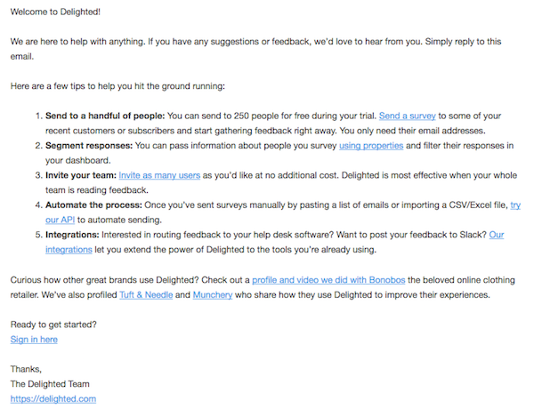
With ten different links in this email, there’s no one area that draws your eye. It’s harder to pick from ten options than to follow one clear direction, as too many options creates choice overload, which often ends up in inaction.
On the other hand, look at this email from productivity tool Trello. There are multiple hyperlinks in this email—links to the Getting Started Guide, social media channels, and Trello’s blog—but the design shepherds you to a clear next step.

Customers see a clear path instead of getting blocked by too much or irrelevant information.
Maximize click-throughs with a button
Much like Trello’s clear next step, using a button rather than linked text or photos can boost click-throughs. Buttons are hard to miss and hard to misunderstand. It’s easy to gloss over a hyperlinked phrase or miss how clicking an image leads to a dashboard.
This email from the Moz Community has both hyperlinked text and a “Start Exploring” button. Here’s the body text:
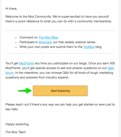
There are six CTAs in total, but only one is the star. Our eyes go right to the yellow “Get Started” button. The other links are easy to gloss over while available for anyone interested enough to explore.
While we recommend using a button to lead your customers on a clear journey, using hyperlinks can provide the context they need along the way.
One Size Doesn’t Fit All
The most important takeaway we’ve learned from analyzing 50 welcome emails is that there’s no one-size-fits-all process for creating yours.
Our trusty shades of blue might clash with the purple in your logo, or maybe your specific audience loves lots of links in their first message. There aren’t any universal rules. There are however some universal goals: welcome messages should leave a positive impression and openness to more engagement.
Okay, we’ve given you strategies for successful welcome emails. Now tell us about your welcome email or how you’re planning on improving them!